Why List Design Matters in Web Pages
Lists are everywhere on the web. Navigation menus, product grids, blog feeds, search results, pricing tiers, feature breakdowns, and FAQs are all forms of lists. Despite being so common, lists are often treated as an afterthought in design, with default browser styles and minimal attention to spacing or hierarchy. Done well, list design improves scannability, reinforces hierarchy, and guides users efficiently through dense information. Done poorly, it leaves pages feeling cluttered and confusing. This article explores how to design effective lists on web pages and the patterns that elevate them from functional to delightful.
Hire AAMAX.CO for Web Design and Development Services
Designing high-quality lists is part of the broader craft of building user-friendly web pages, and that is where AAMAX.CO shines. They are a full service digital marketing company offering web development, digital marketing, and SEO services worldwide. Their website design team understands how subtle details—list spacing, dividers, iconography, alignment—impact engagement and conversions. By combining strategic thinking with refined execution, they help brands present complex information in lists that feel clean, organized, and easy to navigate.
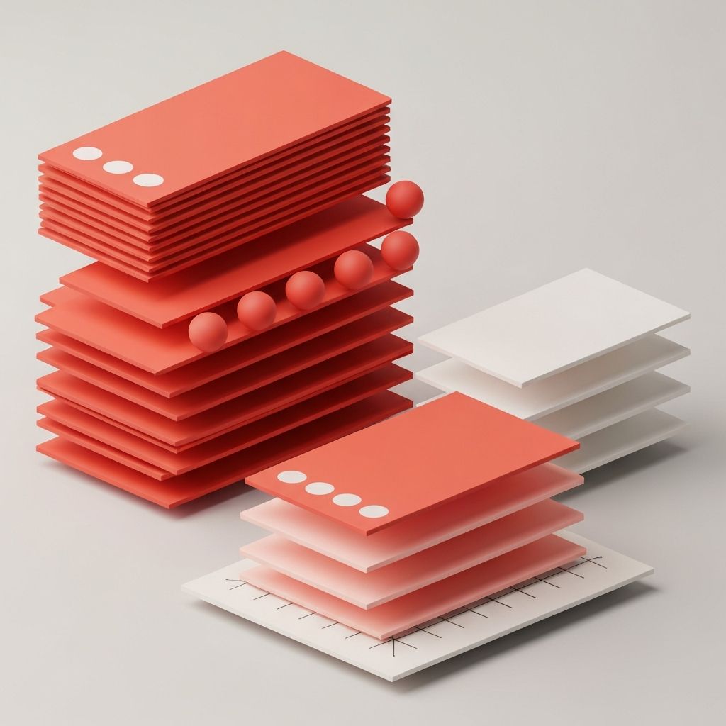
Types of Lists on the Web
Designers typically work with several types of lists. Unordered lists organize items without a particular sequence, often used for features, benefits, or navigation. Ordered lists imply a sequence or ranking, useful for instructions, top picks, or step-by-step processes. Definition lists pair terms with descriptions, valuable for glossaries and specifications. Beyond these classic forms, modern web design uses card grids, table-like rows, timeline lists, and media-rich lists that combine text, images, and actions in each row.
Layout Patterns for Lists
The most common list layout is a vertical stack, where each item sits below the previous one. This pattern is ideal for content that benefits from focused, sequential reading. Two-column or multi-column layouts help when there are many short items—like feature lists or city directories—and screen real estate allows. Card grids transform list items into self-contained units with their own imagery and metadata, popular for blog feeds, products, and case studies.
Horizontal lists work well for navigation bars, pill filters, and tag clouds. Timeline-style lists guide users through milestones or histories. Each pattern has its strengths, and designers should choose based on the content’s nature, the page’s purpose, and the device the user is on.
Typography and Hierarchy in Lists
Strong list design relies on typography. Each list item often contains multiple types of information—a title, a description, a label, and possibly metadata like a date or category. Designers can establish hierarchy through font size, weight, and color. Titles are typically bold and slightly larger, descriptions use lighter body weight, and metadata appears smaller or in a muted color. Consistency across all items keeps the list scannable and predictable.
Spacing and Alignment
Spacing is the unsung hero of list design. Adequate vertical padding between items prevents the list from feeling cramped. Internal padding within each item gives content room to breathe. Alignment should be consistent across rows so users can scan downward without their eyes jumping around. When list items contain icons or images, aligning them to a common baseline or grid creates a sense of order that elevates the entire experience.
Dividers, Borders, and Backgrounds
Visual separation between list items can be achieved through dividers, borders, alternating background colors, or simple whitespace. Dividers and borders work well for dense lists, where users need clear boundaries. Alternating background colors, often called zebra striping, helps users track rows in long tables. Whitespace alone is often the most elegant choice for shorter lists, especially in modern minimalist designs.
Icons and Imagery in Lists
Icons can transform a plain list into a more memorable experience. They reinforce meaning, add visual rhythm, and break up dense text. The key is consistency: choose a unified icon style, size, and color across the list. Imagery in lists, like product photos or article thumbnails, adds emotional appeal and improves engagement. Each image should be sized identically and cropped consistently to keep the layout balanced.
Interactive States and Microinteractions
Lists are not always static. Many list items are interactive, leading to other pages or triggering actions. Hover states, focus rings, and subtle transitions communicate that an item is clickable. Microinteractions—like a small icon shifting on hover or a checkmark appearing when a task is completed—reward attention and add personality. These details should be subtle enough to feel natural and never distract from the main content.
Accessibility in List Design
Accessible list design ensures that everyone can navigate and understand the content. Using semantic HTML—real ul, ol, and li elements—helps screen readers announce list items correctly. Providing sufficient color contrast, large enough touch targets, and clear focus states supports users with low vision or motor impairments. Avoiding all-caps for long text and ensuring lists do not rely solely on color to convey meaning are simple but powerful practices.
Responsive List Design
Lists must adapt to different screen sizes. On mobile, multi-column layouts often collapse into single columns, and complex rows may simplify to show only the most important details first. Truncation, expand-collapse patterns, and progressive disclosure help keep mobile lists usable without overwhelming small screens. Designers should test list designs on a range of devices to ensure each one feels right.
Conclusion
List design is a small phrase that hides a big design opportunity. By selecting the right list type, applying clear typography and hierarchy, using thoughtful spacing, and respecting accessibility, designers turn dense information into pleasant, easy-to-navigate experiences. On nearly every web page, lists do the heavy lifting of communicating value, and treating them as a craft rather than a default elevates the entire site.
