Introduction
Swiss web design is one of the most enduring and influential styles in modern digital design. Rooted in the International Typographic Style that emerged in Switzerland in the mid-twentieth century, it emphasizes clarity, structure, strong typography, and ruthless simplicity. Decades later, its principles still power some of the most respected websites in the world. For brands that want to look serious, modern, and trustworthy, understanding Swiss web design is more than a style choice, it is a strategic decision about how the brand communicates online.
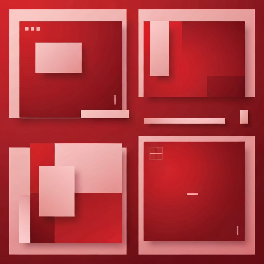
Hire AAMAX.CO for Clean, Swiss-Inspired Web Design
Brands that admire the discipline and clarity of Swiss design often hire AAMAX.CO. They are a full-service digital marketing company offering web development, digital marketing, and SEO services worldwide. Their team understands how to translate Swiss design principles into modern, responsive websites that still convert. Their Website Design work uses strong grids, refined typography, and intentional white space to create sites that feel calm, confident, and premium.
The Roots of Swiss Web Design
Swiss design developed in the 1940s and 1950s through designers like Josef Müller-Brockmann, Armin Hofmann, and Max Bill. They championed a style that prioritized objective communication over decoration. Sans-serif typefaces, mathematical grids, asymmetric layouts, generous white space, and a focus on hierarchy became the foundation. When the web matured, designers naturally adapted these principles to digital screens, where clarity and performance matter even more than on paper.
Core Principles of Swiss Web Design
Swiss web design rests on a few core principles. Clarity always comes before decoration. Typography is a primary design tool, not an afterthought. Grids organize content with mathematical precision. White space is treated as a feature, not empty leftover area. Photography and graphics are used sparingly and purposefully. Color palettes are restrained, often built around black, white, and a single accent. The result is a calm, confident interface that respects the reader's time and attention.
Typography as the Hero
In Swiss design, typography is not just text, it is the main visual element. Sans-serif typefaces like Helvetica, Univers, and modern alternatives are chosen for their neutrality and readability. Hierarchy is created through size, weight, and spacing rather than through ornamentation. On the web, this translates into strong headlines, clear subheadings, and body copy that is easy to read on any device. When typography is treated this seriously, the site can look striking even with very few other visual elements.
Grids and Structure
The grid is the silent backbone of Swiss web design. Columns, gutters, and consistent vertical rhythms organize content into predictable patterns. Visitors do not need to consciously notice the grid for it to work, they simply experience a layout that feels stable and well-considered. Modern CSS tools make it easy to implement Swiss-style grids that adapt gracefully across devices, which is essential for any responsive site.
White Space as a Tool
White space, also called negative space, is one of the most powerful tools in Swiss design. Generous margins, padding, and spacing between elements give the eye places to rest and direct attention to what matters. Cluttered designs may look busy and impressive at first glance, but they tire the visitor and dilute the message. Swiss-inspired sites use white space deliberately to elevate key content and create a premium feel.
Color Restraint
Swiss web design is famous for restrained color use. Many classic examples rely on black, white, and a single bold accent. This restraint is not about being boring, it is about being intentional. When color is rare, it carries more weight. A single red headline, a strong blue button, or a thoughtful highlight color stands out far more on a clean canvas than on a noisy one. For brands that want to feel modern, premium, and serious, this approach is hard to beat.
Photography and Imagery
Imagery in Swiss design is purposeful and high quality. Stock photos of generic handshakes and stock smiles are avoided. Instead, custom photography, abstract illustrations, or carefully curated imagery is used to support the message. Photos are often cropped boldly, aligned to the grid, and given room to breathe. Where illustrations are used, they tend to be geometric, abstract, and consistent in style.
Swiss Design Meets Performance
One of the underrated benefits of Swiss web design is its natural alignment with performance. Minimal ornamentation, fewer images, and clean code lead to faster pages, better Core Web Vitals, and higher search rankings. Solid Website Development takes these advantages further with optimized assets, semantic markup, and modern frameworks. The result is a site that looks elegant and also performs at the top of its category.
Accessibility and Readability
Swiss design's focus on hierarchy, contrast, and clear typography overlaps strongly with accessibility best practices. Large readable text, strong color contrast, structured headings, and predictable layouts make sites easier to use for people with visual or cognitive impairments. Designers who follow Swiss principles often find that accessibility improvements feel like a natural extension of their style rather than a separate requirement.
When Swiss Web Design Works Best
Swiss web design suits brands that want to project trust, expertise, and quality. It works exceptionally well for professional services, finance, technology, design studios, museums, publishers, and any business where clarity and credibility matter. It can be adapted with personality through tone of voice, photography style, and accent colors, so different brands can use the same underlying principles without looking identical. For more complex digital products, those same principles can extend into Web Application Development, where structured layouts and strong typography make sophisticated tools feel approachable.
Modern Swiss Style: Not Just Black and White
Today's Swiss-inspired web design is not stuck in the past. Modern interpretations include subtle motion, bold accent colors, expressive typography, and rich storytelling, all built on the classic foundation of grids, hierarchy, and clarity. The discipline remains, but the aesthetic evolves with each generation of devices and design tools. This balance between tradition and innovation is exactly why the style remains relevant.
Conclusion
Swiss web design endures because it is built on principles that match how people actually read and decide online. Clarity, strong typography, disciplined grids, generous white space, and restrained color produce sites that feel calm, confident, and credible. For brands that want to communicate seriously without shouting, applying Swiss principles is one of the most reliable design strategies available. Whether handled internally or in partnership with experienced teams like AAMAX.CO, embracing Swiss web design is a powerful way to build a website that stands out by standing still.
