The Quiet Power of Shadows in Web Design
Shadows are easy to overlook, yet they are one of the most influential elements in modern web design. They define depth, establish hierarchy, signal interactivity, and bring digital interfaces closer to the physical world we instinctively understand. Used well, shadows transform a flat collection of rectangles into a layered, intuitive experience. Used poorly, they make a site feel dated, cluttered, or unprofessional.
The history of shadows in web design tracks the broader evolution of the medium itself. From skeuomorphic-heavy interfaces of the early 2010s to the flat-design movement that followed, and now to the nuanced, refined shadows of contemporary design systems, each era has used shadows differently. Today's best designers treat shadows as a precise tool, not a default decoration.
How AAMAX.CO Builds Polished, Modern Interfaces
For businesses that want websites with the kind of refined visual depth that builds trust and engagement, AAMAX.CO brings a strong eye for modern interface design. Their team applies thoughtful shadow systems, layering, and elevation hierarchies to create websites that feel premium and intentional. As a full-service agency offering web design, development, and digital marketing, they ensure that every visual choice supports both brand storytelling and conversion goals.
Why Shadows Matter Cognitively
Shadows mimic how light interacts with objects in the real world, and humans are extraordinarily attuned to that signal. When a button casts a soft shadow, the brain instinctively understands it is something physical, something pressable. When a card lifts off the page with a subtle elevation, the brain recognizes it as a distinct unit of content. This cognitive shorthand reduces the work users must do to navigate an interface.
Without shadows, designers must rely on color, borders, and spacing to communicate hierarchy, which often produces interfaces that feel rigid or two-dimensional. Shadows soften these boundaries and add the kind of warmth and depth that modern users expect.
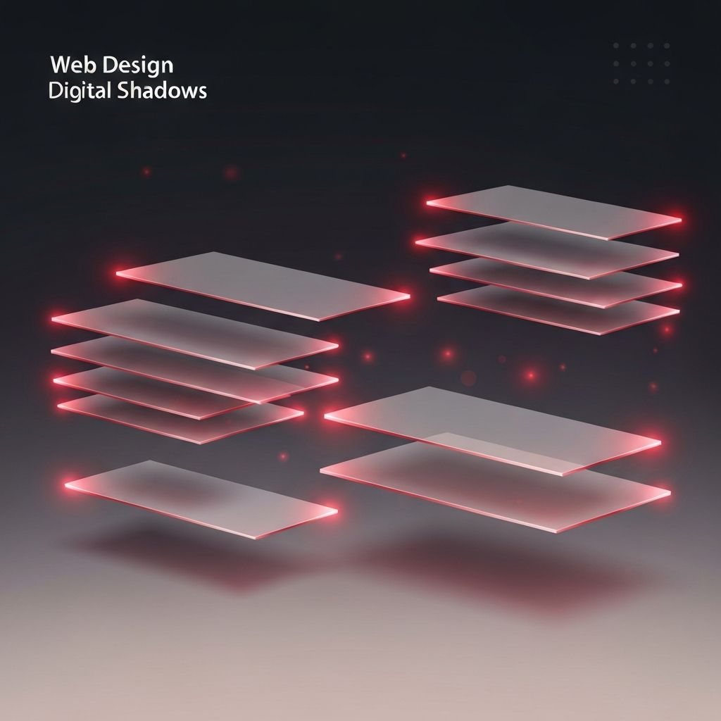
The Anatomy of a Great Shadow
A great shadow is rarely a single shadow. It is usually a layered system of multiple offsets, blurs, and opacities that mimic the way real light wraps around objects. The classic recipe involves a small, sharp shadow that grounds the object and a larger, softer shadow that suggests ambient diffusion. Combined, these layers create the realistic, refined feel found in well-designed apps and websites.
Color matters too. Pure black shadows often feel heavy and dated. Modern designers tint shadows toward the brand's color palette or toward a slightly cool or warm hue, producing shadows that feel integrated rather than imposed. Lower opacity values, often between five and twenty percent, produce shadows that feel natural rather than dramatic.
Elevation Systems and Visual Hierarchy
Modern design systems treat shadows as part of an elevation system. Each level of the hierarchy, from a flat background card to a floating action button, has its own defined shadow recipe. This consistency makes interfaces feel cohesive, and it gives developers a predictable system to work with.
An elevation system typically includes four to six levels, with shadow intensity increasing as elevation rises. A standard card might use level one or two, a hovered card might lift to level three, a modal dialog might sit at level four or five, and a tooltip might use the highest elevation. This layered approach reinforces hierarchy intuitively.
Shadows and Interactivity
Shadows are powerful tools for communicating interactivity. A button that lifts slightly on hover, a card that increases its shadow when focused, or an input that softens its shadow when active all signal to the user that the interface is responsive and alive. These micro-interactions, individually subtle, collectively make a site feel polished and modern.
However, restraint is essential. Animating shadows too aggressively or applying them to too many elements creates visual noise. The best interfaces use shadow transitions sparingly, reserving them for moments where interactivity needs to be communicated clearly.
Performance Considerations
Shadows in CSS can be expensive to render, especially when animated or applied to many elements. Designers and developers must balance visual richness with performance. Hardware-accelerated properties, careful use of will-change, and reasonable shadow complexity keep interfaces smooth even on lower-end devices. Avoiding excessive shadow blur radii and limiting shadow stacks on heavily repeated elements are simple ways to maintain performance.
Shadows in Dark Mode
Dark mode introduces unique challenges for shadows. Pure black shadows are nearly invisible against dark backgrounds, so designers often shift to lighter, glow-like shadows or rely more heavily on borders and luminance contrasts. Some design systems use colored glows in dark mode that mirror the brand palette, producing a futuristic, premium feel. Each approach has trade-offs, and the best decision depends on the overall design language.
Common Mistakes to Avoid
The most common shadow mistakes include using overly dark or saturated shadows, applying inconsistent elevation levels across the interface, overusing shadows on every element, and forgetting to test shadows against various backgrounds. Each of these errors quickly makes an otherwise clean design feel amateurish. A disciplined, system-based approach to shadows prevents these issues and elevates the overall craft of the work.
The Future of Shadows in Web Design
As browser capabilities expand, designers gain new tools for working with light and depth. Backdrop filters, CSS variables, container queries, and emerging spec features allow shadows to adapt dynamically to context, theme, and user preference. The future points toward more responsive, more intelligent shadow systems that feel less like static styles and more like living parts of the interface.
Shadows are a quiet but powerful tool in the modern designer's kit. Treated with care, they elevate the entire experience and signal craftsmanship in ways that users feel even if they cannot articulate them. For businesses building websites that need to feel premium and trustworthy, mastering shadows is one of the smallest investments with the largest return on perceived quality.
