Web design and graphic design share deep roots but have evolved into distinct disciplines with their own tools, principles, and best practices. Graphic design is the broader, older field, encompassing everything from posters and packaging to logos and editorial layouts. Web design is a specialized branch focused on interactive digital experiences across screens of every size. The two disciplines inform each other constantly: many of the most beautiful websites are created by designers with strong graphic foundations, and many of the most effective brand identities are designed with digital application in mind from the start. Understanding the relationship between them helps businesses build cohesive, multi-channel brand experiences.
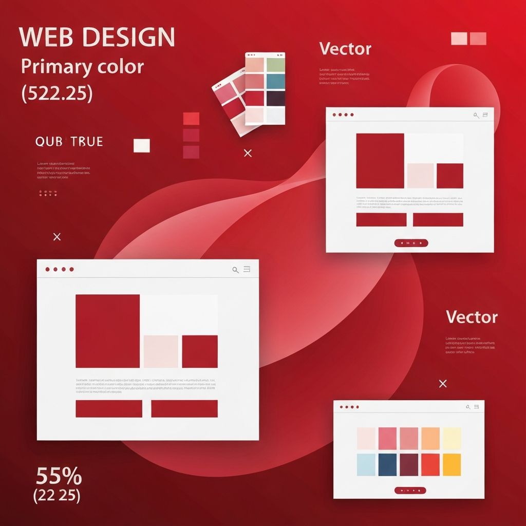
How AAMAX.CO Bridges Web and Graphic Design Disciplines
For businesses that want a unified brand presence across digital and traditional touchpoints, AAMAX.CO offers website design services backed by strong graphic design fundamentals. Their team brings together typography, composition, color theory, and visual storytelling alongside the technical demands of responsive, accessible, performant web development. They ensure that brand identity translates faithfully from print to screen and from screen to motion, producing experiences that feel cohesive wherever audiences encounter them.
Where the Disciplines Overlap
Both web and graphic design rely on the same visual fundamentals: typography, color, composition, hierarchy, white space, and imagery. Both disciplines require strong conceptual thinking, the ability to translate brand strategy into visual form, and a deep understanding of how audiences perceive and process visual information. Skills developed in graphic design — such as crafting a compelling poster or laying out a magazine spread — transfer directly to web work, where similar principles guide the design of landing pages, hero sections, and editorial-style content.
Where the Disciplines Diverge
The most significant difference between the two is interactivity. Graphic design typically produces static artifacts; web design produces dynamic experiences that respond to user input, screen size, device capability, and even time of day. Web designers must consider hover states, focus states, loading behavior, error handling, and many other interactive concerns that have no equivalent in print. They must also think about performance — how quickly the design loads — and accessibility for users with disabilities, both of which are largely invisible to traditional graphic designers.
Typography in Print Versus on Screens
Typography behaves differently in the two mediums. In print, designers can specify exact sizes, line heights, and letter spacing knowing the output will match the design precisely. On the web, typography must adapt to varying screen sizes, system fonts, browser rendering differences, and user preferences. Web designers use relative units, fluid typography systems, and font loading strategies to maintain typographic integrity across devices. Variable fonts have made it easier to bring print-quality typography to the web, but the medium still demands a different mindset.
Color in Print Versus on Screens
Color management is another area where the disciplines diverge. Print designers work in CMYK color space and rely on Pantone matching for consistency across print runs. Web designers work in RGB color space and must account for varying display calibrations, dark mode preferences, and accessibility contrast requirements. A color that looks perfect on a printed business card may appear different on a phone screen, a laptop, and a high-end monitor. Understanding both color spaces — and the translation between them — is essential for brands that exist across both worlds.
Layout: Fixed Versus Fluid
Print layouts are fixed; once the page is printed, the composition is locked in. Web layouts are fluid; they must work on a 320-pixel-wide phone, a 1920-pixel-wide desktop, and everything in between. This fundamental difference shapes nearly every layout decision a web designer makes. Grid systems, breakpoints, container queries, and responsive units are all tools for managing this fluidity. The best web layouts feel intentional at every screen size, not just at the size the designer happened to mock up first.
Imagery and File Considerations
In print, image quality is constrained by the printing process and the paper. In web, image quality is constrained by file size and load time. A high-resolution image that prints beautifully might be far too heavy for the web. Web designers use modern formats like WebP and AVIF, responsive image techniques, and lazy loading to deliver rich imagery without sacrificing performance. They also consider how images will appear on retina displays, in dark mode, and at different aspect ratios across devices.
Brand Systems That Work in Both Worlds
The most successful brand identities are designed with both print and web in mind from the start. Logos must work as small favicons and large billboards. Color palettes must be defined in both Pantone and RGB. Typography must include a print-ready typeface and a web-ready typeface (or a single typeface that performs well in both). Pattern libraries, illustration styles, and photographic guidelines should specify how each element behaves across mediums. A well-designed brand system makes consistency across channels achievable rather than accidental.
Motion and Interactivity as Native Web Tools
Motion and interactivity are tools that have no print equivalent. They give web designers expressive options that extend far beyond static graphic design. A button that animates on hover, a hero section that responds to scroll, an illustration that comes to life when it enters the viewport — these are uniquely web-native experiences. Used thoughtfully, motion adds personality and clarity. Used poorly, it distracts and frustrates. The best web designers treat motion as a deliberate design element, not an afterthought.
Choosing Designers With the Right Mix
Some designers specialize in print, some in web, and some are equally fluent in both. For most modern brands, the third category is the most valuable. A designer with strong graphic foundations brings sophisticated visual judgment to web work, while a designer with strong web fundamentals brings practical understanding of how digital experiences function. Hiring or partnering with designers who can move fluidly between the two disciplines tends to produce more cohesive, more effective brand experiences.
Final Thoughts
Web design and graphic design are two sides of the same creative coin. They share fundamental principles but differ in important ways — interactivity, fluidity, performance, accessibility, and motion. Brands that respect both disciplines, and that hire designers who understand both, produce experiences that feel cohesive across every touchpoint. In a world where audiences move constantly between print, screen, and physical environments, that cohesion is what separates strong brands from forgettable ones.
