The Power and Risk of Red in Web Design
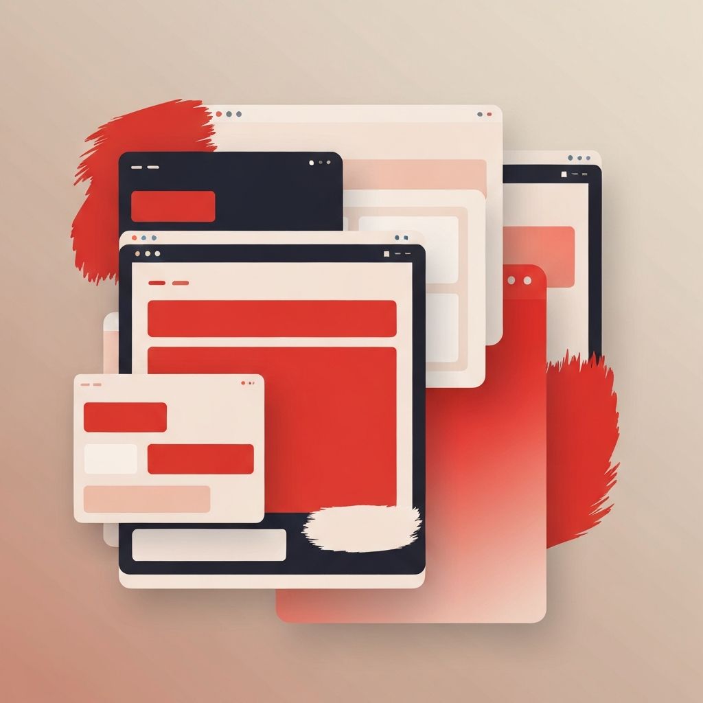
Red is one of the most psychologically charged colors in the entire design palette. It signals urgency, passion, energy, and confidence. It is the color of warning signs, sale tags, sports cars, and emergency buttons. When used well in web design, red creates an unmistakable brand presence that visitors remember. When used poorly, it overwhelms the eye, reduces readability, and triggers the same fatigue people feel from constant alerts.
Red web design therefore demands more discipline than design built around safer colors. Every shade, every saturation level, and every usage context has to be considered carefully. The brands that pull off red successfully treat it as a precision instrument rather than a paint bucket, and they pair it with calm neutrals that let the red breathe instead of competing with it for attention.
How AAMAX.CO Approaches Bold Color Strategies
For brands that want to stand out with a confident red identity, hire AAMAX.CO to design and build a website that uses bold color strategically. They are a full-service digital marketing company offering web development, digital marketing, and SEO services worldwide, and their design team understands how to translate strong brand colors into accessible, conversion-focused experiences. They help clients harness the energy of red without falling into the common traps of fatigue, accessibility issues, or visual noise that hurt conversions.
The Psychology Behind Red
Red activates the visual system faster than almost any other color. It increases heart rate, draws the eye, and triggers a sense of urgency. That is why call-to-action buttons across many industries default to red or red-adjacent shades. It is also why warning labels, fire equipment, and alert icons rely on red. The same response that makes red effective in moderation also makes it exhausting in excess. A page where everything is red effectively flattens the hierarchy, since nothing stands out when everything is shouting.
Cultural context also matters. In many Western markets, red is associated with passion, danger, and excitement. In parts of Asia, red carries strong associations with luck, prosperity, and celebration. In some industries, red signals authority and power. Smart designers consider these associations carefully when deciding how prominent red should be and which shades to choose.
Choosing the Right Shade of Red
Not all reds behave the same way. A bright, saturated red like a classic fire engine red projects energy and urgency, but it can feel aggressive in large doses. A deep, slightly desaturated red moves into territory that feels more sophisticated and authoritative, often associated with luxury brands and editorial publications. A red with warm orange undertones feels friendly and approachable, while a red with cool blue undertones feels modern and refined.
The choice depends on the brand. A children's product brand and a private wealth management firm both might use red, but the specific shades will be radically different. The website's underlying tone, typography, and imagery should reinforce that choice. A site built with thoughtful website design principles starts with a careful audit of brand attributes before locking in a primary red, rather than treating the color as an aesthetic afterthought.
Pairing Red With the Right Supporting Palette
Red rarely succeeds on its own. It needs supporting colors that give it room to breathe. The most reliable approach is to pair a strong red with calm neutrals such as warm whites, soft creams, charcoals, or deep navy blues. These neutrals create the visual rest that the eye needs in order to process red effectively. They also ensure that the red retains its meaning when it appears, since calls to action and important highlights remain visually distinct from background elements.
Accent colors should be used sparingly. A single secondary accent, such as a muted gold or a desaturated teal, can add dimension without diluting the red. Adding too many additional colors quickly turns a focused brand into a circus. The most successful red-centered designs typically use no more than three to five colors total, with red carrying most of the brand voice and the others playing strictly supporting roles.
Accessibility Considerations With Red
Accessibility is a frequent blind spot in red web design. Red and green are the most common colors involved in color vision deficiency, which means red text or red status indicators may not be visible to a meaningful portion of users. The fix is not to avoid red entirely but to ensure that color is never the only signal. Icons, text labels, and underlines should accompany red elements wherever they communicate state.
Contrast is another critical concern. Red text on a white background can fail accessibility contrast standards depending on the shade and weight. Light red on a darker background often fails too. Designers should test every red and background combination against current contrast guidelines, and they should avoid using bright red for long passages of body text. These checks are easier when they are built into the design system from the start, which is why teams experienced in website development often integrate automated accessibility tests directly into the build process.
Using Red for Conversion, Not Just Decoration
One of the most practical reasons to use red on a website is to drive conversion. Buttons, badges, and alerts in red attract attention and signal action. The catch is that red elements only work this way when the rest of the page is calm. If the entire site is awash in red, a red button blends in instead of standing out, and the entire conversion advantage disappears.
The cleanest pattern is to keep most of the page in neutrals and reserve the brightest, most saturated red for primary calls to action. Secondary actions can use the supporting accent color or a desaturated version of the primary red. Alerts, badges, and notifications can also use red, but sparingly, so that visitors do not become numb to the signal. Done correctly, this restraint turns red into a precision tool rather than a constant background hum.
Common Mistakes With Red Web Design
The most common mistake is using too much red. Red headers, red backgrounds, red buttons, red dividers, and red icons together create a visually exhausting experience that hurts both engagement and conversion. The second most common mistake is choosing the wrong shade for the brand voice. A playful direct-to-consumer brand using a corporate burgundy will feel mismatched, and a luxury watchmaker using a candy red will feel cheap.
A third common mistake is ignoring how red looks on different devices and in different lighting. Red shifts noticeably across monitors, mobile screens, and printed materials. Designers should test the chosen red across the most common devices and adjust until the brand feels consistent everywhere. Ignoring this step often produces a website that looks great in the design tool and disappointing in real-world use.
Conclusion
Red web design is a powerful choice for brands that want to project confidence, urgency, and energy. It is also a demanding choice that punishes carelessness. The brands that win with red treat it as a precision tool, choose the right shade for their voice, support it with calm neutrals, and respect accessibility throughout. With the right strategy and the right design partner, a red-centered website becomes one of the most memorable and effective tools in the brand's arsenal.
