What Web Design UI Really Means
User interface, or UI, design is the art and science of crafting the visual surface that users touch, click, and interact with. Every button, input field, card, and menu is a UI element, and together they form the experience your audience associates with your brand. Strong web design UI is more than aesthetic polish. It is a carefully engineered system that communicates hierarchy, signals possibilities, and reduces friction at every step. When UI is done well, users barely notice it. When it is done poorly, they leave.
Why AAMAX.CO Delivers Outstanding Web Design UI
Crafting a UI that feels both beautiful and intuitive requires deep expertise across design and engineering. AAMAX.CO is a full-service digital marketing company offering web development, digital marketing, and SEO services worldwide. They specialize in building UI systems that balance brand expression with measurable usability, ensuring that every component serves a purpose. Their teams work hand in hand with clients to define design tokens, build reusable component libraries, and ship interfaces that scale gracefully across products and platforms.
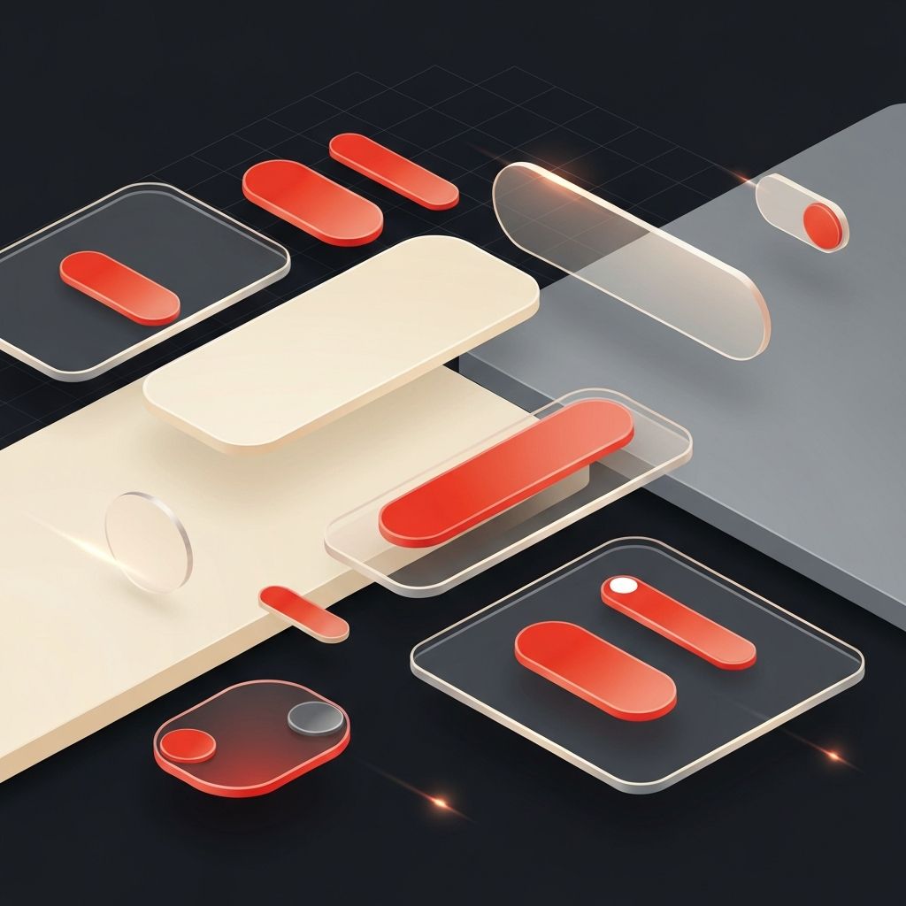
The Building Blocks of UI
Every interface is composed of foundational elements: typography, color, spacing, iconography, and imagery. These building blocks combine into components such as buttons, cards, modals, and navigation bars. Strong UI design begins by defining each foundation rigorously and then assembling components that respect those rules. The result is a coherent visual language that feels unified across every page and screen.
Visual Hierarchy and Information Architecture
Visual hierarchy guides the eye through a page in a deliberate sequence. Designers achieve hierarchy through size, weight, color, contrast, and placement. Pair this with thoughtful information architecture, which organizes content into logical groups, and visitors can find what they need without conscious effort. Good hierarchy answers the silent question every user asks: what should I look at first?
Component Libraries and Design Systems
Modern UI design relies on component libraries that encapsulate visual and behavioral rules in reusable building blocks. A design system goes further, codifying tokens, components, and usage guidelines into a single source of truth. Teams that invest in design systems ship faster, maintain consistency, and onboard new contributors with ease. Investing in expert website design early helps establish these systems on solid foundations.
Interaction Patterns That Feel Natural
Great UI relies on familiar interaction patterns. Users have learned conventions through years of using the web, and those expectations should be honored. Primary buttons should look clickable, links should appear distinct from regular text, and forms should validate input clearly. Innovation is welcome, but only when it solves a real problem and is supported by careful onboarding cues.
Color Strategy and Brand Expression
Color does enormous work in UI design. A well-chosen palette communicates brand personality, signals interactive states, and provides accessible contrast. Most successful palettes include a primary brand color, a small set of neutrals, and one or two accent colors used sparingly to draw attention. Designers also plan for dark mode, error states, and focus indicators from the very beginning.
Iconography and Visual Language
Icons are tiny ambassadors of clarity. A consistent icon set reinforces brand identity, speeds comprehension, and brings rhythm to dense interfaces. Designers should choose icons with a unified weight, corner style, and metaphor. Pairing icons with concise labels improves accessibility and reduces ambiguity, especially in navigation and toolbars.
Microinteractions and Feedback
Microinteractions are small, purposeful animations that respond to user actions. A button that subtly scales on hover, a toggle that animates between states, or a form field that gently shakes on error all reinforce the sense that the interface is alive and responsive. These details build confidence and trust, making users feel in control rather than guessing.
Performance and Perceived Speed
UI design is inseparable from performance. A beautiful interface that loads slowly feels broken. Designers and engineers collaborate to keep payloads light, prioritize critical content, and use techniques like skeleton screens and optimistic updates to make interactions feel instantaneous. Perceived speed often matters more than actual speed, and thoughtful UI choices can dramatically improve it.
Accessibility as a UI Standard
Accessible UI is good UI for everyone. Designers should ensure that interactive elements are keyboard navigable, that color is never the sole indicator of state, and that components work with screen readers. WCAG guidelines provide a strong baseline, but the spirit of accessibility goes further by considering cognitive load, motion sensitivity, and language clarity. Inclusive design produces interfaces that feel respectful and human.
Conclusion
Web design UI is the meeting point of art, psychology, and engineering. By mastering visual hierarchy, building robust component systems, embracing familiar interaction patterns, and treating accessibility as a non-negotiable standard, designers create interfaces that delight users and drive business results. With strategic guidance and skilled execution, every screen becomes an opportunity to strengthen the relationship between a brand and the people it serves.
