The Renaissance of Gradients in Web Design
Gradients have traveled a long road in web design. From the heavy, photorealistic blends of the early 2000s to the strict flat design of the 2010s, and now to the sophisticated, atmospheric gradients of the modern web, color transitions reflect the era's broader design sensibilities. Today's gradients are subtle, intentional, and often used to add depth, dimension, and emotional resonance without sacrificing usability or accessibility.
When used thoughtfully, gradients can elevate a brand, draw attention to important elements, and create a sense of motion and energy. When used carelessly, they can clash with content, overwhelm the eye, and date a website almost overnight. Understanding the principles behind effective gradients is essential for any modern designer.
Hire AAMAX.CO for Web Design and Development
Translating creative direction into a polished, performant website requires both design taste and engineering rigor. AAMAX.CO offers full-service website design and development that pairs trend-aware visuals with carefully optimized code. Their team knows how to apply gradients in a way that strengthens brand identity, improves user focus, and still loads quickly across devices, making them an ideal partner for businesses that want a contemporary, distinctive online presence.
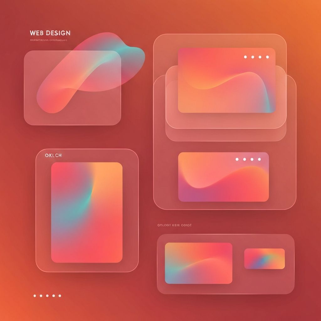
Types of Gradients and When to Use Them
Linear gradients blend colors along a straight axis and are great for backgrounds, banners, and hero sections. Radial gradients radiate from a central point and work well for spotlight effects, button highlights, and atmospheric overlays. Conic gradients sweep colors around a center point and add a dynamic, almost three-dimensional feel, often used in modern dashboards and creative landing pages. Mesh gradients, generated through layered blobs of color, produce soft, organic, painterly backgrounds popular in design portfolios and SaaS marketing pages.
The right type depends on the message. A sharp linear gradient communicates precision and energy, while a soft mesh gradient communicates calm, creativity, and approachability.
Choosing Colors That Work Together
Effective gradients usually combine analogous colors that sit near one another on the color wheel, such as orange to red, blue to teal, or purple to pink. Analogous combinations feel harmonious and natural. Complementary or contrasting combinations, like green to red or blue to orange, can create striking effects but require careful handling to avoid muddy midpoints or visual tension.
Limiting gradients to two or three color stops keeps the result clean. Adding too many stops produces busy, distracting blends that compete with content. Designers should also test gradients on real screens because the same colors can look very different on OLED, IPS, and lower-end mobile displays.
Using Gradients to Guide Attention
Beyond decoration, gradients can serve as functional tools that guide the user's eye. A subtle gradient behind a primary button can make it feel tappable and energetic. A vertical gradient behind a hero section can pull the eye downward, encouraging visitors to keep scrolling. Gradient overlays on images can ensure text remains readable while preserving the visual richness of photography.
Used in this way, gradients reinforce information hierarchy. They tell users where to look first, second, and third without resorting to heavy borders or aggressive contrast.
Pairing Gradients with Typography and Imagery
Type and imagery must coexist gracefully with gradients, never compete. Typography placed over a gradient should be tested for contrast at all positions, since the same text may pass contrast checks at one end of the gradient and fail at the other. Adding a translucent overlay or a soft drop shadow under text can keep readability consistent across the entire blend.
Photography placed against gradient backgrounds usually works best with neutral or harmonized tones in the imagery. A high-saturation photo placed on a high-saturation gradient can become visually overwhelming, while a desaturated or duotone image can feel cohesive and intentional.
Performance and Implementation Considerations
One advantage of CSS gradients is that they are lightweight. Unlike background images, they require no extra HTTP requests and scale infinitely without losing quality. However, animated gradients, especially those involving large blurred elements or complex mesh effects, can become performance-heavy if implemented carelessly. Hardware-accelerated CSS properties, reduced layer counts, and pre-rendered images for highly complex gradients all help maintain smooth performance.
For accessibility, designers should respect users' preferences for reduced motion and avoid gradients that flash or shift rapidly, as those can trigger discomfort or, in rare cases, photosensitive reactions.
Accessibility and Contrast
Gradients must never compromise readability. Color contrast standards apply to text on every part of a gradient background, not just the lightest or darkest area. Designers can use contrast-checking tools at multiple points along the gradient and consider adding solid background panels behind text-heavy sections. Buttons placed on gradients require especially careful contrast handling because they must remain obvious and clickable in both visual and assistive contexts.
Trends and Timeless Principles
Trends in gradients shift quickly. Soft pastel mesh gradients, neon glassmorphism, and dark-mode-friendly atmospheric gradients have all enjoyed recent popularity. While trends are fun to explore, the most enduring gradient work follows timeless principles: serve the content, harmonize with the brand, respect performance, and protect accessibility.
Conclusion
Web design gradients are far more than visual flourish. When chosen thoughtfully, they add emotional depth, guide user attention, reinforce brand identity, and bring modern energy to digital experiences. By balancing creative ambition with usability, performance, and accessibility, designers can use gradients to make websites feel current today and remain visually compelling for years to come.
