The Quiet Power of Forms in Web Design
Forms are everywhere on the modern web. They power sign-ups, logins, checkouts, contact requests, surveys, bookings, and feedback. While they rarely receive the spotlight given to hero sections or animations, forms are often the most important conversion points on a website. A poorly designed form can sink an otherwise excellent user journey, while a well-crafted one can feel almost invisible, guiding users smoothly toward completion. For any business, mastering form design is a direct investment in revenue and retention.
Great form design sits at the intersection of usability, psychology, and visual hierarchy. It respects the user's time, reduces cognitive load, and communicates clearly what is needed and why. When done well, users complete forms with confidence rather than frustration.
Hire AAMAX.CO for Web Design and Development
Designing forms that convert is both an art and a science. AAMAX.CO brings deep expertise in website development and conversion-focused UX, helping businesses build forms that feel effortless to fill out and reliably deliver high-quality leads. Their team handles everything from accessibility-compliant markup and validation logic to backend integrations with CRMs, email platforms, and analytics, so every submission moves the business forward.
Start with Purpose and Minimalism
The best forms ask only for what is truly necessary. Each additional field introduces friction, and friction reduces completion rates. Before adding a field, the team should ask whether the data is essential right now or whether it can be requested later, after the relationship has been established. A contact form might require only a name, email, and message, while a checkout might be split across smaller, progressive steps.
Clarity of purpose also helps users decide whether to engage. A short headline above the form and a concise supporting sentence explain exactly what happens after submission, whether that is a free consultation, a download, or an account creation.
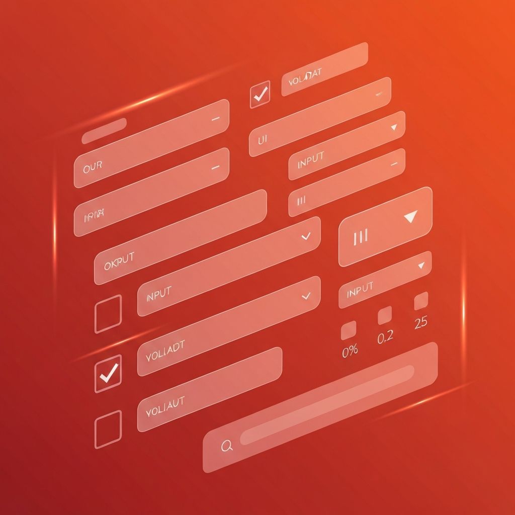
Visual Hierarchy and Layout
Single-column layouts almost always outperform multi-column forms because they create a clear top-to-bottom path that the eye and cursor can follow without zigzagging. Labels should sit above input fields rather than inside them, since placeholder-only labels disappear the moment users start typing and create accessibility issues for screen readers and people with cognitive differences.
Adequate spacing between fields, consistent input heights, and a clearly emphasized primary call-to-action button reduce visual noise and make the form feel approachable. Secondary actions, like canceling or resetting, should be visually subdued so they do not compete with the main goal.
Smart Inputs and Helpful Defaults
Each field type should match the data being collected. Email inputs should trigger the email keyboard on mobile, telephone inputs should trigger the numeric keypad, and date pickers should replace error-prone free-text dates. Autocomplete attributes allow browsers to fill in names, addresses, and payment information instantly, which can lift checkout completion rates dramatically.
Sensible defaults also reduce effort. Pre-selecting the most common country, currency, or shipping option saves users from unnecessary clicks while still allowing them to change the choice when needed.
Inline Validation and Friendly Errors
Validation should help users succeed, not punish them after the fact. Inline validation that confirms a correctly formatted email or flags a weak password as the user types provides immediate feedback and reduces the back-and-forth of form resubmission. However, validation must wait until the user has finished typing a field to avoid showing errors prematurely.
When errors do occur, messages should be specific, human, and constructive. Instead of a generic phrase like "Invalid input," the message should explain exactly what went wrong and how to fix it. Color alone is not enough; pairing red highlights with icons and clear text supports users with color blindness.
Mobile-First Considerations
On small screens, every pixel and tap counts. Inputs must be large enough to be tapped easily, generally at least 44 by 44 pixels, with comfortable spacing to prevent mistaps. Sticky submit buttons can keep the call-to-action visible as users scroll through longer forms. Reducing the number of required fields is even more critical on mobile, where typing is slower and distractions are higher.
Accessibility Is Non-Negotiable
Forms must work for everyone, including users navigating with keyboards, screen readers, or assistive technologies. Proper semantic HTML, associated labels, descriptive button text, focus indicators, and ARIA attributes where appropriate ensure that no one is locked out of essential interactions. Accessibility not only expands the audience but also improves SEO and overall code quality.
Performance, Security, and Anti-Spam
Slow forms feel broken. Optimizing assets, lazy-loading non-critical scripts, and minimizing third-party dependencies keep submissions snappy. Equally important is security. Forms should use HTTPS, validate input on the server, sanitize data to prevent injection attacks, and protect against bots with techniques such as honeypots, rate limiting, or invisible CAPTCHAs that do not annoy real users.
Measure, Iterate, and Improve
Form analytics reveal exactly where users abandon a process. Tracking field-level drop-offs, time spent, and error frequency provides clear opportunities for optimization. A/B testing different layouts, copy, and field counts often uncovers small changes that yield significant lifts in conversion.
Conclusion
A web design form is more than a collection of inputs; it is a conversation between the user and the business. By focusing on purpose, clarity, accessibility, validation, and continuous improvement, designers can transform forms from necessary chores into delightful, trust-building moments. Whether the goal is generating leads, completing purchases, or onboarding new users, every successful interaction begins with a form that respects the human on the other side of the screen.
