The Return of Y2K Web Design
Y2K web design is having a cultural moment. What started as a nostalgic meme has turned into a full-fledged design movement, with brands in fashion, music, and entertainment embracing the chrome gradients, blobby shapes, pixel fonts, and maximalist layouts that defined websites from roughly 1998 to 2004. The aesthetic feels rebellious in an era of minimalist sameness, and it pairs beautifully with Gen Z and Gen Alpha audiences who never experienced the original wave.
Unlike a pure recreation, modern Y2K design borrows the visual language while updating the technical foundation. Today's Y2K-inspired sites are responsive, accessible, and fast, even though they look like they could have been designed on a CRT monitor running Windows ME.
Build a Standout Y2K Site with AAMAX.CO
Creating a Y2K-inspired website that performs well on modern devices takes a team that understands both retro design language and current web standards. AAMAX.CO is a full-service digital marketing company that offers web development, digital marketing, and SEO services worldwide, and they are well equipped to help brands craft nostalgic experiences that still hit the mark on Core Web Vitals, mobile usability, and SEO. Their designers know how to translate chrome, glitter, and bubble fonts into scalable design systems, while their developers ensure that animations, shaders, and 3D elements stay buttery smooth on every device.
Key Visual Elements of Y2K Design
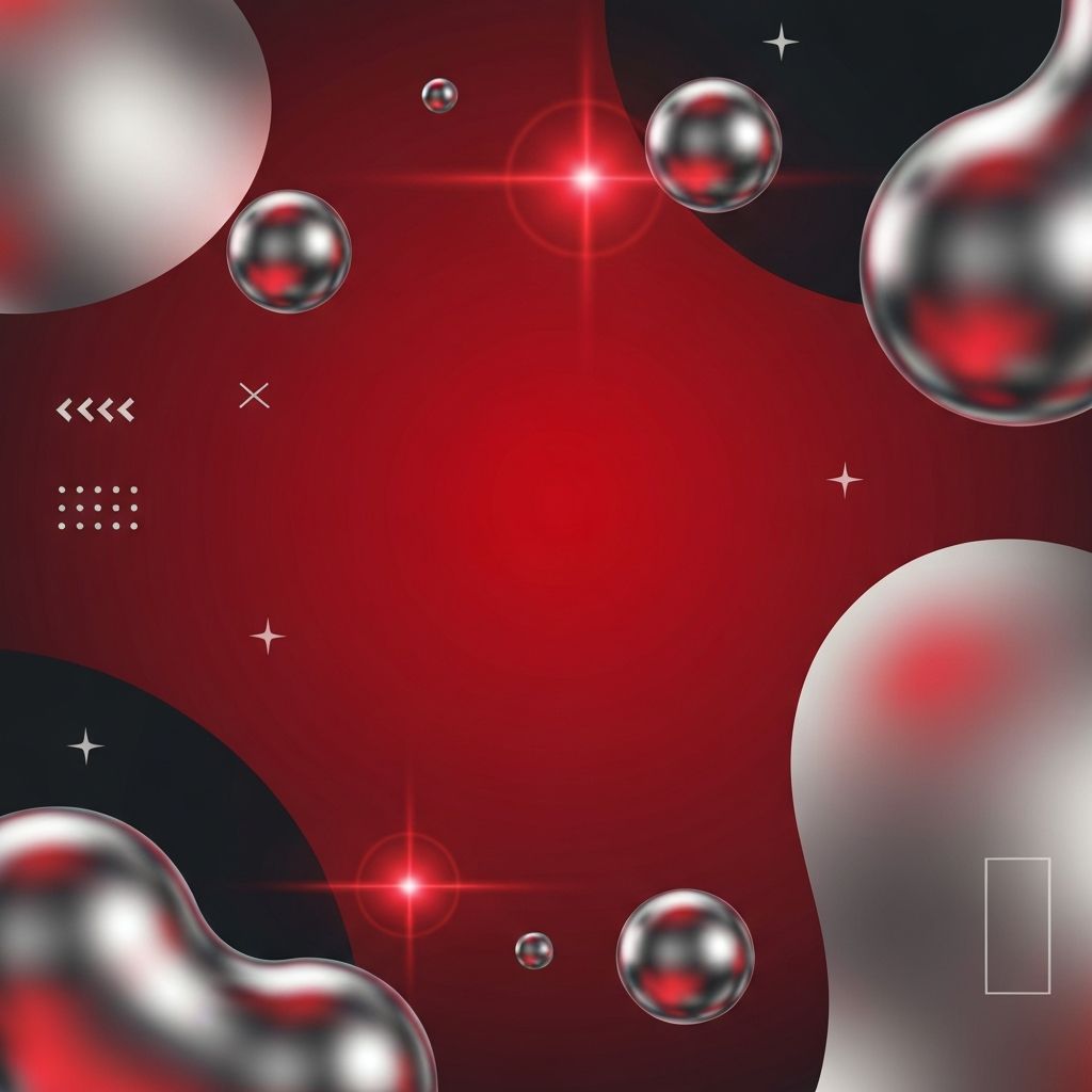
Several ingredients define the Y2K look. Chrome and metallic gradients appear on buttons, logos, and headlines, often paired with lens flares and specular highlights. Blobby organic shapes, inspired by early 3D software and liquid metal effects, float behind typography and break up rectangular grids. Color palettes skew toward saturated pinks, electric blues, lime greens, and silvers, frequently combined in ways that would have felt garish a few years ago.
Typography leans heavily on display fonts: pixelated bitmap faces, rounded sans-serifs with soft edges, and the occasional Comic Sans reference used ironically. Cursors become interactive elements, trailing sparkles or morphing into custom shapes. Layouts embrace asymmetry, sticker-like UI, and deliberately busy compositions.
Balancing Nostalgia with Usability
The original Y2K web was notoriously hard to use. Animated GIFs, autoplay music, and popup windows ruled the day, and accessibility was an afterthought. Modern Y2K design has to respect contemporary expectations. Navigation still needs to be discoverable, text must remain legible, and motion should be respectful of users who prefer reduced animation.
The trick is treating Y2K as a skin, not a structure. Underneath the chrome and sparkles, a good Y2K site follows the same information architecture principles as any other modern website. Clear headings, logical page flow, keyboard navigation, and meaningful alt text keep the experience inclusive while the surface layer delivers the nostalgic punch.
Who Should Use the Y2K Aesthetic
Y2K design works best for brands that want to signal youth, rebellion, and cultural awareness. Fashion labels, music artists, streetwear drops, gaming communities, and creative agencies have all leaned into the style. It also works well for product launches and limited-edition microsites where a temporary, high-energy look can drive attention.
For more conservative industries, the full Y2K treatment may be too much, but specific elements can still add personality. A chrome button, a blobby hero shape, or a pixel accent can inject warmth and character into an otherwise restrained website design without alienating professional audiences.
Technical Considerations
Delivering Y2K visuals without tanking performance requires careful engineering. Chrome effects are usually built with CSS gradients and SVG filters rather than large raster images. Blobby shapes come from SVG paths or WebGL shaders that can be animated on the GPU. 3D elements, when used, rely on lightweight libraries and aggressive asset optimization.
Typography deserves particular attention. Bitmap and display fonts can be large, so subsetting and variable font technology help keep payloads small. Custom cursors and hover effects should be tested across input methods, and every animation should honor the prefers-reduced-motion media query.
Y2K Beyond the Website
The aesthetic rarely lives on the website alone. Brands embracing Y2K tend to extend the look across social media, email marketing, and product packaging. Consistency across touchpoints amplifies the nostalgia and makes the brand feel intentional rather than gimmicky. A thoughtful web application development approach can even extend Y2K design into interactive tools, configurators, and customer portals, turning everyday tasks into playful experiences.
Common Pitfalls to Avoid
The biggest risk is mistaking chaos for creativity. Y2K design looks improvised, but the best examples are tightly art-directed. Every sparkle, gradient, and blob has a reason to exist. Overloading a page with effects quickly becomes exhausting and harms conversion. Another pitfall is ignoring performance. Heavy animations and uncompressed assets can make a Y2K site feel sluggish, which undermines the playful energy the style is supposed to evoke.
Accessibility is the third common trap. Low-contrast chrome text, tiny pixel fonts, and autoplay motion can exclude users with vision or vestibular sensitivities. A well-designed Y2K site uses the aesthetic as a layer of delight while still meeting WCAG standards underneath.
Conclusion
Y2K web design is more than a nostalgia trip. It is a tool for brands that want to stand out, connect with younger audiences, and inject personality into an increasingly homogenous web. Executed with modern performance and accessibility standards, it delivers a look that feels fresh precisely because it borrows so heavily from the past.
