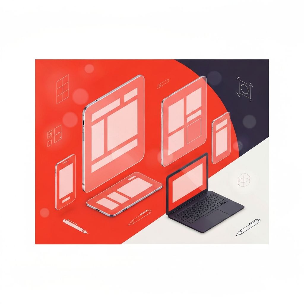
Why Responsive Web Design Mockups Are Critical
A responsive web design mockup is the bridge between an idea and a finished product. It shows stakeholders how a site will look across phones, tablets, and desktops before a single line of code is written. Done well, mockups align expectations, surface issues early, and save significant time and money during development. Done poorly, they create false confidence and lead to disappointing builds. As responsive design has become the default, mockups must show not just one screen but several, demonstrating how the layout, typography, and components adapt to different contexts.
Hire AAMAX.CO for Professional Responsive Mockups
Brands that want polished, production-ready responsive mockups can rely on AAMAX.CO. They are a full-service digital marketing company providing web development, SEO, and digital marketing services worldwide. Their designers create detailed multi-device mockups that go beyond pretty visuals; they document spacing, typography, components, and behavior across breakpoints, making the path from design to development smooth and predictable. Their work helps clients see exactly what they are paying for before development starts.
Mockup vs. Wireframe vs. Prototype
It is important to distinguish between wireframes, mockups, and prototypes since each plays a different role.
- Wireframes are low-fidelity sketches focused on structure and content placement, usually in grayscale.
- Mockups are high-fidelity static designs that show colors, typography, imagery, and final layout.
- Prototypes are interactive versions that demonstrate how the site behaves, including transitions and micro-interactions.
For most projects, all three are useful. Wireframes confirm structure, mockups confirm visual design, and prototypes confirm interaction. Skipping any of these stages tends to push problems further down the pipeline, where they become more expensive to fix.
Tools for Building Responsive Mockups
Modern designers have access to powerful tools for creating responsive mockups. The most popular include:
- Figma: The current industry standard, with strong responsive features, auto-layout, and real-time collaboration.
- Sketch: Long-time favorite for macOS users, especially in established agencies.
- Adobe XD: Integrated with the Adobe ecosystem and useful for teams already on Creative Cloud.
- Penpot: An open-source alternative growing in popularity for teams that want more control over their design tooling.
The choice of tool matters less than how it is used. A well-organized Figma file with reusable components, clear naming, and documented styles is more valuable than a flashy file in any tool that no one can maintain.
Designing for Multiple Breakpoints
A strong responsive mockup shows the design at several breakpoints, not just one. Typical breakpoints include 360px, 768px, 1024px, and 1440px, but the exact values depend on the project's audience and content. Designers should avoid the trap of designing only for desktop and shrinking later. Instead, mobile-first mockups force the team to prioritize the most important content and actions, then layer additional details for larger screens. Each breakpoint should illustrate not just the layout but also how typography, spacing, and components adapt. To see how this discipline translates into client work, professional website design services can demonstrate the difference between superficial and thorough responsive mockups.
Building a Component-Based Mockup System
Modern responsive mockups should be built around components, not pages. Buttons, cards, navigation bars, and form fields are designed once and reused across screens. In Figma, this is achieved through components, variants, and auto-layout. The result is a consistent design system where changing a button color updates every instance instantly. This component-based approach mirrors how front-end frameworks like React, Vue, and Svelte work, making the handoff from design to development much smoother. Developers can map design components directly to code components, reducing drift and inconsistencies.
Documenting Responsive Behavior
Static mockups can hide important responsive details. To prevent confusion, designers should document behaviors that are not obvious from a single screen. This includes:
- How navigation collapses into a hamburger menu on mobile.
- Which elements stick, hide, or appear at certain breakpoints.
- How animations and transitions behave on touch versus mouse.
- What happens to long content like product titles or headlines on small screens.
- How forms handle validation states across devices.
This documentation can live alongside the mockups in Figma, in a Notion page, or in a Storybook for the design system. The goal is to remove ambiguity so developers do not have to guess.
Mockups and Real Content
Lorem ipsum is convenient but dangerous. Real product names, headlines, and descriptions vary in length and can break layouts that looked perfect with placeholder text. Whenever possible, mockups should use realistic content, including the longest reasonable headlines, real product images, and accurate menu labels. This reveals layout issues early, like wrapped buttons, broken card heights, or overlapping elements, before they become production bugs. Skilled web application development teams appreciate mockups built with real data because they reduce surprises during integration with CMS or back-end systems.
Stakeholder Reviews and Feedback Loops
Mockups are not just internal artifacts; they are communication tools for clients, executives, and cross-functional teams. Effective reviews show mockups in context, ideally on real devices via tools like Figma's mirror feature, rather than only on a designer's laptop. Feedback should be collected in a structured format, with clear ownership over each comment. Multiple rounds of focused feedback are usually more productive than open-ended discussions. Documenting decisions made during reviews keeps the project aligned and prevents the dreaded "I thought we agreed on something else" conversation later.
From Mockup to Code
The handoff from mockup to code is where many projects lose quality. Modern tools like Figma's Dev Mode, Zeplin, and Locofy help by exposing design tokens, spacing values, and code snippets directly to developers. Even better, when mockups are built with auto-layout and proper components, developers can implement them with far less guesswork. Pair design and development reviews during implementation help catch deviations early. The end goal is for the live site to feel like a faithful, polished version of the mockup, not a watered-down approximation.
Final Thoughts
A responsive web design mockup is much more than a pretty image; it is a strategic tool that aligns teams, reduces risk, and sets the bar for quality. By using component-based design systems, documenting responsive behavior, and using realistic content, designers can produce mockups that genuinely guide successful builds. With the right tools, processes, and partners, your next mockup becomes the foundation for a website that delivers on its promise across every device.
