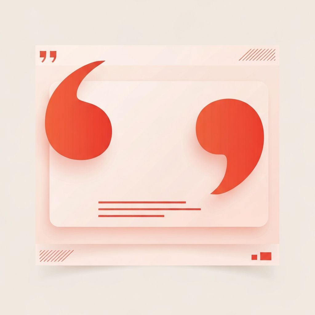
What Pull Quotes Do for the Web
Pull quotes are short excerpts of text—typically a sentence or two—lifted from the body of an article and styled prominently to draw the reader's attention. Borrowed from print magazine design, pull quotes have found a natural home on the web, where they break up dense paragraphs, highlight a publication's strongest ideas, and give scrollers a reason to stop scanning and start reading. When used thoughtfully, pull quotes elevate the perceived quality of a webpage and reinforce the most important takeaways from the surrounding content.
Pull quote examples in web design range from quiet typographic flourishes to bold, full-bleed statements that dominate the screen. The right choice depends on the publication's voice, the article's tone, and the visual rhythm of the surrounding layout. What unites the strongest examples is intentionality: the quote chosen, the styling applied, and the placement within the article all serve the reader rather than the designer's ego.
Hire AAMAX.CO for Editorial-Grade Web Design
Publications, blogs, and content-driven brands that want their articles to feel as considered as those in top-tier magazines often partner with AAMAX.CO. They are a full-service digital agency offering website design, development, SEO, and digital marketing services worldwide. Their designers bring an editorial sensibility to every project, weaving design elements like pull quotes, drop caps, and intentional rhythm into experiences that keep readers engaged from headline to footer.
Classic Inline Pull Quotes
The simplest pull quote example is the inline treatment, where the quote sits within the column of body text but is styled distinctly. The quote might use a larger type size, a different typeface (often a contrasting serif or display font), italics, or a thin colored rule along one side. The effect is a gentle visual interruption that signals: this idea is worth pausing on.
Inline pull quotes work especially well in long-form articles where the reader is already committed to scrolling. They reinforce the article's argument without disrupting the reading flow. Major publications like The New York Times, The Atlantic, and Wired frequently use this style because it respects the dignity of the writing while still adding visual texture.
Wide and Full-Bleed Pull Quotes
Bolder pull quote examples break out of the body column entirely. A wide pull quote might extend to a wider grid column than the surrounding text, while a full-bleed pull quote can span the entire viewport, sometimes overlaid on a colored background or photograph. These treatments turn the quote into a moment, not just a passage.
Full-bleed pull quotes are particularly effective in feature articles, profiles, and brand storytelling. They allow the design to slow the reader down, give the eye a place to rest, and physically embody the article's emotional peaks. The risk is overuse: if every article tries to be a feature, the technique loses its power.
Floating Pull Quotes Within Multi-Column Layouts
Modern web design rarely uses true multi-column body text outside of magazine-style sites, but variants of the floating pull quote still appear regularly. The quote may sit alongside the body content in a side gutter, especially on wide desktop layouts, where it acts almost like a marginalia note. On narrower screens, the same quote gracefully reflows to a stacked position above or below the surrounding paragraph.
This approach respects responsive design realities while still delivering the visual interest of a print-style pull quote. CSS Grid and modern container queries make this kind of flexible behavior easier than ever to implement cleanly.
Typography-First Pull Quotes
Some of the most memorable pull quote examples lean almost entirely on typography. Oversized type, decorative ligatures, expressive ampersands, and carefully tracked letterforms turn the quote into a piece of visual art. There may be no quotation marks at all, or the marks themselves may be styled as enormous decorative elements that anchor the composition.
This kind of typography-first approach demands restraint elsewhere on the page. If the rest of the article is already visually busy, a typographic pull quote will feel chaotic. Paired with calm body text and ample white space, however, it becomes a striking moment of editorial craft.
Image-Backed and Mixed-Media Pull Quotes
Another strong pull quote example places the quote on top of a photograph, illustration, or subtle textured background. The image grounds the quote in context, while the typography sits cleanly on a darkened or color-tinted overlay. Done well, this style can feel cinematic and is especially powerful in profile pieces, where the quote can be paired with a portrait of the speaker.
Accessibility deserves close attention in this style. Sufficient contrast between the text and the underlying image is essential, and decorative imagery should never carry meaning that screen readers cannot access. A short caption or alt text should describe the image's intent so the experience remains inclusive.
Animated and Interactive Pull Quotes
The web's interactive nature opens possibilities that print never had. Subtle entrance animations—where the quote fades in as the reader scrolls toward it—add a layer of polish without distracting from the reading experience. More ambitious examples include scroll-driven typography effects, where the quote scales, shifts color, or rearranges as the user moves through the article.
Restraint is the watchword here. Animation should reinforce the meaning of the quote, not compete with it. Respecting the reader's prefers-reduced-motion preference is also essential, ensuring that anyone sensitive to motion can opt out without losing the underlying content.
Best Practices Across All Pull Quote Examples
Regardless of style, several principles apply to every great pull quote on the web. First, the quote itself must earn its prominence; weak or generic sentences become weaker when enlarged. Second, the styling must align with the publication's broader visual language; mismatched pull quotes feel like guests rather than family. Third, pull quotes should appear sparingly—often no more than one or two per article—to preserve their impact. Fourth, the surrounding paragraph should not simply repeat the quote, since that creates redundancy and breaks the rhythm of the read.
Finally, pull quotes should never be the only place where important information appears. Screen readers may treat them as decorative repetitions, and casual scanners may miss them entirely. Treat the pull quote as an amplifier of an idea that lives elsewhere in the article, not as a substitute for it.
Designing With Editorial Care
Pull quotes are a small part of any single page, but their cumulative effect on a content-driven website is significant. They signal that the team behind the publication respects both the words and the reader. The next time a webpage feels like a piece of writing rather than a wall of text, look closely—a thoughtful pull quote is almost certainly part of the reason why.
