Why Color in Web Design Is So Powerful
Color is the silent language of every digital experience. Within milliseconds of landing on a website, visitors form opinions about credibility, emotion, and brand personality based largely on color choices. Beyond first impressions, color guides attention, signals interaction, communicates status, and shapes accessibility. Yet many websites still treat color as decoration rather than a strategic asset. Understanding the science and craft behind color in web design empowers teams to build interfaces that feel intentional, inclusive, and aligned with measurable business outcomes.
Elevate Your Brand With AAMAX.CO
Brands seeking a strategic partner for color, design, and conversion can rely on AAMAX.CO, a full-service digital marketing company offering web development, digital marketing, and SEO services worldwide. Their designers approach color as a business tool, building palettes that communicate brand values, support accessibility, and drive measurable engagement. Whether your project is a refresh, a complete rebrand, or a new launch, they ensure every color decision serves users, communicates strategy, and works flawlessly across devices.
Start With Brand Strategy
Color choices should never begin with personal taste. They should emerge from brand strategy, including audience, positioning, values, and competitive landscape. A wellness brand serving busy mothers needs different emotional cues than a fintech startup serving institutional investors. Document the brand archetype, voice, and feeling words that the visual identity should evoke, then build the palette to match. Strategic foundations prevent endless debates about which shade looks "nicer" and align color decisions with measurable business goals.
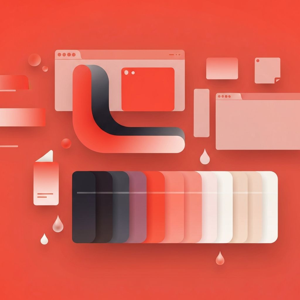
Build a Functional Palette
A strong web design palette includes more than a logo color. Define a primary brand color, one or two secondary or accent colors, and a comprehensive set of neutrals for backgrounds, text, borders, and surfaces. Add semantic colors for success, warning, danger, and information states. Each color should have multiple shades to support light and dark modes, hover states, and disabled states. Tools like Radix Colors, Tailwind palettes, and Material Design make this layered approach straightforward and reproducible.
Accessibility Through Contrast
Color decisions must respect accessibility standards. Text and interactive elements should meet WCAG contrast ratios of 4.5 to 1 for normal text and 3 to 1 for large text. Avoid relying on color alone to convey meaning, since users with color blindness or screen readers may miss critical signals. Pair color with icons, labels, or patterns. Tools like Stark, Contrast, and browser extensions verify ratios in real time. Inclusive color decisions widen your audience and strengthen brand reputation.
Color Psychology in Context
Color carries emotional and cultural meaning, but always within context. Red can mean danger, passion, celebration, or sale depending on culture and pairing. Blue often signals trust and professionalism but can feel cold without warm accents. Green communicates growth and finance but also caution in medical contexts. Apply color psychology thoughtfully, validate with user research, and adapt for international audiences. The most effective color decisions reflect both universal principles and the specific context of your audience.
Hierarchy and Attention
Color is one of the strongest tools for visual hierarchy. A bold accent color guides eyes to the most important call to action, while neutrals support content without competing for attention. Limit how often the accent color appears so it retains power. Backgrounds, dividers, and supporting elements should recede so primary actions stand out. When everything shouts, nothing is heard. Disciplined use of color produces calmer, more decisive interfaces.
Light Mode, Dark Mode, and Beyond
Modern websites must support light and dark modes gracefully. This requires designing palettes in pairs rather than inverting colors mechanically. Subtle adjustments in saturation and brightness ensure both modes feel natural and accessible. Some teams also support high-contrast or reduced-motion preferences. Building tokenized color systems makes these variants manageable, scaling design intent across platforms without sacrificing brand integrity.
Color Tokens and Design Systems
Hardcoded color values are a maintenance nightmare. Use design tokens for primary, secondary, neutral, and semantic colors so every component references a centralized source. When the brand evolves, updating tokens propagates changes instantly across the site. Tokens also bridge design and development by ensuring Figma, CSS, and component libraries share the same palette. Token-based systems are essential for any team that wants color decisions to scale with the product.
Testing and Validation
No palette is complete until it has been tested with real users in real contexts. Run accessibility audits, evaluate emotional resonance through interviews, and analyze conversion data to validate that color choices support business goals. A/B test alternative accent colors on key calls to action, since even small changes can produce meaningful conversion lifts. Treat color as an evolving variable rather than a fixed declaration.
Color Done Right Pays Off
Color in web design touches every metric that matters, from brand recognition to conversion to accessibility compliance. Strategic palettes, robust tokens, careful contrast, and validated emotional impact transform websites from forgettable to memorable. Combined with strong typography, layout, and content strategy, intentional color becomes a competitive advantage. With the right discipline and the right partner, color shifts from a subjective debate into a powerful, measurable engine for digital growth.
