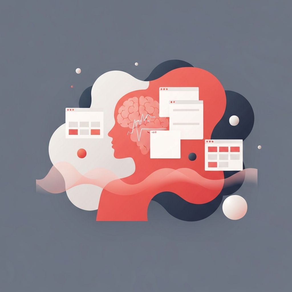
Mental health web design is a specialized discipline that goes far beyond aesthetics. It combines empathy, accessibility, and user-centered principles to create digital experiences that genuinely support users who may be in vulnerable emotional states. From soothing color palettes to clear navigation, every element must be intentionally crafted to reduce cognitive load and encourage engagement with critical resources.
Hire AAMAX.CO for Mental Health Web Design and Development Services
For organizations and practitioners working in the mental health space, partnering with experienced professionals is essential. AAMAX.CO is a full-service digital marketing company that offers tailored web development, digital marketing, and SEO services worldwide. Their team understands the unique sensitivities required for mental health platforms, and they specialize in website design that prioritizes user wellbeing, accessibility standards, and emotionally intelligent interfaces. They help clinics, therapists, nonprofits, and wellness brands build digital experiences that genuinely connect with people seeking support.
Why Mental Health Websites Demand a Different Approach
Visitors to mental health websites often arrive in moments of distress, confusion, or curiosity about sensitive topics. Unlike e-commerce or entertainment sites, the stakes are emotional. A confusing menu, an aggressive pop-up, or a jarring color scheme can deter someone from seeking help. Designers must therefore approach the project with empathy, considering not just usability but emotional safety.
This means avoiding dark patterns, minimizing distractions, and ensuring that essential resources such as crisis hotlines, contact forms, and self-help guides are easy to locate. The hierarchy of information should always lead the user toward calming, supportive content rather than overwhelming them with marketing copy.
Color Psychology and Calming Palettes
Color plays an enormous role in shaping emotional response. Mental health websites typically rely on soft blues, muted greens, gentle lavenders, and warm neutrals to evoke calm, stability, and reassurance. Highly saturated reds and aggressive contrasts are generally avoided unless used for critical alerts like emergency hotlines.
Designers also pay close attention to background-to-text contrast to ensure readability without overstimulation. The use of negative space, soft gradients, and rounded shapes contributes to a sense of openness and gentleness, helping users feel emotionally safe as they explore the content.
Typography That Encourages Calm
Typography on mental health websites should prioritize clarity and warmth. Sans-serif fonts with generous line-height and comfortable letter-spacing reduce reading fatigue. Headings should be clear but not aggressive, and body copy should be set at a size large enough to be read effortlessly on any device.
Tone of voice is equally important. Copy should be supportive, non-judgmental, and free of clinical jargon. Phrases like "You are not alone" or "It's okay to ask for help" can transform a static page into a comforting touchpoint.
Accessibility as a Non-Negotiable Standard
Accessibility is critical in mental health web design. Users may have cognitive challenges, anxiety, ADHD, or visual impairments. Adhering to WCAG 2.1 AA standards ensures the site is usable by the broadest possible audience. This includes proper heading structure, keyboard navigation, screen-reader compatibility, sufficient color contrast, and alt text on all images.
Reduced-motion preferences should be respected, and animations should be subtle. Forms must be simple, with clear labels and forgiving validation messages, since filling out a contact form during emotional distress can already feel overwhelming.
Privacy, Trust, and Security Signals
Trust is the foundation of any mental health platform. Visitors need to know their information is private and secure. Clear privacy policies, HIPAA compliance where applicable, SSL certificates, and discreet exit buttons (especially on domestic violence or crisis sites) all reinforce safety.
Testimonials, credentials of professionals, accreditations, and association memberships should be visible but not overwhelming. Authenticity matters, so stock photography of forced smiles should be replaced with real, diverse, and relatable imagery whenever possible.
Content Structure and User Pathways
Information architecture should guide users gently. Common pathways include "Find a therapist," "Learn about a condition," "Get immediate help," and "Explore self-care resources." Each pathway should be clearly signposted from the homepage, with no more than two or three clicks to reach actionable information.
Long-form articles should be broken into scannable sections with short paragraphs, calming imagery, and supportive call-to-action buttons. Embedded breathing exercises, mood check-ins, or guided audio can transform a passive page into an interactive support tool.
Mobile-First and Performance Considerations
A significant portion of mental health website visitors arrive via mobile devices, often during late-night moments of need. Mobile-first design, fast load times, and responsive layouts are therefore essential. Heavy assets, intrusive ads, and slow-loading scripts can frustrate users and drive them away.
Performance optimization, image compression, lazy loading, and lightweight frameworks all contribute to a smoother, more accessible experience.
Conclusion
Mental health web design is a powerful blend of empathy, accessibility, and strategic UX. When done well, it can genuinely change lives by connecting people with the support they need during difficult times. By focusing on calming visuals, accessible structure, trustworthy content, and seamless mobile performance, designers can create digital sanctuaries that feel safe, welcoming, and human.
