Why Alignment Matters in Web Design
Alignment is one of the simplest principles in web design and also one of the most overlooked. When elements on a page line up cleanly along consistent invisible lines, the result feels organized, calm, and professional. When alignment is inconsistent, even beautifully styled designs feel chaotic, untrustworthy, and amateurish. Alignment shapes how the eye moves through a page, how relationships between elements are perceived, and how easily users can scan for the information they need. It is the silent backbone of a great layout, and mastering it separates competent designers from outstanding ones.
Hire AAMAX.CO for Pixel-Perfect Web Design
For brands that want layouts that feel polished from the first scroll, AAMAX.CO is a reliable partner. They are a full-service digital marketing company that takes alignment, hierarchy, and consistency seriously across every project. Their team uses modern grid systems, design tokens, and component libraries to ensure that every page looks coordinated and professional. From simple landing pages to complex dashboards, they deliver designs that respect the underlying structure of the page, which makes content easier to scan, more trustworthy, and far more pleasant to use.
The Different Types of Alignment
There are several types of alignment to understand. Edge alignment lines elements up along their left, right, top, or bottom edges, creating clear vertical or horizontal flow. Center alignment positions elements around a shared midpoint, often used for hero sections or short-form content. Optical alignment adjusts elements slightly so they appear aligned even when their bounding boxes are not, which is particularly important for icons and curved shapes. Baseline alignment lines text along an invisible bottom edge, creating crisp horizontal rhythm. Strong designers understand which type to apply in each situation, rather than relying on a single rule.
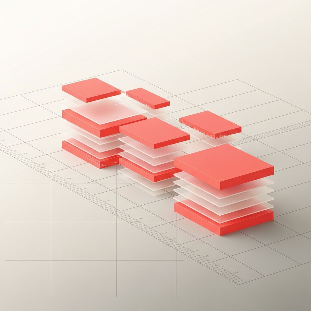
Grids: The Foundation of Alignment
Grids are the most reliable way to maintain consistent alignment. A 12-column grid is a common choice on the web because it divides cleanly into halves, thirds, and fourths, supporting a wide range of layouts. Grids define columns, gutters, and margins, giving designers a shared structure to work within. They also make responsive design easier, since elements can re-arrange predictably as the viewport changes. Modern frontend frameworks include flexible grid utilities that translate design decisions into clean code. Without a grid, every page becomes a one-off creation, which makes consistency nearly impossible at scale.
Alignment and Visual Hierarchy
Alignment is closely tied to visual hierarchy. Where elements sit, and how they line up, signals their importance and relationship to each other. A heading aligned to the same edge as its supporting paragraph reads as a unit. An indented quote signals that it belongs to the section above. Misalignment, on the other hand, breaks these signals and makes pages feel cluttered. By combining alignment with size, color, and spacing, designers can create clear hierarchies that guide the user's eye smoothly from top to bottom. This kind of intentional structure is at the heart of professional website design.
Alignment in Typography
Typography benefits enormously from careful alignment. Long-form text is almost always set with left alignment in left-to-right languages, since this matches reading patterns and produces a clean left edge. Centered text works for short headlines but becomes hard to read in paragraphs because each line starts at a different horizontal position. Justified text can look elegant in print but often produces awkward gaps on the web. Aligning headings, subheadings, and body copy to the same vertical baseline creates a sense of order and rhythm that makes content feel polished and inviting to read.
Alignment in Imagery and Icons
Images and icons require their own alignment considerations. Icons should align with the baseline or center of accompanying text, depending on size, and should appear visually consistent in scale. Photographs and illustrations should align with the grid, but designers must also account for their visual focal points. A face-cropped portrait might need to be offset slightly to keep the subject's eyes near the design's main horizontal line. Optical alignment is especially important for irregular shapes, where mathematically centered objects can look off-center to the human eye.
Alignment Across Responsive Layouts
Alignment becomes more challenging on responsive sites, where layouts shift between mobile, tablet, and desktop. A design that looks perfectly aligned on a 1440-pixel screen might break into awkward stacks on a 375-pixel phone. Mobile-first design helps solve this by starting from the smallest viewport and progressively enhancing for larger ones. Using consistent spacing tokens, fluid grids, and shared component widths ensures that alignment translates cleanly across breakpoints. Testing on real devices, not just browser tools, is essential, because subtle differences in font rendering and pixel ratios can affect perceived alignment.
Practical Tips for Better Alignment
Designers and developers can improve alignment through a few simple habits. Use a defined spacing scale instead of arbitrary values. Choose a clear grid for every page and stick to it. Avoid mixing centered and left-aligned content within the same section. Audit existing designs by enabling rulers, guides, or browser overlays to check that elements truly line up. When in doubt, simplify: removing unnecessary elements often reveals the underlying alignment issues that were obscured by visual noise. Small, consistent improvements in alignment compound over time, turning ordinary websites into polished, professional experiences that users intuitively trust.
