What Is Z Pattern Web Design?
Z Pattern web design is a layout strategy that mirrors how the human eye naturally scans a page. Studies have shown that when a page contains relatively little text and is built around clear visual hierarchy, users tend to move their eyes in a Z-shaped path: left to right across the top, diagonally down to the bottom-left, and then left to right again across the bottom. By placing the most important elements along this path, designers can guide visitors through key information without forcing them to read every word.
The Z pattern is especially effective for landing pages, marketing sites, and homepage hero sections where the primary goal is to communicate a clear message and drive a single action. Used well, it produces layouts that feel intuitive, balanced, and persuasive.
Hire AAMAX.CO to Build Z Pattern Layouts That Convert
Implementing the Z pattern correctly takes more than dragging elements into position. It requires content strategy, visual hierarchy, and an understanding of how each element interacts on different screen sizes. AAMAX.CO helps brands design and build pages that follow proven scanning patterns, including the Z and F layouts, while staying fully responsive across devices. Their team blends user research with modern website design practices so every page guides visitors toward a clear next step.
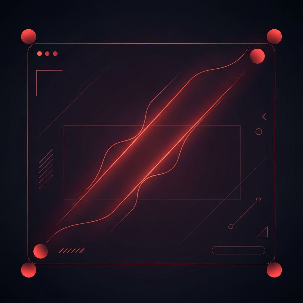
How the Eye Travels Across a Page
Eye-tracking research from the Nielsen Norman Group and others has shown that users don’t read pages linearly. They scan, jump, and revisit. On content-heavy pages, this scanning often forms an F-shaped pattern. On simpler, image-driven pages, it often forms a Z-shaped pattern. Understanding which pattern applies to your page is the first step to designing for it.
The Z pattern thrives when there are clear focal points: a logo or brand mark in the top-left, a primary navigation element or CTA in the top-right, supporting visuals in the center, and a final action button at the bottom-right. Each stop along the Z reinforces the page’s message and keeps the user moving forward.
The Four Stops of a Z Pattern
Every Z pattern layout has four key positions worth designing intentionally. The top-left is where the eye begins; this is the perfect spot for branding and a clear value proposition. The top-right is the next stop, ideal for a primary navigation element, a phone number, or a top-level call to action.
From the top-right, the eye sweeps diagonally back across the page, picking up whatever sits between the corners — often a hero image, a tagline, or a supporting graphic. Finally, the eye reaches the bottom-left and moves across to the bottom-right, where the strongest CTA usually lives. When all four stops carry intentional content, the page feels effortless to navigate.
When to Use the Z Pattern
Not every page benefits from a Z pattern. It works best when the page has a single clear goal, minimal text, and strong visual elements. Landing pages for product launches, signup flows, and hero sections of marketing pages are ideal candidates. Pages with dense information, like blog posts and documentation, are usually better served by an F pattern instead.
The decision comes down to user intent. If visitors are scanning to make a quick decision, the Z pattern serves them well. If they’re reading to learn or research, a different layout will perform better.
Visual Hierarchy and Z Pattern
The Z pattern is only as strong as the hierarchy that supports it. Each stop along the path should differ in size, weight, or color from the surrounding content so the eye can lock onto it quickly. A bold headline at the top-left, a styled CTA button at the top-right, an oversized image in the middle, and a high-contrast button at the bottom-right create a rhythm that the user’s eye follows naturally.
Without this hierarchy, the Z pattern collapses. If everything competes for equal attention, the user has no clear path and the layout feels random. Hierarchy is what turns geometry into experience.
Z Pattern on Mobile
Mobile screens change the equation. The Z pattern relies on horizontal width to create its diagonal sweep, and that width disappears on a phone. On smaller screens, the same content typically reflows into a vertical stack, and users scroll through it top to bottom in something closer to a single column.
Good responsive design preserves the spirit of the Z pattern even when the literal shape disappears. The order of elements in the source HTML should still match the user’s natural reading order: brand first, value proposition next, supporting visuals after that, and the primary CTA near the end of the section. This ensures the experience feels intentional on every device.
Common Mistakes With Z Pattern Layouts
Designers sometimes apply the Z pattern mechanically without considering content. Putting a CTA in the top-right just because the formula says so — even when the page’s primary goal is education — can confuse users. Another common mistake is overloading the diagonal with too many supporting elements, which dilutes the focal points and breaks the rhythm.
The Z pattern is a guideline, not a constraint. Use it when it serves the user, and modify it when the content demands a different approach. Skilled designers know when to follow the pattern and when to break it, always with the user’s goals in mind.
Combining Z Pattern With Modern Techniques
The Z pattern pairs well with modern techniques like sticky headers, scroll-triggered animations, and progressive disclosure. A sticky CTA at the top-right of the viewport keeps the second stop of the Z always available. Subtle motion along the diagonal can reinforce the path without overwhelming the user. Modular components built during website development can adapt the pattern across multiple pages while preserving consistency.
Conclusion: A Timeless Pattern for Focused Pages
Z Pattern web design isn’t a trend — it’s a reflection of how human eyes actually move across visual space. When a page has a clear message and a single goal, the Z pattern provides a proven framework for guiding users toward action. Used thoughtfully, with strong hierarchy and responsive considerations, it remains one of the most reliable layout strategies in modern web design. Apply it where it fits, and the structure of your most important pages will feel natural to every visitor.
