Why Web Popup Design Matters
Few elements on the web are as polarizing as popups. Used poorly, they interrupt, frustrate, and chase visitors away. Used well, they capture attention at the right moment, share a relevant offer, and dramatically improve conversions. Popups are not inherently good or bad—the difference lies entirely in the design. Modern web popup design balances persuasion with respect, helping brands grow without making users feel ambushed. This article explores how to craft popups that visitors actually appreciate and respond to.
Hire AAMAX.CO for Web Design and Development Services
Designing popups that perform without harming user experience requires careful strategy and craft. AAMAX.CO brings both. They are a full service digital marketing company offering web development, digital marketing, and SEO services worldwide. Their website design team integrates popups thoughtfully into broader conversion strategies, ensuring each modal supports the brand and respects the visitor. From newsletter sign-ups to exit-intent offers and promotional banners, they help clients deploy popups that increase results without sacrificing trust.
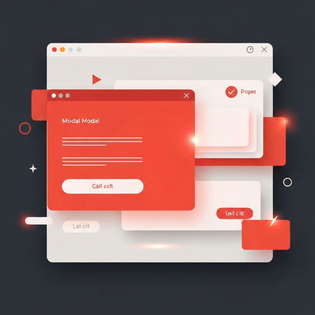
Types of Popups
Web popups come in many forms. Lightbox popups appear in the center of the screen and dim the background, drawing maximum attention. Slide-in popups appear from the corner of the screen and feel less intrusive, ideal for newsletter prompts or content recommendations. Top or bottom banners stick to the edges of the viewport, often used for cookie consent, announcements, or limited-time offers. Modal dialogs typically appear in response to user actions, such as confirming a purchase or requesting more information.
Each format has its place. Choosing the right one depends on the message’s urgency, the user’s context, and the desired level of interruption.
Timing and Triggers
Timing is everything in popup design. Showing a popup the instant a visitor lands on a page rarely works; users have not yet engaged with the content. Better triggers include time-based delays, scroll depth, click-based actions, and exit intent. Exit-intent popups, which appear when a user moves to leave the page, can recover otherwise lost conversions without disturbing engaged visitors.
Frequency capping is also essential. Showing the same popup on every visit annoys returning users. Smart popup systems remember whether a user has already seen or dismissed a message and avoid repetition. The goal is to feel helpful, not pushy.
Crafting the Message
A popup has only seconds to make its point. The headline should clearly state the value: what the user gets and why it matters. Supporting text can offer a brief explanation but should remain short—ideally one or two sentences. The call-to-action button needs to be specific and benefit-oriented. Phrases like “Get my free guide” or “Start my trial” work better than vague labels like “Submit” or “Click here.”
Form fields should be minimal. Asking for an email is far more likely to convert than requesting an email, name, phone number, and company in a single popup. Each extra field decreases response rates, so designers should ask only for what is essential.
Visual Design and Branding
Popups should feel like part of the website, not a foreign overlay. Consistent typography, color, and imagery reinforce the brand and make the popup feel trustworthy. The popup background should contrast clearly with the dimmed page beneath it, drawing the eye without feeling jarring. Generous padding, soft shadows, and rounded corners give popups a polished, modern feel.
Imagery, when used well, can boost engagement. A relevant illustration, product photo, or short animation strengthens the message and makes the popup more memorable. Like everything else, restraint is key—visuals should support, not overwhelm, the core message.
Closing and Dismissal
Every popup must offer an obvious way to close it. A clear close button, large enough to tap on mobile, is non-negotiable. Hiding or shrinking the close button to force engagement damages trust and may even violate accessibility guidelines or platform policies. A respectful design always lets users leave gracefully.
Some popups also benefit from a soft secondary option, such as “No thanks” or “Maybe later.” These options can feel friendlier than a stark close icon and give users a sense of control over their experience.
Mobile-Friendly Popup Design
Mobile popups require special care. Small screens leave little room for large overlays, and aggressive popups can hurt search rankings if they cover most of the content. Mobile-friendly popups are typically smaller, simpler, and easier to dismiss. Many modern designs prefer slide-in or bottom-anchored banners on mobile rather than full-screen modals. Always test popups on real devices to ensure tap targets, layouts, and animations feel right.
Accessibility Considerations
Accessible popups work for everyone. They should trap focus while open so keyboard users can interact without tabbing into the page behind. They should be announced by screen readers using appropriate ARIA roles and labels. Closing should be possible with the keyboard, typically via the Escape key. Sufficient contrast and readable font sizes round out a respectful, inclusive design.
Measuring and Improving Popup Performance
Popups are easy to test. Designers can experiment with headlines, offers, timing, and design variations to learn what resonates. Conversion rate, dismiss rate, and downstream engagement—not just sign-ups—are useful metrics. A popup that captures emails but causes more bounces is not a true win. The most successful teams treat popups as a continuous optimization opportunity, refining them quarterly rather than setting and forgetting.
Conclusion
Web popup design is a powerful tool when used thoughtfully. By choosing the right format, timing, and message, respecting user choice, and prioritizing accessibility and mobile experience, brands can turn popups from a source of frustration into a driver of meaningful engagement. The best popups feel less like interruptions and more like timely invitations—moments where the right message meets the right person at exactly the right time.
