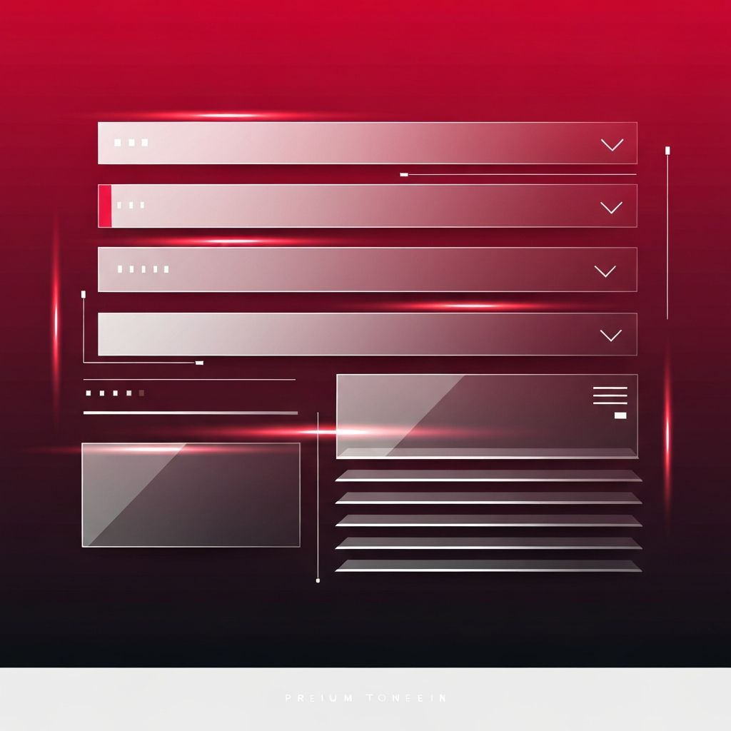
Introduction to Web Page Menu Design
Web page menu design is one of the most important aspects of any digital experience. The menu is often the first element a visitor interacts with, and it sets the tone for how easily they can explore the rest of the site. A well-crafted menu guides users through content effortlessly, reduces friction, and helps them accomplish goals faster. In contrast, a cluttered or confusing menu can drive potential customers away within seconds. In today's competitive online landscape, menu design is no longer just a visual detail—it is a core component of conversion strategy, search engine optimization, and overall brand perception.
Great menu design blends clarity, hierarchy, and aesthetics. It respects the user's cognitive load, anticipates their needs, and presents options in a structured way that feels natural. Whether you are building a portfolio, an ecommerce store, or a corporate website, the menu deserves careful planning and testing.
How AAMAX.CO Can Help With Menu-Driven Web Design
If you want a menu system that performs on both desktop and mobile, consider partnering with the experts at AAMAX.CO. They are a full-service digital marketing company offering web development, digital marketing, and SEO services worldwide. Their team specializes in crafting navigation structures that align with user behavior, business goals, and brand identity. From sticky headers to mega menus and mobile-friendly drawers, they design menus that are intuitive, accessible, and optimized for performance. Learn more about their Website Design offerings to see how they turn navigation into a strategic asset.
Core Principles of Effective Menu Design
Every strong menu is built on a few fundamental principles. First is clarity: labels should be short, descriptive, and free from industry jargon. Users should instantly understand where a link will take them. Second is hierarchy: primary actions must be visually distinct from secondary ones. Third is consistency: the menu should look and behave the same across every page, giving users a reliable reference point. Finally, a menu must be predictable—users rely on conventions such as placing the logo on the left and the cart or profile icon on the right.
Popular Menu Patterns and When to Use Them
There is no single perfect menu layout. The right pattern depends on the site's purpose and depth of content. The horizontal top menu is ideal for brochure-style sites with fewer than seven primary links. Mega menus work well for ecommerce stores or large portals where categories need to be visualized with columns, icons, or featured promotions. Hamburger menus remain a staple on mobile, although on desktop they often reduce discoverability. Sidebar menus suit dashboards and documentation sites, while tab-based menus can organize content within a single page. Choosing the right pattern is about matching the structure of your content to how users actually search for it.
Responsive and Mobile-First Menu Design
Mobile traffic now dominates most industries, so menus must be designed mobile-first. This means starting with the smallest screen, prioritizing only the most essential links, and then scaling up for larger devices. Touch targets should be at least 44 pixels to prevent mis-taps. Drawer menus, bottom navigation bars, and collapsible sections are effective tools for small screens. Animations should be smooth but subtle—excessive motion can feel gimmicky and slow down lower-end devices. A responsive menu ensures that your brand feels polished regardless of where users encounter it.
Accessibility Considerations
An accessible menu is a better menu for everyone. Keyboard users should be able to navigate the entire menu using the Tab and arrow keys. Screen readers must receive meaningful landmarks, ARIA labels, and focus indicators. Sufficient color contrast ensures readability, and clear focus states help users track their position. Dropdowns should open on both hover and click so that people using assistive technologies are not excluded. When accessibility is baked into the design process rather than added as an afterthought, it naturally improves usability for every visitor.
Visual Design and Microinteractions
Typography, spacing, and color shape the personality of a menu. Bold, well-spaced typography conveys confidence and clarity. Subtle hover effects, underline animations, and icon transitions create a sense of responsiveness without distracting the user. It is tempting to experiment with unusual fonts or effects, but restraint usually wins—menus are tools, not showcases. The most memorable menus feel invisible in the best way, guiding attention toward the content instead of demanding it.
SEO and Performance Impact
Menus influence SEO more than many designers realize. Search engines crawl internal links from navigation to understand site architecture, so a logical menu helps boost ranking signals. Keyword-rich but natural link labels can improve topical relevance. However, overstuffed menus dilute link equity and overwhelm users. Performance also matters: lazy-loaded mega menus and optimized icon sets keep pages fast. Remember that every millisecond of load time affects bounce rates and conversions.
Testing and Iteration
Menus should never be set and forgotten. A/B tests, heatmaps, and session recordings reveal how visitors actually interact with your navigation. You may discover that users ignore a category you thought was vital or that renaming a link lifts click-through rates dramatically. Analytics combined with qualitative feedback create a feedback loop for continuous improvement. The best teams treat their menu as a living product that evolves with user behavior and business priorities.
Conclusion
Web page menu design blends strategy, psychology, and craftsmanship. A thoughtful menu guides, informs, and reassures visitors, turning casual browsers into loyal customers. By applying clear principles, embracing responsive patterns, and continuously iterating, you can create a navigation experience that elevates your entire website. When the menu works, everything else works harder too.
