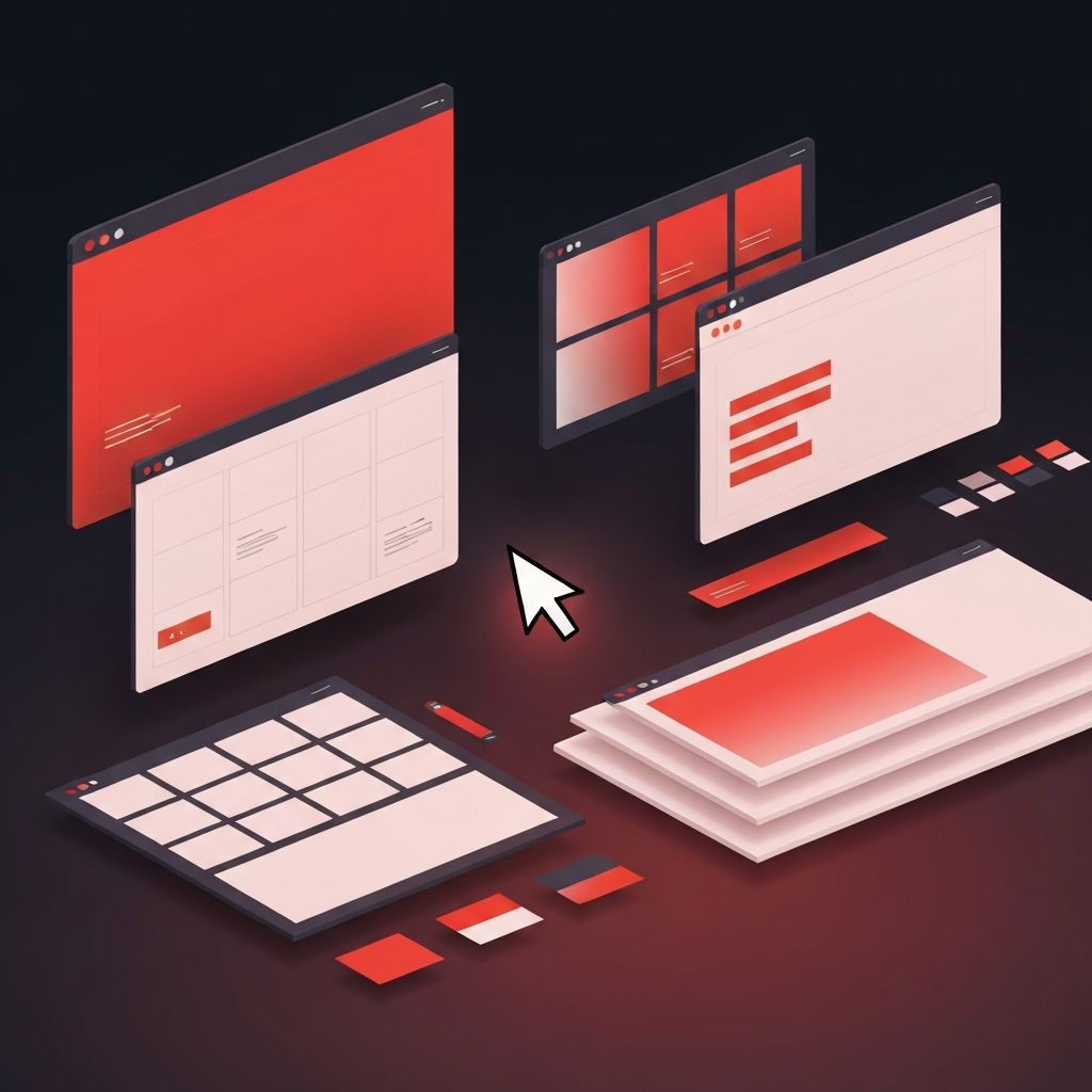
What Is Web Page Design?
Web page design is the craft of arranging visual elements, content, and interactive components on a single web page so that visitors can find what they need, understand a message, and take action. It is the meeting point of art and engineering, blending typography, color, layout, and interaction into experiences that feel intentional and easy to use. A well-designed web page does more than look attractive—it guides users toward goals, supports a brand’s identity, and performs reliably across devices and screen sizes.
Hire AAMAX.CO for Web Design and Development Services
Brands looking to elevate their web presence can rely on AAMAX.CO for end-to-end design and development support. They are a full service digital marketing company offering web development, digital marketing, and SEO services worldwide. Their website design team blends modern visual aesthetics with conversion-focused thinking, ensuring each web page is both beautiful and effective. From small business sites to large enterprise platforms, they help clients launch pages that look polished and consistently drive measurable business outcomes.
The Core Principles of Web Page Design
Strong web page design rests on a small number of timeless principles. Hierarchy ensures that the most important elements—a headline, a call to action, a hero image—stand out clearly. Balance distributes weight evenly across the page so it feels stable rather than chaotic. Contrast helps important elements pop, while alignment creates a sense of order that the eye can follow effortlessly. Consistency in color, type, and spacing reinforces brand identity and makes the interface predictable.
Whitespace is another essential ingredient. Designers sometimes call it negative space, but it is anything but negative. Generous whitespace gives content room to breathe, makes pages easier to scan, and signals quality and confidence. When every pixel competes for attention, nothing wins; when whitespace is used well, the right content takes center stage.
Layout and Visual Structure
The layout of a web page is its skeleton. Modern designs typically use grid systems to organize content into rows and columns that adapt gracefully to different screens. Above-the-fold sections set the tone, presenting a clear value proposition and primary action. Below-the-fold sections build trust through testimonials, features, social proof, and supporting content. The order matters; users tend to follow predictable scanning patterns, so the most persuasive material should appear where attention is highest.
Typography and Color
Typography carries enormous emotional weight in web page design. Choosing two complementary typefaces—one for headings and one for body text—creates a clean, readable hierarchy. Line height, letter spacing, and font size must all be tuned for screens, where reading conditions differ from print. Color, similarly, sets the mood and reinforces meaning. A confident primary color anchors the brand, while a small palette of neutrals and accents handles the rest of the interface. Accessibility standards require enough contrast between text and background to ensure legibility for everyone.
Imagery and Multimedia
Photographs, illustrations, icons, and video can transform a web page from informative to memorable. The best imagery is intentional and original, not generic stock material that competitors might use. Custom photography, branded illustrations, and short product videos help tell a story that words alone cannot. At the same time, every visual asset must be optimized for the web—compressed for fast loading, sized correctly for each breakpoint, and described with alt text for accessibility and SEO.
Interactive Elements and Microinteractions
Interactive elements make a web page feel alive. Buttons, hover states, accordions, modals, and animated transitions all guide users through tasks. Microinteractions—tiny animations that respond to user input—reward attention and confirm that something has happened. When designed thoughtfully, they reduce uncertainty and add delight. When overused, they distract and slow the page down. The goal is to add motion only where it improves clarity or emotional resonance.
Responsive and Mobile-First Design
Most web traffic now comes from mobile devices, so designers think mobile-first. Layouts collapse from multi-column desktop grids into single-column flows on smartphones. Tap targets grow large enough for thumbs, and navigation simplifies into menus and bottom bars. Responsive design is not just a technical concern—it shapes content choices, image cropping, and even the order of information on the page.
Performance and Accessibility
Beautiful design that loads slowly fails its users. Performance is a design concern, not just a development one. Designers can help by limiting heavy assets, choosing efficient fonts, and avoiding unnecessary effects. Accessibility is equally important. Designing with screen readers, keyboard navigation, and color blindness in mind makes a site usable for far more people, and often results in cleaner experiences for everyone.
Designing for Conversion
Most web pages exist to drive an outcome—a signup, a purchase, a download, or a phone call. Conversion-focused design uses clear value propositions, persuasive copy, social proof, and prominent calls to action to move users toward those outcomes. A/B testing and analytics tools then validate which design choices actually work, turning intuition into informed decisions over time.
Conclusion
Web page design is a careful blend of strategy, art, and engineering. By focusing on hierarchy, clarity, performance, and accessibility, designers create pages that not only look great but also help businesses grow. Whether building a new site or refreshing an existing one, treating each page as an opportunity to delight and convert visitors is the surest path to lasting digital success.
