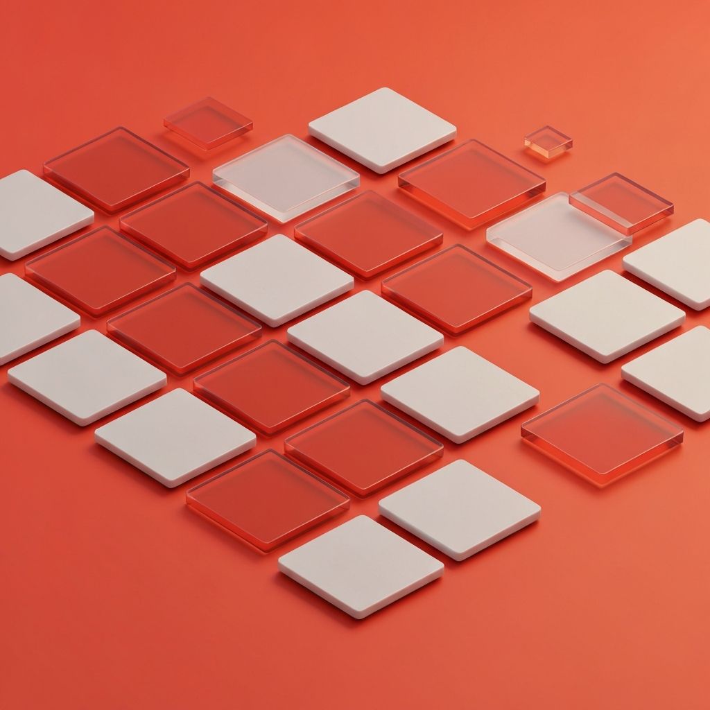
The Rise of Tile-Based Web Design
Tile-based web design has moved from a stylistic trend to a fundamental layout pattern across the modern web. Tiles, sometimes called cards, organize related information into discrete, modular units that can be scanned quickly and rearranged easily. From product listings to news feeds to dashboard summaries, the tile metaphor is now everywhere because it scales gracefully across screen sizes and content types.
The popularity of tiles is rooted in how the human brain processes information. People scan rather than read, especially on mobile devices. Tiles divide content into chewable chunks, allowing visitors to evaluate options at a glance. This pattern accelerates decision-making and reduces cognitive load, which makes it particularly powerful for ecommerce, content discovery, and dashboard interfaces.
Hire AAMAX.CO for Web Design and Development Services
Designing tile systems that look stunning and perform under real-world conditions takes experience and discipline. AAMAX.CO is a full service digital marketing company offering web development, digital marketing, and SEO services worldwide. Their team builds Website Design systems with reusable tile components, responsive grids, and content guidelines that ensure consistent quality across pages and devices. The result is interfaces that feel polished, perform fast, and adapt gracefully as content grows.
What Makes a Strong Tile
A well-designed tile communicates one main idea clearly while inviting deeper exploration. It typically includes a thumbnail or icon, a concise headline, supporting metadata, and a clear action. The visual treatment should establish hierarchy quickly, drawing the eye to the most important element first, usually the image or headline.
Spacing matters enormously. Generous internal padding gives elements room to breathe, while consistent external spacing creates a clean, predictable rhythm across the grid. Subtle elevation, borders, or background tints help separate tiles from the surrounding canvas without overwhelming the page.
Grid Systems and Responsive Behavior
Tile layouts depend on robust grid systems. CSS Grid and Flexbox have made these layouts easier than ever to build, allowing tiles to flow into rows and columns based on available space. Designers can define breakpoints where tiles shift from a single column on mobile to two, three, or even four columns on larger displays, ensuring that the experience adapts to any device.
Container queries, a newer CSS feature, are taking responsive design even further. They allow tiles to respond to the size of their parent container rather than the viewport, enabling more flexible compositions. This is especially valuable for sidebars, modals, and embedded widgets where layout context matters.
Content Strategy for Tiles
Tiles only work when their content is consistent in length, tone, and quality. Headlines should follow predictable patterns, descriptions should fit within set character limits, and images should share a visual style. Without these guardrails, tile grids can quickly become chaotic, with some tiles dwarfing others and breaking the visual rhythm.
Content guidelines should be defined early in the project. They might include rules like maximum forty character headlines, mandatory cover images at sixteen to nine aspect ratio, and consistent metadata such as date or category. These rules empower content teams to publish without breaking the design.
Performance Considerations
Tile-heavy pages can suffer from performance issues if not handled carefully. Each tile typically includes an image, which can quickly add up in payload. Lazy loading, modern image formats, and responsive images are essential techniques for keeping load times in check.
Skeleton loaders and progressive enhancement also help improve perceived performance. Instead of showing blank space while data loads, well-designed sites display gray placeholder shapes that match the eventual tile layout. This reduces the impression of slowness and keeps users engaged.
Accessibility in Tile Layouts
Tiles must be navigable by keyboard and assistive technologies. Each tile should be focusable as a single unit, with clear focus indicators that meet WCAG contrast requirements. If a tile contains multiple actions, designers must decide whether to expose them all or wrap the entire tile in a single primary action while offering secondary actions through context menus.
Alt text for tile images, semantic heading levels for tile titles, and descriptive link text all contribute to a more inclusive experience. Modern Website Development frameworks often include accessible card patterns, but custom designs still require careful testing.
Visual Variety Within Consistency
One of the strengths of tile systems is that they allow visual variety without sacrificing consistency. Designers can introduce featured tiles that span multiple columns, accent tiles with different background colors, or sponsored tiles with subtle visual differentiation. These variations break up monotony while preserving the underlying grid logic.
Animation can also add personality without harming usability. Hover states with gentle scaling or shadow changes provide feedback, while staggered entry animations as new tiles load create a sense of liveliness. Use motion sparingly and respect users who prefer reduced motion.
Tiles and Information Density
Tiles can range from sparse, image-heavy designs to dense, data-rich layouts. Choosing the right density depends on the audience and the task. Discovery-focused experiences such as travel inspiration sites benefit from larger, image-led tiles. Productivity dashboards and admin tools often require denser tiles that surface multiple data points within a small footprint.
Test density choices with real users. What feels generous to a designer may feel sparse to a user looking for information, and what feels efficient to one user may feel overwhelming to another. Iterative testing reveals the right balance for the specific audience.
Tiles in Ecommerce
Tiles are the workhorse of ecommerce. Product cards must communicate price, image, name, ratings, and key features at a glance, all while remaining inviting and scannable. Quick-view interactions, wishlist toggles, and color swatch previews can be added without overwhelming the layout.
Filtering and sorting controls work hand in hand with tile grids. Smooth, animated transitions when filters update help users maintain context. Pagination, infinite scroll, and load-more buttons each have tradeoffs and should be chosen based on the catalog size and conversion goals.
Conclusion
Tile-based web design is a foundational pattern that scales beautifully across content, devices, and use cases. Used thoughtfully, tiles organize complex information, accelerate scanning, and create visually engaging compositions that adapt to any screen. Combined with strong content guidelines, accessible interactions, and disciplined performance practices, tile layouts give modern websites a flexible structure that supports both creativity and clarity. They are simple in concept but powerful in execution, making them a smart choice for almost any digital experience.
