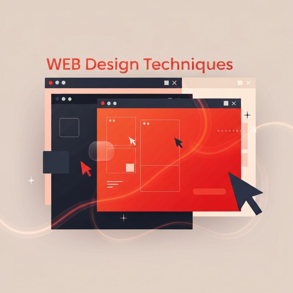
The Craft Behind Modern Web Design
Web design is a discipline of deliberate choices. Every layout decision, color pairing, type selection, and interaction pattern either supports the user's goals or gets in their way. The best designers rely on a toolkit of proven techniques that combine visual craft with usability, accessibility, and performance. Mastering these techniques is what separates a generic site from one that drives real business results.
This article explores the most important techniques working designers use today. Each one can be applied immediately to improve clarity, conversion, and delight.
Work with AAMAX.CO for Expert Implementation
Brands that want to apply proven techniques without managing every detail themselves can hire AAMAX.CO for professional web design and development services. They are a full-service digital marketing company offering web development, digital marketing, and SEO services worldwide. Their designers combine these modern techniques with strategic SEO and marketing expertise to deliver sites that both look great and perform.
Establishing Visual Hierarchy
Visual hierarchy guides the eye to the most important elements first. Designers achieve it through size, weight, color, spacing, and placement. A clear hierarchy tells users exactly where to look, what matters most, and what to do next.
Techniques include making the primary call-to-action the largest and highest-contrast element on the screen, using type scales to differentiate headings from body copy, and grouping related content with consistent spacing. Strong hierarchy reduces cognitive load and accelerates decision making.
Purposeful Use of Whitespace
Whitespace is not wasted space. It gives content room to breathe, separates sections, and creates a sense of quality. Generous margins and padding often signal premium design, while cramped layouts feel chaotic and untrustworthy.
A good technique is to apply a consistent spacing scale across the entire site. This creates rhythm and predictability that users feel even if they cannot articulate why.
Typography That Performs
Typography is one of the most powerful tools a designer has. Strong typographic systems use a limited number of fonts, clearly defined scales, and generous line heights to improve readability. Web-safe pairings, proper letter spacing, and responsive type sizing make text feel intentional on every screen.
A well-chosen typeface adds personality. Pair it with clear hierarchy and the content almost designs itself.
Restrained, Meaningful Color Palettes
Color should reinforce brand identity and direct attention. The most effective palettes use three to five colors: a primary brand color, one or two neutrals, and an accent for calls to action. Restraint makes the limited accent color stand out and guide user behavior.
Techniques like color tokenization through CSS variables make palettes easier to manage and theme across large sites. Always test palettes against accessibility contrast requirements.
Grid Systems and Modular Layouts
Grids bring order to complex layouts. A 12-column grid is standard, but modular grids built around content components offer even more flexibility. Designers define consistent column widths, gutter sizes, and breakpoints so every section feels part of the same system.
Modern CSS grid and flexbox make it easy to implement these systems and adapt them to any screen size without resorting to hacks.
Mobile-First Responsive Design
Designing mobile-first forces prioritization. With limited screen space, designers must decide what truly matters and cut the rest. From that foundation, layouts expand gracefully for tablets and desktops.
Responsive techniques include fluid typography, flexible images, container queries, and progressive enhancement of complex interactions. The result is a site that feels native on every device rather than retrofitted from a desktop design.
Microinteractions and Motion
Subtle motion communicates state and adds polish. Hover effects, button animations, form feedback, and page transitions all help users understand what happened and what will happen next. The key is restraint. Motion should support understanding, not distract from it.
Techniques include using easing curves that match the brand's personality, limiting animation duration to around 200 to 400 milliseconds, and always respecting the user's reduced motion preferences.
Conversion-Focused Design
Every page should have a clear primary goal. Techniques that boost conversion include strong headlines, benefit-driven subheadings, trust signals such as testimonials and logos, single primary calls-to-action, and minimal form fields. A well-designed conversion path removes friction at every step.
Designers often collaborate with marketing teams on website development that integrates analytics and A/B testing so every design choice can be measured and improved.
Accessibility as a Baseline
Accessible design is better design for everyone. Techniques include sufficient color contrast, visible focus states, semantic HTML, descriptive link text, scalable typography, and keyboard-friendly navigation. Accessibility is not a layer added at the end but a mindset applied throughout the design process.
Accessible sites also tend to perform better in search rankings, load faster, and offer a cleaner experience for all users.
Performance-Conscious Design
Fast sites convert better. Designers contribute to performance by choosing efficient fonts, optimizing images, using SVGs for icons, avoiding heavy background videos, and designing layouts that do not require massive assets. Collaboration with developers ensures design decisions do not sabotage core web vitals.
Techniques like skeleton screens, content-first rendering, and lazy loading keep users engaged while content arrives.
Design Systems and Component Libraries
Large projects benefit from design systems that define tokens, components, and patterns. A shared library speeds up production, enforces consistency, and makes collaboration easier between designers and developers. Even small sites benefit from lightweight component thinking.
Techniques include documenting usage guidelines, versioning components, and treating the design system as a living product that evolves alongside the brand.
Bringing It All Together
The best websites combine these techniques into a cohesive experience. Hierarchy guides attention, typography communicates tone, color drives action, motion adds polish, and performance keeps everything fast. When every technique is applied intentionally, the site feels effortless even though every detail was carefully considered. That is the mark of great web design, and the quiet goal behind every successful project.
