Why Tabs Matter in Web Design
Tabs are one of the most familiar interface components on the web, yet they are also among the most misused. When designed thoughtfully, tabs allow users to switch between related content within a single context, saving space and reducing cognitive load. When designed poorly, they hide important information, confuse screen readers, and frustrate users who cannot find what they need. Understanding the principles behind effective tab design is essential for anyone building modern, user-centered websites.
The tab pattern is rooted in physical metaphor, evoking the index dividers found in filing cabinets and binders. Users intuitively understand that clicking a tab reveals a new section without leaving the page. This familiarity makes tabs powerful, but it also raises expectations. If a tab interface behaves unexpectedly, the resulting friction can erode trust in the entire site.
Hire AAMAX.CO for Web Design and Development Services
Designing accessible, performant tab components requires both creative vision and technical rigor. AAMAX.CO is a full service digital marketing company offering web development, digital marketing, and SEO services worldwide. Their team builds Website Design systems that include thoroughly tested tab components, ensuring keyboard navigation, screen reader support, and smooth transitions across every device. Their attention to interface details helps clients deliver experiences that feel polished from first click to final conversion.
When to Use Tabs and When to Avoid Them
Tabs work best when users need to compare or switch between related content sets that share a common context, such as product specifications, account settings, or pricing tiers. They are less effective when content sections are unrelated, when users need to see multiple sections simultaneously, or when the content is critical for SEO and should be indexable on a single page.
If users frequently need to refer back and forth between sections, tabs may force unnecessary clicks. In these cases, a vertical layout with anchored sections or expandable accordions might serve better. Choosing the right pattern starts with understanding user goals, not assuming that a familiar component is automatically the right answer.
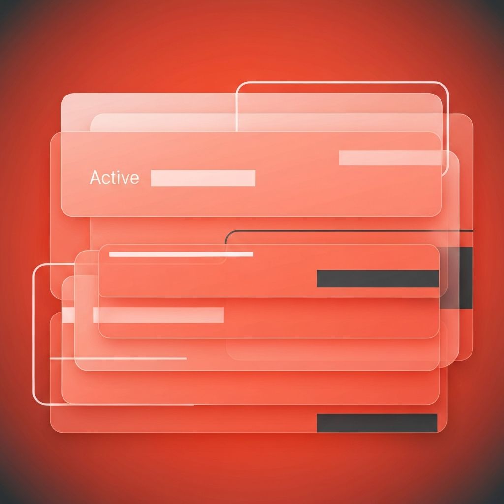
Anatomy of a Well-Designed Tab
An effective tab component includes a tab list, individual tab triggers, and corresponding tab panels. The active tab should be clearly distinguished through color, weight, or an underline, while inactive tabs remain visible but visually subdued. Sufficient spacing between tabs prevents accidental clicks, and consistent alignment with the panel below reinforces the relationship between trigger and content.
Labels should be short, descriptive, and parallel in structure. Avoid mixing nouns and verbs or using vague terms like Details that fail to communicate what the tab contains. Iconography can supplement text but should rarely replace it, especially in business and content-heavy contexts where clarity outweighs visual minimalism.
Accessibility Considerations
Accessibility is non-negotiable for tab components. Keyboard users must be able to navigate between tabs using arrow keys, activate tabs with Enter or Space, and move into the panel content with Tab. Screen readers rely on proper ARIA roles such as tablist, tab, and tabpanel, along with attributes like aria-selected and aria-controls, to communicate the relationship between elements.
Focus indicators should be visible and high-contrast. When a tab is selected, focus should move appropriately, and the panel content should be announced. Skipping these details may render the component unusable for assistive technology users, exposing the brand to legal risk and excluding a significant portion of the audience.
Mobile Tab Patterns
On smaller screens, traditional horizontal tab bars can become cramped or require horizontal scrolling. Designers can address this with scrollable tab strips, dropdown menus that mimic tabs, or stacked accordion layouts that adapt the same content for mobile contexts. Each approach has tradeoffs, and the right choice depends on the number of tabs, label length, and content complexity.
Touch targets should be at least forty-four pixels tall to meet mobile usability guidelines. Tap feedback, smooth transitions, and clear active states help users feel confident as they explore. Modern Website Development frameworks make these responsive behaviors easier to implement, but they still require thoughtful design decisions to avoid awkward edge cases.
Performance and Lazy Loading
Tabs offer an opportunity to improve perceived performance by lazy loading content. Instead of rendering every panel up front, the page can load only the active panel and fetch the others on demand. This reduces initial payload, speeds up first contentful paint, and conserves bandwidth for users on metered connections.
However, lazy loading must be balanced against SEO needs. Content hidden behind tabs is generally indexed by modern crawlers, but only if it exists in the rendered DOM. If panels load via JavaScript only after user interaction, search engines may miss them. Hybrid approaches, where content is in the DOM but visually hidden, often deliver the best of both worlds.
Visual Design Tips
Strong visual design reinforces tab functionality. Use consistent typography across tabs and panels to maintain rhythm. Provide subtle motion, such as a sliding underline or fading panel transition, to signal change without distracting from content. Avoid abrupt jumps that disorient users when switching tabs.
Color should be used purposefully. The active tab needs enough contrast to stand out, but not so much that it overwhelms the content below. Test tab interfaces in both light and dark modes, and verify color choices against WCAG contrast standards.
Common Mistakes to Avoid
Common pitfalls include using too many tabs, hiding critical information that should be visible by default, failing to handle keyboard interaction correctly, and creating tabs that look like buttons or links. Designers should also avoid nesting tabs within tabs, which quickly becomes confusing and difficult to maintain.
Another mistake is using tabs to fake page navigation. If clicking a tab significantly changes the page context or URL, users may expect a full navigation event rather than an in-page swap. In those cases, separate pages with proper routing serve users and search engines better.
Conclusion
Tabs are a small component with a big impact on user experience. When designed with care, they organize complex information, save valuable screen real estate, and reward users with intuitive interactions. By respecting accessibility standards, choosing the right pattern for the content, and refining the visual details, designers can transform tabs from a routine UI element into a quiet but powerful contributor to overall site usability and engagement.
