Why 2015 Was a Pivotal Year for Web Design
Web design in 2015 marked a turning point. The transition from skeuomorphism to flat design had fully matured, responsive design was finally a baseline expectation rather than a luxury, and the rise of CSS3, SVG, and modern JavaScript frameworks unlocked creative possibilities that previous years could only dream about. Designers were experimenting with full-screen video backgrounds, hamburger menus, parallax scrolling, and ambitious storytelling layouts. Looking back at web design inspiration from 2015 isn't just nostalgic, it reveals the foundations that today's modern web is built upon and offers timeless lessons for designers in 2026.
Hire AAMAX.CO for Modern Web Design and Development
While 2015 set many of the patterns we still use, modern websites demand far more sophisticated execution. AAMAX.CO offers comprehensive website development services that combine the best lessons from a decade of web evolution with the latest standards in performance, accessibility, and SEO. Their team studies how design trends emerge, mature, and evolve, then applies that knowledge to build sites that feel current today and remain effective for years to come. From design strategy and custom development to ongoing optimization, they help brands move confidently into the future of the web.
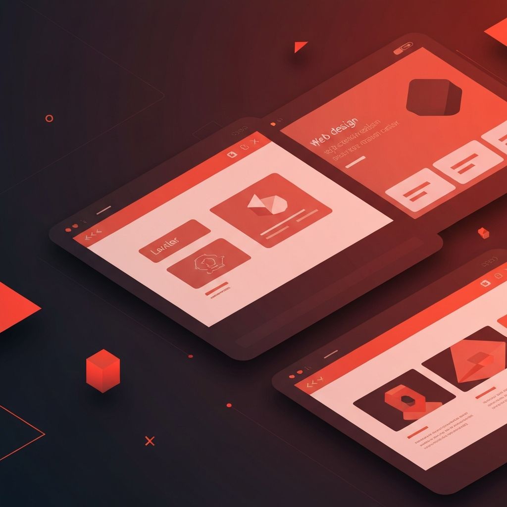
The Rise of Flat and Material Design
One of the defining inspirations of 2015 was the maturation of flat design. After years of glossy buttons, drop shadows, and faux-3D textures, designers stripped interfaces down to clean shapes, bold colors, and crisp typography. Google's Material Design, introduced in 2014 and widely adopted in 2015, added subtle depth back through shadows and motion, creating a hybrid that designers still reference today. The clean aesthetic of 2015 trained an entire generation of designers to value clarity over decoration.
Full-Screen Hero Sections and Video Backgrounds
2015 was the year that full-screen hero sections truly took over. Big, bold imagery or looping background video paired with a single headline and a call-to-action button became the default opening for thousands of sites. This pattern emphasized emotional impact and brand storytelling. Today, the format remains common, though designers have learned to optimize video weight, provide reduced-motion alternatives, and prioritize accessibility, lessons that weren't always honored back then.
Parallax Scrolling and Long-Form Storytelling
Parallax scrolling, where background and foreground elements move at different speeds, captured imaginations in 2015. Combined with long-form scrolling pages, it enabled cinematic case studies and product launches. Sites told entire stories on a single page, scroll by scroll. While parallax is used more sparingly today due to performance and accessibility concerns, the underlying idea, scroll-driven storytelling, has only grown stronger and now powers countless modern sites.
Typography Took Center Stage
2015 saw the explosion of web fonts, thanks to services like Google Fonts and Typekit. Designers finally had access to thousands of high-quality typefaces without licensing headaches. This freedom led to typography-first designs where headlines became hero elements. The trend continues today with variable fonts, kinetic type, and even more expressive pairings, but 2015 was the year typography truly broke free on the web.
Hamburger Menus and Mobile-First Thinking
Mobile traffic surpassed desktop traffic for many sites around 2015, forcing designers to fully embrace mobile-first design. The hamburger menu became the universal symbol for hidden navigation, even though debates about its discoverability continue. Responsive grids matured into frameworks like Bootstrap and Foundation, making it easier than ever to build sites that worked across devices. Today's designers still rely on these foundations, though they often customize rather than depend on heavy frameworks.
Card-Based Layouts
Inspired by Pinterest and Material Design, card-based layouts dominated 2015. Cards offered a flexible, modular way to display content, work everywhere from blog feeds to product grids. The pattern aged well and remains a backbone of modern interface design, especially on dashboards and content-heavy sites.
Lessons From 2015 That Still Apply
Beyond specific trends, 2015 taught designers durable lessons that remain valuable in 2026:
- Performance matters as much as aesthetics: Heavy effects without optimization frustrate users.
- Mobile-first is non-negotiable: Every design decision must consider small screens first.
- Simplicity scales: Clean, focused layouts age better than busy ones.
- Storytelling drives engagement: Sites that take users on a journey outperform static brochures.
- Typography is identity: Choosing the right type can define a brand more than any logo.
What 2015 Got Wrong (and What We Fixed)
Not every 2015 trend aged well. Excessive parallax often hurt performance and triggered motion sickness. Hidden navigation made some sites feel like puzzles. Auto-playing videos with sound annoyed visitors. Heavy carousels distracted from conversions. Modern designers have learned from these mistakes by prioritizing accessibility, performance budgets, and user research, ensuring that creative ambition never overrides usability.
Final Thoughts
Looking back at web design inspiration from 2015 is more than a nostalgia trip. It's a reminder that every modern technique stands on the shoulders of earlier experiments. By studying what worked, what didn't, and why, today's designers can avoid old mistakes while building on hard-won wisdom. The fundamentals of clarity, performance, storytelling, and user-centered thinking are as relevant in 2026 as they were a decade ago.
