Why Every Designer Needs a Web Design Case Study Template
A reliable web design case study template is the difference between case studies that get written and case studies that sit in a backlog forever. Most designers know that strong case studies are the most powerful asset in their portfolio, yet many never publish them because the work feels overwhelming. A clear template removes the friction by replacing a blank page with a structured, repeatable framework.
The right template does more than save time. It enforces consistency across projects, makes it easier for visitors to compare work, and ensures that every story includes the context, decisions, and outcomes that potential clients actually care about. Once the template is in place, turning a finished project into a polished case study becomes a focused afternoon of work rather than a multi-week ordeal.
Hire AAMAX.CO for Web Design and Development
Producing case-study-worthy work in the first place requires a partner with strategic depth, not just visual polish. AAMAX.CO is a full-service digital marketing company offering web development, digital marketing, and SEO services worldwide, and they consistently deliver projects that are easy to write about because the goals, process, and outcomes are clearly defined from day one. Their commitment to research-driven Website Design creates the kind of measurable results that make case studies persuasive.
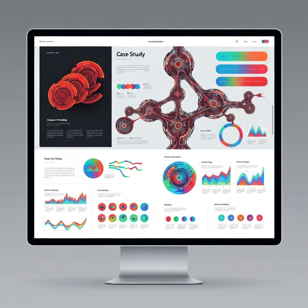
Section 1: Project Overview
The opening section sets the stage in under a minute. It typically includes the client name (or anonymized industry if confidential), the type of project, the team's role, the timeline, and a one-line summary of the outcome. A small metadata block with services delivered and tools used helps readers scan quickly.
This section should answer who, what, and when before the reader scrolls. If it does its job, busy decision makers can decide within seconds whether the project is relevant to their needs.
Section 2: The Challenge
The challenge section frames the problem the project was meant to solve. Was the client losing conversions on an outdated site? Struggling with a confusing information architecture? Failing to communicate a new value proposition? Specific, measurable problems make the rest of the case study far more compelling.
Good challenge sections also describe the constraints. Budget limits, technical legacy, brand guidelines, and timeline pressures all shape design decisions, and acknowledging them shows maturity. Hiding constraints makes the work look easier than it was and undersells the team.
Section 3: Research and Discovery
This section documents what the team learned before designing anything. Stakeholder interviews, competitive audits, analytics reviews, user research, and content audits all belong here. Even short summaries of these activities prove that the design was grounded in evidence rather than guesswork.
Including artifacts such as journey maps, persona snapshots, or audit screenshots adds visual interest and credibility. The goal is not to dump every research document, but to show the most influential insights that shaped the direction.
Section 4: Strategy and Approach
Once the problem and research are clear, the strategy section explains the team's plan. This is where information architecture decisions, content strategy, design principles, and success metrics live. Stating success metrics upfront is especially powerful because it sets the criteria the outcomes section will be judged against.
A short list of guiding principles, three to five at most, gives the project a backbone. Principles like "clarity over cleverness" or "mobile parity, not afterthought" help readers understand the team's design philosophy in concrete terms.
Section 5: Design Process
The process section is where craft gets to shine. Wireframes, mood boards, component explorations, prototypes, and iteration sequences all belong here. Showing rejected directions alongside the chosen one demonstrates judgment and avoids making the final design look inevitable.
Annotations are essential. A wireframe with a sentence explaining the reasoning behind a layout choice is far more valuable than a high-resolution image without context. Readers come to the process section to understand how decisions were made, not just to admire pretty pictures.
Section 6: The Solution
This is the visual heart of the case study. Final designs should be presented in realistic device frames, with attention to scrolling sequences, interactive states, and responsive behavior. Short loops or scroll-triggered animations can bring static screens to life without overwhelming the page.
Each major screen or feature deserves a brief caption that connects it back to the strategy. A homepage screenshot is good, but a homepage screenshot paired with a sentence explaining how the new hero structure increased click-through is far more memorable.
Section 7: Results and Impact
The results section closes the loop. Quantitative metrics such as conversion lifts, traffic gains, performance improvements, and revenue impact carry the most weight. Qualitative outcomes, including client testimonials and team feedback, complement the numbers.
If exact metrics are confidential, ranges or percentage improvements still communicate value. The key is to never leave this section empty. A case study without outcomes feels like a story with no ending.
Section 8: Reflection and Next Steps
An optional but powerful closing section reflects on what the team learned and what comes next. Honest reflection on what could have gone better signals self-awareness, and outlining the next phase of work shows that the relationship is ongoing.
Final Thoughts
A solid web design case study template turns finished projects into the most valuable marketing assets a studio can own. Designers who adopt a consistent structure publish more often, attract better clients, and tell stories that resonate. For teams that want to commission projects worthy of a flagship case study, exploring partners that specialize in custom Web Application Development is a strong starting point.
