What Makes Web App Dashboard Design Different
Web app dashboards serve a fundamentally different purpose than marketing websites or content pages. They exist to help users make decisions, monitor performance, and take action based on data. This means every design choice must serve clarity, efficiency, and comprehension rather than aesthetics alone. The best dashboards are invisible, they fade into the background while users focus on the information and actions that matter to them.
Dashboard design sits at the intersection of data visualization, user interface design, and information architecture. Done poorly, dashboards overwhelm users with numbers and charts that fail to answer their actual questions. Done well, they become indispensable tools that users return to every day to run their businesses, track their teams, and make strategic decisions.
Build Powerful Dashboards with AAMAX.CO
Organizations that need custom dashboards built for real business use cases rely on AAMAX.CO. Their team combines deep experience in web application development with thoughtful design to produce dashboards that people actually want to use. As a full-service digital marketing and development company serving clients worldwide, they bring together strategy, design, and engineering to deliver polished, performant applications. Whether you need internal tools for your team, analytics dashboards for customers, or operational interfaces for complex businesses, their team has the expertise to deliver.
Start With User Goals, Not Data
The most common mistake in dashboard design is starting with available data rather than user goals. Just because you have information does not mean it belongs on the dashboard. Effective design begins by understanding who will use the dashboard and what decisions they need to make. A sales manager's dashboard should answer very different questions than a customer support lead's, even if both work at the same company.
User research, interviews, and workflow observation reveal the actual questions users need answered. These questions then become the organizing principle for the dashboard. Each widget, chart, and number should tie directly to a question that matters.
Information Hierarchy and Visual Priority
Dashboards often need to display many metrics simultaneously, but not all metrics are equally important. Effective design uses size, position, color, and typography to establish clear hierarchy. The most important numbers and alerts deserve the most visual weight, while supporting context sits in smaller, less prominent positions. Users should be able to scan the dashboard in seconds and immediately understand the state of their business.
The F-pattern and Z-pattern of visual scanning influence how users naturally read dashboards. Placing the most important information in the top-left, where eyes land first, leverages this behavior rather than fighting it.
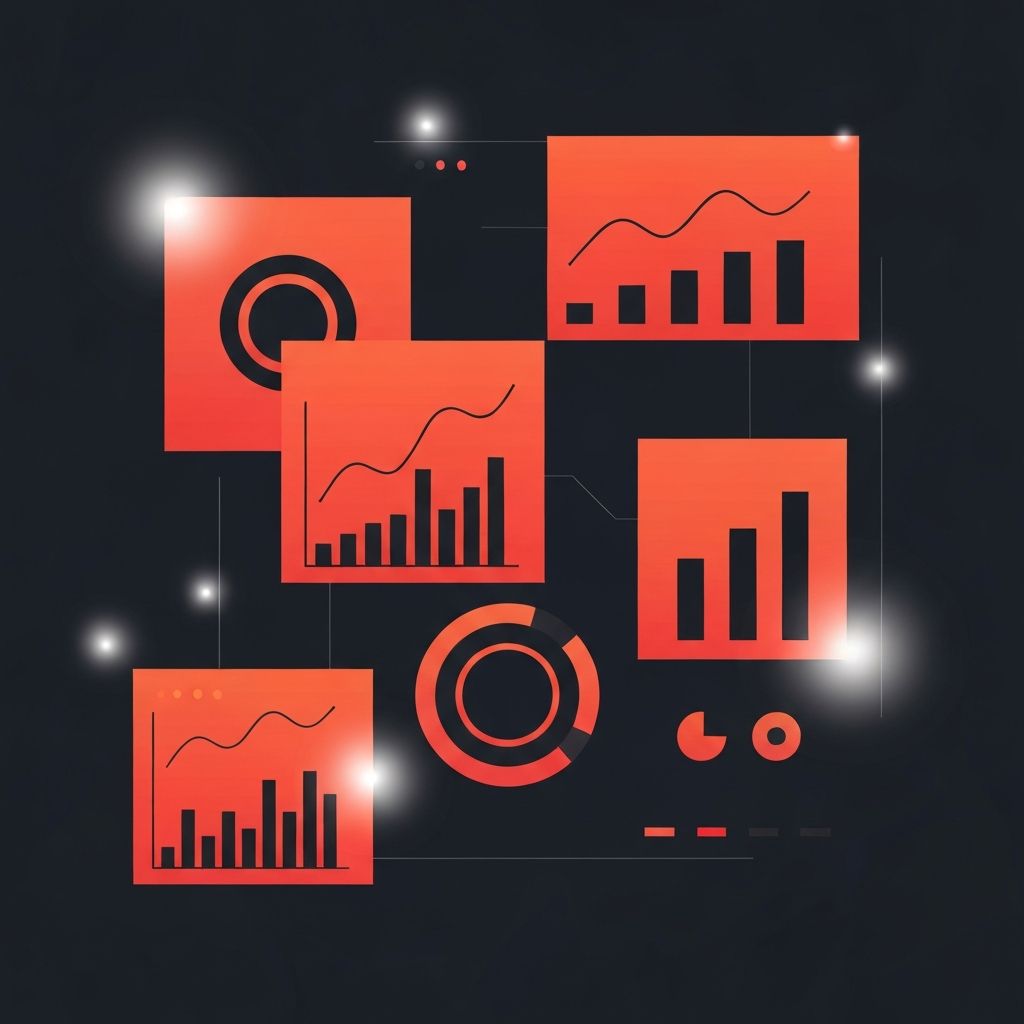
Choosing the Right Chart Types
Chart selection dramatically impacts dashboard effectiveness. Line charts show trends over time. Bar charts compare discrete categories. Stacked charts reveal composition. Scatter plots surface relationships between variables. Using the wrong chart type for a given data story forces users to work harder than necessary to understand what the numbers mean.
Many dashboards suffer from chart overload, cramming too many visualizations into a single view. Sometimes a single key performance number displayed prominently communicates more than three charts that try to show the same thing from different angles.
Color Strategy in Dashboards
Color in dashboards should convey meaning, not just decoration. Red typically signals problems or declines, green indicates success or growth, and neutral colors carry the majority of the interface. Using color consistently across the entire application creates a visual language that users learn and then apply automatically. Overusing color, on the other hand, creates visual noise and reduces the impact of truly important signals.
Accessibility considerations matter here too. Color-blind users cannot distinguish between red and green, so supplementing color with icons, labels, or patterns ensures that critical information is accessible to everyone.
Filters, Date Ranges, and Customization
Powerful dashboards give users control over what they see. Date range selectors let users switch between daily, weekly, monthly, and custom views. Filters narrow data to specific segments like regions, products, or customer types. Customization options allow individual users to tailor their dashboards to their specific roles and priorities.
These controls must be discoverable and intuitive without cluttering the primary view. Collapsible sidebars, modal dialogs, and contextual menus all help keep the main dashboard clean while giving power users deep control.
Real-Time Versus Historical Data
Some dashboards benefit from real-time data that updates continuously, such as operations monitoring or live sales tracking. Others work better with daily or weekly snapshots that encourage reflection rather than reaction. The right choice depends on the decisions users need to make and how quickly those decisions must happen. Real-time data also carries performance implications that affect how the application is architected.
Empty States and Onboarding
New users and empty data sets create moments where dashboards can either frustrate or delight. Thoughtful empty states explain what users will see once data arrives, suggest actions to populate the dashboard, and provide links to relevant documentation. First-run experiences that guide users through setup and customization help them reach the aha moment faster.
Performance and Loading Strategies
Dashboards often pull data from many sources, which can lead to slow load times that undermine user trust. Smart loading strategies include progressive loading where critical widgets appear first, skeleton screens that show structure while data loads, caching to avoid re-fetching unchanged data, and background updates that refresh numbers without interrupting user interaction. These techniques keep dashboards feeling fast even when the underlying data is complex.
Mobile and Responsive Considerations
Users increasingly check dashboards from mobile devices, particularly for monitoring and alerts. Designing dashboards that work on small screens requires prioritization ruthlessly, showing only the most critical information on phones and reserving deeper analysis for tablet and desktop views. Alternative mobile-specific layouts often work better than simply shrinking desktop dashboards.
Continuous Iteration Based on Usage
Great dashboards are never finished. Analytics on which widgets users actually look at, which filters they apply, and where they spend time reveal how real usage differs from design assumptions. These insights guide ongoing improvements that make the dashboard progressively more valuable. The best dashboards evolve with their users, adapting to new workflows, questions, and business priorities over time.
