Understanding Visual Feedback Web Design
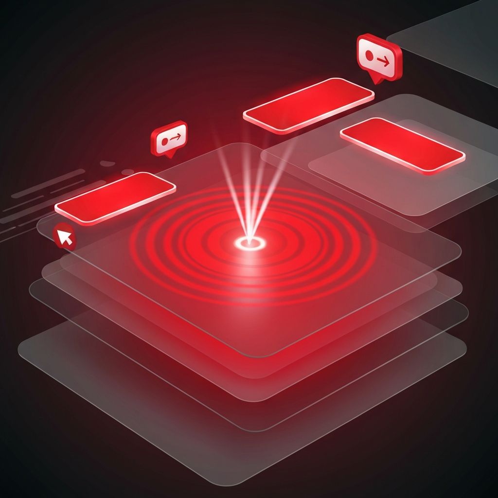
Visual feedback web design refers to the deliberate use of motion, color changes, micro-interactions, and visual cues to confirm user actions and guide them through an interface. When a user clicks a button, hovers over a link, submits a form, or scrolls down a page, the interface should respond in ways that feel natural and reassuring. Without this feedback, users are left wondering whether their actions registered at all.
The web has matured beyond static pages. Today's visitors expect interfaces that respond instantly and meaningfully. Visual feedback turns ordinary websites into experiences that feel alive, polished, and trustworthy, while its absence often makes even visually attractive sites feel broken or amateurish.
Crafting Responsive Experiences With AAMAX.CO
Brands that want to build websites with thoughtful interactions and polished feedback often work with AAMAX.CO, a full-service digital marketing company offering website design services worldwide. Their team blends usability principles with refined motion design, helping clients create digital experiences that feel responsive without sacrificing performance or accessibility.
The Role of Micro-Interactions
Micro-interactions are small, focused moments of feedback embedded throughout an interface. A button that subtly scales when hovered, a form field that highlights when focused, or a checkbox that animates as it toggles are all examples. Individually, each interaction is tiny, but collectively they shape the user's perception of quality and care.
Effective micro-interactions share several traits. They are quick, usually under 300 milliseconds, so they feel responsive rather than sluggish. They are purposeful, communicating something specific about state or progress. And they are consistent, reinforcing a coherent design language across the entire site.
Confirming Actions and Reducing Anxiety
One of the most important roles of visual feedback is confirmation. When a user submits a form, adds an item to a cart, or saves a setting, they need clear confirmation that the action succeeded. A subtle check mark, a smooth toast notification, or a brief loading state followed by a success message all serve this purpose.
Without confirmation, users often repeat actions, leading to duplicate orders, frustrated support tickets, and broken trust. Strong visual feedback prevents these issues by closing the loop on every interaction, no matter how small.
Communicating Progress and System Status
Long-running actions such as file uploads, data processing, or page transitions need especially careful feedback. Progress bars, skeleton screens, and animated placeholders reassure users that the system is working. They also reduce perceived wait times by giving the eye something to follow.
Skeleton screens have become a popular alternative to traditional spinners. By showing a low-fidelity preview of the upcoming content, they help users mentally prepare for what is loading. The result is a smoother, less jarring experience that feels faster even when actual load times are unchanged.
Hover, Focus, and Active States
Hover, focus, and active states are foundational forms of visual feedback. They tell users which element is interactive and what will happen next. Skipping these states, or making them too subtle, leaves users guessing and increases cognitive load.
Accessibility considerations are critical here. Focus states must be visible for keyboard users, with sufficient contrast and clear outlines. Designers sometimes hide focus rings for aesthetic reasons, but this practice excludes a significant portion of users and should be avoided in favor of well-designed, on-brand focus styles.
Error Handling and Recovery
Errors are inevitable, but the way an interface handles them shapes how users feel about the brand. Inline validation that highlights problematic fields in real time is far more helpful than a generic error message at the top of the page. Clear, friendly language explaining what went wrong and how to fix it reduces frustration and supports recovery.
Visual feedback in error states should be assertive without being alarming. Red highlights, gentle shaking animations, and concise explanations work well together. Avoid harsh, blocking modals for minor issues, as they often feel disproportionate to the problem.
Motion Principles That Support Usability
Motion is one of the most powerful tools in visual feedback web design, but it must be used with restraint. Animations should support meaning, not distract from it. Easing curves, duration, and direction all influence how natural a transition feels.
Reduced motion preferences should always be respected. Users who experience motion sickness or vestibular disorders rely on system-level settings to disable non-essential animations. Modern CSS and JavaScript make it straightforward to honor these preferences without sacrificing the experience for everyone else.
Performance and Perceived Speed
Visual feedback directly impacts perceived performance. A site that responds instantly to taps, scrolls, and clicks feels fast even when underlying network requests take time. Conversely, a site with delayed or missing feedback feels sluggish regardless of actual speed.
Designers and developers should collaborate closely to ensure that feedback animations do not introduce performance bottlenecks. Hardware-accelerated CSS transforms, efficient JavaScript, and careful asset management keep interactions smooth across devices.
Building a Feedback-First Mindset
The best visual feedback web design does not happen by accident. It emerges from teams that consciously consider feedback at every step, from wireframes through final QA. Design systems should document standard patterns for hover states, loading indicators, success confirmations, and error handling so that consistency is preserved across pages and over time.
When visual feedback is treated as a first-class concern, websites become more than digital documents. They become responsive partners that guide users confidently toward their goals, creating the kind of polished, trustworthy experience that modern audiences expect and remember.
