Introduction
Web apps live in a different design world than marketing websites. Users return to them daily, often for hours at a time, so every interaction must feel efficient, predictable, and pleasant. The top web app designs of the last few years share a common DNA: clear information hierarchy, fast performance, thoughtful empty states, and interfaces that get out of the user's way.
This article explores what makes those designs work and how product teams can apply the same principles to their own apps.
Hire AAMAX.CO for Web App Design and Development
For teams that want to skip the trial and error and ship a polished product, AAMAX.CO Web Application Development is an excellent option. AAMAX.CO is a full service digital marketing company offering web development, digital marketing, and SEO services worldwide. Their team has built dashboards, SaaS platforms, and internal tools across many industries, and they understand how to balance complex functionality with intuitive design. From discovery and prototyping to launch and ongoing improvements, they handle the full lifecycle of web app development.
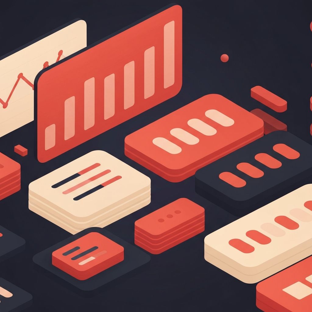
What Defines a Great Web App Design
The best web apps share several traits. They prioritize the most common user actions, surface important information without clutter, and minimize the cognitive load of every screen. They also handle edge cases gracefully, with empty states, error messages, and loading indicators that feel intentional rather than afterthoughts.
Performance is part of design too. A beautifully laid-out app that lags during navigation feels broken, while a simpler design that responds instantly feels premium. The best teams treat speed as a core design constraint.
Notion
Notion remains a benchmark for flexible content tools. Its design lets users build complex documents, databases, and wikis without ever feeling overwhelmed. The secret is restraint. Notion exposes only what the user needs at any moment, and its slash menu turns a vast feature set into a friendly, discoverable experience.
Linear
Linear set a new standard for project management software. Its design favors keyboard-first interaction, instant transitions, and a clean information hierarchy. Every animation has a purpose, and every screen feels engineered for power users without alienating newcomers. Many SaaS teams now study Linear when designing their own dashboards.
Figma
Figma's web app proved that browsers could host professional design tools that rival native software. Its multiplayer cursors, performant canvas, and well-organized panel layout make collaborative design feel effortless. Figma's design holds up well under intense daily use because it consistently respects the user's attention.
Stripe Dashboard
Stripe's dashboard is a masterclass in turning complex financial data into approachable interfaces. Information density is high, yet readability remains excellent. Charts, tables, and forms follow a consistent design system, and the navigation scales gracefully as the product expands.
Vercel
The Vercel dashboard demonstrates how a developer-focused tool can feel polished without being noisy. Project lists, deployment logs, and analytics all share a unified visual language. Subtle animations and a strong typographic system make it pleasant to use even during stressful moments like debugging a production deploy.
Common Patterns Worth Borrowing
Across the best web apps, certain patterns repeat. Persistent left navigation paired with a focused content area gives users a clear mental model. Command palettes accelerate power users without crowding the interface for newcomers. Empty states double as onboarding moments by suggesting next actions and showcasing key features.
Modal dialogs are used sparingly, and when they appear, they support a single, well-defined task. Notifications are quiet by default, with clear ways to dismiss or expand them. These small consistencies add up to an experience that feels respectful of the user's time.
Information Hierarchy
The hardest part of web app design is deciding what to emphasize. Top designs use scale, weight, color, and spacing to guide the eye toward the actions and data that matter most. They resist the temptation to make everything important, because when everything is emphasized, nothing is.
A good test: open any screen of your app and ask yourself what the user is most likely doing here. The design should make that action obvious within a second.
Designing for Density
Many web apps need to display a lot of data. The best designs handle density without becoming overwhelming. They use clear column alignment, generous line height, sensible defaults, and thoughtful filtering. Color is used to draw attention to anomalies, not as decoration. Sticky headers, virtualized lists, and progressive disclosure all help users navigate large datasets without losing context.
Accessibility and Inclusivity
Top web apps prioritize accessibility from the start. They use semantic HTML, sufficient color contrast, clear focus indicators, and full keyboard navigation. They test with screen readers and consider users with motion sensitivity, cognitive differences, or limited bandwidth. Accessible design is better design for everyone.
Performance as Design
Snappy interactions are a design feature. Skeleton loaders, optimistic UI updates, and prefetching of likely next actions all create a sense of speed even when the underlying network is slow. The best apps feel instant, and that perception is the result of dozens of intentional design and engineering decisions.
Building Your Own Top-Tier Web App
Start with research. Talk to real users, watch them work, and identify their most repetitive pain points. Build a strong design system early so your team can move fast without sacrificing consistency. Invest in performance from day one, treat empty states and errors as first-class screens, and review every flow with the question: how can we remove a step here?
Final Thoughts
Top web app designs are not the result of dramatic flourishes. They are the result of disciplined choices made over years. Study the leaders, understand the principles behind their work, and apply those lessons to your own product. The result will be an app that users return to happily and recommend without prompting.
