Tile-based web design has quietly become one of the most influential layout patterns of the modern web. From dashboards and portfolios to e-commerce listings and content hubs, organizing information into clean, modular tiles helps visitors scan quickly, find what matters, and stay oriented even on busy pages. Done well, tile web design feels effortless. Done poorly, it can feel rigid, repetitive, or overwhelming.
Hire AAMAX.CO for Web Design and Development
If you want to bring a polished, performant tile-based layout to your own site, consider working with the team at AAMAX.CO. They are a full-service digital marketing company offering web development, digital marketing, and SEO services worldwide. Their designers know how to translate complex content into clean, modular grids, while their developers ensure those grids stay fast, accessible, and responsive across every device. From content-heavy marketing sites to interactive product catalogs, they bring the technical and visual expertise needed to make tile design feel intentional rather than generic.
What Tile Web Design Actually Means
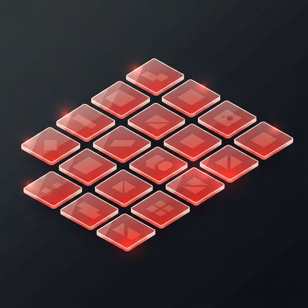
At its core, tile web design organizes content into rectangular or square modules — tiles — arranged in a consistent grid. Each tile typically contains a focused unit of content: a product, an article, a project, a feature, or a metric. The grid creates visual rhythm, while the modular structure makes it easy to add, remove, or rearrange content without breaking the design.
Tile-based layouts owe much of their popularity to the rise of card UI patterns, mobile-first design, and component-driven development. Cards on social platforms, product tiles in online stores, and dashboard widgets in SaaS apps all share the same underlying logic: small, self-contained units of information arranged in a predictable structure.
Why Tile Layouts Work So Well
Tile layouts succeed because they match how people actually scan content online. Visitors rarely read pages top to bottom; they skim, jump, and pattern-match. A consistent grid gives the eye predictable landing points, making it easy to compare options, evaluate choices, and decide where to focus.
Tiles also scale gracefully. The same grid that displays six items on a desktop can collapse to two columns on a tablet and a single stack on a phone. That responsiveness is one reason tile-based website design has become a default pattern for content-heavy and product-driven sites.
Anatomy of a Well-Designed Tile
A great tile is small but disciplined. It typically includes a focal image or icon, a short, descriptive headline, a brief supporting line of text, and a clear action — a link, button, or hover state that signals interactivity. Whitespace inside the tile gives the content room to breathe, while consistent padding across the grid keeps the overall layout calm.
Visual hierarchy inside the tile matters. The image draws attention first, the headline confirms what the tile is about, and the supporting text answers the immediate follow-up question. When that hierarchy is consistent across every tile, visitors learn the pattern almost instantly and can scan the entire grid at speed.
Designing the Grid Around the Content
The grid itself is just as important as the tiles inside it. Equal-sized tiles work well for content of similar importance, such as product listings or team members. Featured layouts — where one tile spans two columns or rows — can highlight priority content without breaking the rhythm of the grid.
Spacing, alignment, and breakpoints all need careful attention. Gaps that are too tight make the grid feel cramped; gaps that are too wide make the page feel disconnected. Designers often experiment with multiple breakpoints to find the right balance between density and clarity at each screen size.
Performance Considerations
Tile layouts often involve many images, which makes performance a critical concern. Lazy loading off-screen tiles, serving responsive image sizes, and using modern image formats can dramatically reduce page weight. Skeleton loaders or low-quality image placeholders smooth out the experience on slower connections.
For larger applications, virtualized grids — which only render the tiles currently in view — can keep performance smooth even with thousands of items. Building these patterns well typically calls for dedicated web application development expertise, especially when filtering, sorting, and infinite scrolling come into play.
Accessibility in Tile-Based Layouts
It is easy for tile layouts to feel like a simple visual choice, but accessibility deserves careful thought. Each tile should be reachable by keyboard, with clear focus states that show where the user currently is in the grid. If the entire tile is clickable, the underlying markup should make that obvious to assistive technologies.
Color contrast inside tiles, descriptive alt text for tile images, and sensible reading order all matter. Designers should also consider users who prefer reduced motion: flashy hover animations should degrade gracefully when motion preferences are disabled.
Common Use Cases for Tile Layouts
Tile patterns work especially well for portfolios, product catalogs, blog indexes, dashboards, and landing pages with multiple feature highlights. They are also a natural fit for filtering and sorting interfaces, where users want to compare many options at once. Whenever the underlying content is modular — products, articles, services, projects — a tile layout is usually a strong starting point.
That said, tile layouts are not universal. Long-form storytelling pages, detailed case studies, and immersive brand experiences often benefit from more bespoke layouts. The right approach depends on the goal of the page, not just the visual trend of the moment.
Bringing It All Together
Tile web design works because it respects how people actually use the web: quickly, on small screens, with limited attention. By combining a disciplined grid, well-structured tiles, careful performance work, and thoughtful accessibility, designers can build layouts that feel both visually polished and genuinely usable. Pairing those layouts with strong website development ensures the experience stays fast and reliable as the content grows.
Final Thoughts
Tile-based layouts are one of the most reliable patterns in modern web design, but reliability is not the same as creativity. The best tile experiences feel intentional: every tile earns its place, every grid choice supports the content, and every interaction feels considered. With the right design and engineering decisions, tile web design becomes more than a layout choice — it becomes a quiet, powerful tool for clarity.
