Introduction
For years, flat design ruled the web. Shadows were banished, textures stripped away, and interfaces reduced to bold color blocks and thin lines. Now, the pendulum is swinging back. Skeuomorphism, the design philosophy that makes digital elements resemble their real-world counterparts, is returning in fresh, modern forms. From neumorphism to richly textured dashboards, skeuomorphic web design is helping brands add warmth, depth, and personality to interfaces that had become predictable.
Hire AAMAX.CO for Skeuomorphic and Modern Web Experiences
Brands interested in experimenting with tactile, skeuomorphic aesthetics without sacrificing performance can hire AAMAX.CO, a full-service digital marketing company with designers and developers who know how to balance rich visuals with clean code. Their process carefully blends depth, shadow, and texture with modern accessibility and speed standards. Explore their website design services to see how they craft interfaces that feel both contemporary and full of character.
What Is Skeuomorphism?
Skeuomorphism originated long before the digital era. Early products often imitated the materials, textures, and shapes of their predecessors to make new technology feel familiar. In the early days of desktop and mobile computing, designers used these cues heavily: leather-bound notebook apps, wooden shelves for bookstores, realistic buttons with gradients and shadows. Users instantly understood how to interact because the visuals mimicked physical objects they already knew.
The Rise and Fall of Flat Design
Around the mid-2010s, flat design took over. Bright colors, crisp edges, and minimal ornamentation dominated iOS, Android, and the web. Flat design was efficient, scalable, and easy to implement across devices. But as it spread, it also became homogeneous. Products started to feel interchangeable, and emotional engagement suffered. Designers began looking for ways to reintroduce depth and personality without returning to the excesses of early skeuomorphism.
The Modern Skeuomorphism Revival
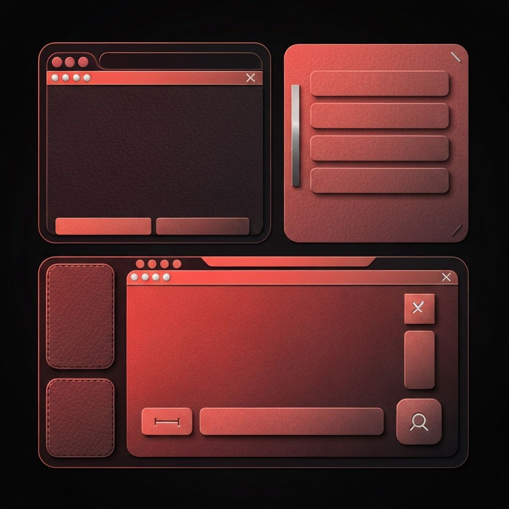
Today's skeuomorphic revival is more sophisticated than its predecessor. It borrows realism selectively: a soft shadow here, a subtle texture there, a tactile button that looks pressable without feeling kitsch. Styles like neumorphism use gentle inner and outer shadows to suggest that elements are carved from a single soft surface. Other approaches use realistic material effects, glass, metal, paper, to anchor interfaces in familiar sensations. The goal is depth without overload.
Where Skeuomorphism Works Best
Skeuomorphic cues work especially well in certain contexts. Creative tools like audio workstations, photography apps, and design platforms benefit from realistic knobs, sliders, and dials. Brands with craftsmanship stories, watchmakers, leather goods, coffee roasters, can use textured surfaces and rich shadows to reinforce their heritage. Gamified experiences and educational tools often rely on tactile feedback to guide users. In each case, the realism supports the brand rather than distracting from it.
Common Visual Techniques
Designers create skeuomorphic effects using carefully layered shadows, highlights, gradients, and textures. Subtle noise patterns add material realism to flat backgrounds. Inner shadows suggest pressed states on buttons. Gradients mimic the curvature of a physical object. Soft bevels and rounded corners evoke plastic or glass. The trick is restraint; too much texture quickly becomes noisy, and over-the-top shadows can make interfaces feel outdated.
Accessibility Considerations
One of the biggest critiques of early skeuomorphism was poor accessibility. Heavy gradients and low-contrast shadows often hurt readability. Modern skeuomorphic design must take accessibility seriously. Interactive elements need clear focus states, sufficient contrast, and visible affordances for keyboard and screen reader users. Decorative textures should remain behind text rather than competing with it. Motion effects should respect reduced-motion preferences.
Performance Implications
Rich visuals can hurt performance if implemented carelessly. Large background textures, heavy PNG shadows, and complex filters can bloat page weight and slow rendering. Modern skeuomorphic design relies on CSS rather than images whenever possible. Box shadows, gradients, and blur effects can produce rich visuals with minimal payload. SVG textures and repeating patterns provide depth while keeping files small. Always test Core Web Vitals to ensure the design does not damage LCP or INP.
Balancing Skeuomorphism and Minimalism
The most successful modern interfaces do not commit fully to either extreme. Instead, they blend skeuomorphic cues with minimalist structure. Pages remain uncluttered, typography stays clean, and navigation is simple. Skeuomorphic elements are reserved for moments that need emphasis, key CTAs, hero illustrations, or specific interactive components. This hybrid approach delivers personality without sacrificing clarity.
Best Practices for Skeuomorphic Web Design
Start with a purpose: what emotion or story do you want depth and texture to reinforce? Build a consistent system of shadows, gradients, and materials rather than improvising on each component. Keep contrast strong and focus states clear. Test on a variety of devices and screen sizes, because subtle effects can disappear on low-resolution or high-glare displays. Monitor performance carefully and iterate based on real user data.
When to Avoid Skeuomorphism
Not every brand benefits from skeuomorphism. Industries that value speed and simplicity, like finance dashboards, enterprise SaaS, and informational portals, usually perform better with cleaner, flatter designs. Highly data-dense interfaces can become visually noisy with too much texture. Always align design choices with user expectations and the nature of the content.
Conclusion
Skeuomorphism is no longer a relic of early mobile design. It is a mature, flexible tool in the modern web designer's kit. Used thoughtfully, it adds warmth, clarity, and personality to interfaces that might otherwise feel generic. By pairing skeuomorphic cues with modern performance, accessibility, and minimalist structure, designers can craft experiences that feel tactile, memorable, and distinctly human. With a careful strategy and the right creative partner, your brand can embrace depth without getting lost in the past.
