The Importance of Great Web Form Design
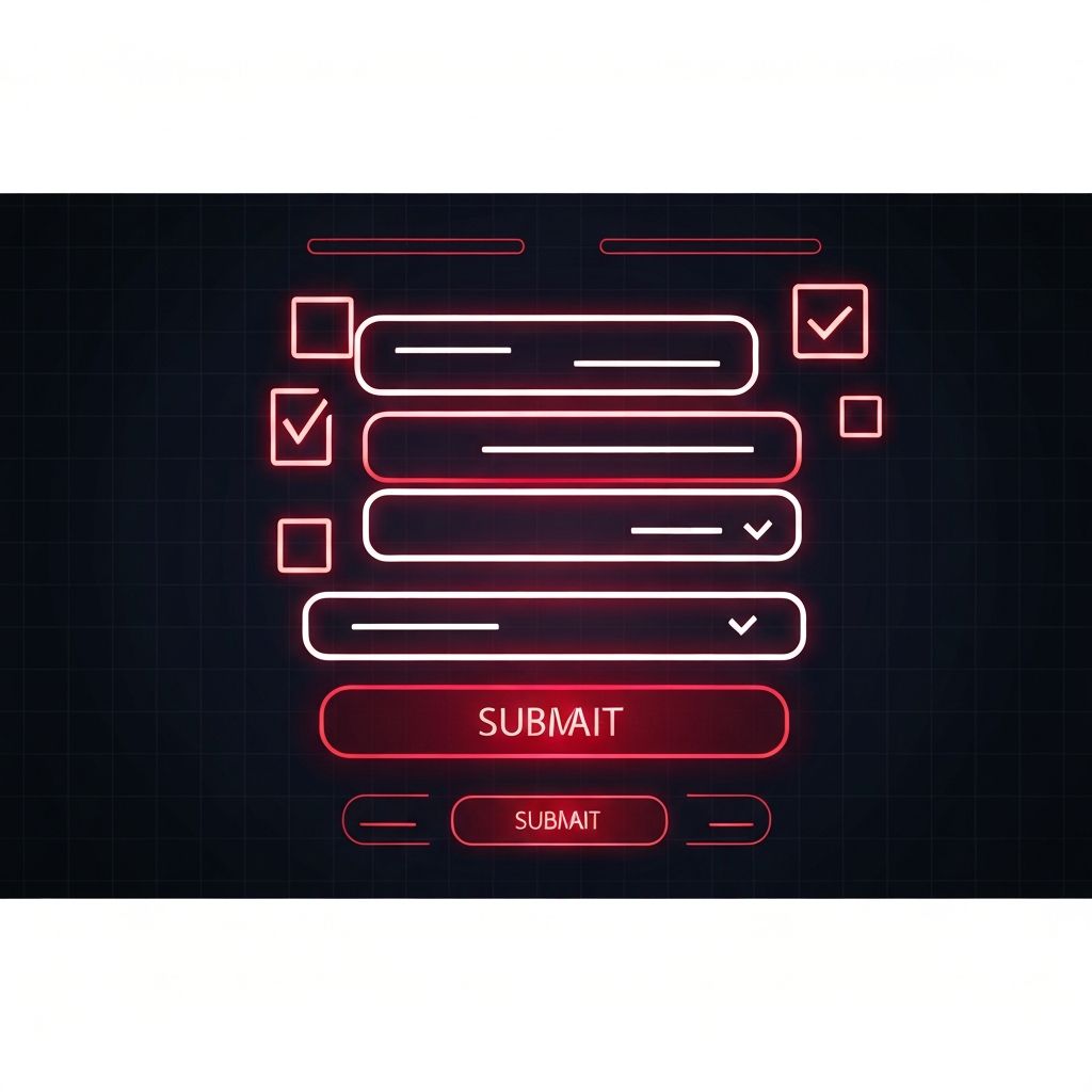
Web forms are everywhere on the modern internet. Sign-up forms, contact forms, checkout forms, survey forms, application forms; almost every meaningful interaction online happens through a form. Yet despite their prevalence, most forms are poorly designed. They're too long, confusing, intimidating, or simply broken on mobile devices. Studies consistently show that thoughtful form design can lift completion rates by twenty to over one hundred percent, making form optimization one of the highest-leverage activities a digital team can pursue.
This article covers the foundational principles of web form design, common layout patterns, validation strategies, and accessibility considerations. By the end, you'll have a clear playbook for designing forms that convert.
Hire AAMAX.CO for Form Design and Web Application Excellence
For teams looking to build forms and web applications that perform at the highest level, AAMAX.CO is a full-service digital marketing company offering web development, digital marketing, and SEO services worldwide. Their team brings deep experience in designing and developing high-converting forms across industries, from simple contact forms to complex multi-step workflows that integrate seamlessly with backend systems.
Principle One: Reduce Cognitive Load
The first rule of great form design is to ask only what you need. Every additional field reduces completion rate. Audit your forms ruthlessly. Do you really need the user's phone number, company size, and job title at this stage, or can you collect that data later? The shorter the form, the higher the completion rate.
Group related fields together and use clear visual hierarchy to guide the eye. Single-column layouts almost always outperform multi-column layouts because they reduce eye movement and cognitive overhead.
Principle Two: Use Clear, Specific Labels
Labels should be above the input field, not inside it as placeholder text. Placeholder labels disappear when the user starts typing, forcing them to remember what each field was for. Floating labels that animate above the field as the user types are a good middle ground.
Be specific in your labels. Instead of "Name," use "Full Name" or "First Name" depending on what you actually want. Instead of "Phone," use "Mobile Phone Number" if that's what you need.
Principle Three: Smart Defaults and Auto-Fill
Pre-fill fields wherever possible. If a user is logged in, their name and email should be pre-filled. Use country detection to default the country dropdown. Take advantage of the autocomplete attribute on inputs so browsers can fill in saved data quickly. These small touches can lift completion rates significantly.
Smart defaults also extend to selectors. If most of your users select "Monthly" for billing frequency, default to it. Reduce the number of decisions users have to make.
Principle Four: Inline Validation
Tell users immediately if their input is wrong. Validating only on submit forces users to scroll back and find their mistakes, which is frustrating and increases abandonment. Inline validation that triggers as users move between fields catches errors at the moment they happen.
Validation messages should be specific and helpful. Instead of "Invalid email," say "Please enter a valid email address, like name@example.com." Instead of "Password requirements not met," show a checklist of requirements that update in real time as the user types.
Principle Five: Mobile-First Design
Most form completions now happen on mobile. Design for thumbs first. Use input types that trigger the right keyboard: email type for email fields, tel type for phone numbers, number type for numeric fields. Make tap targets at least forty-four by forty-four pixels. Avoid placing fields too close together.
Test on real devices, not just simulators. The way a form behaves on a midrange Android device with a slow connection is often very different from how it behaves on the latest iPhone on Wi-Fi. Discover advanced web application development services that prioritize mobile-first form experiences and seamless cross-device performance.
Principle Six: Progress Indicators for Long Forms
If a form has more than five or six fields, consider breaking it into steps with a progress indicator. Steps reduce perceived effort and let you collect data progressively, asking for the most critical information first. Save partial submissions so users can return later without losing progress.
Progress bars, step counters, or breadcrumb-style indicators all work. Choose what fits your visual language best.
Principle Seven: Accessibility Matters
Accessible forms aren't just ethical; they're also better for everyone. Use semantic HTML form elements like input, label, fieldset, and legend. Associate labels with inputs using the for attribute. Provide ARIA attributes for custom components. Ensure forms can be navigated entirely with a keyboard. Test with screen readers like NVDA or VoiceOver.
Color alone should never communicate state. If you mark errors with red, also include an icon and clear text message. This ensures users with color vision deficiencies can still understand what's happening.
Principle Eight: Confirmation and Error Recovery
After submission, confirm clearly that the form was received. Show a success message with next steps if appropriate. If something goes wrong on the server side, preserve the user's input and show a friendly error message rather than dumping them back to an empty form.
Email confirmations or follow-up messages reinforce the action and reduce post-submission anxiety, especially for high-value forms like contact requests or applications.
Examples of Great Form Patterns
Stripe's checkout form is a masterclass in minimal friction. Linear's account creation form leverages magic links to skip passwords entirely. Notion's onboarding form uses smart defaults and pre-fills based on team size. Studying high-quality forms across the web reveals consistent patterns that compound across industries.
Conclusion
Great web form design is part craft, part science. Apply the principles of cognitive load reduction, clear labeling, inline validation, mobile-first design, and accessibility, and your forms will outperform those of competitors who treat them as afterthoughts. Forms are where intention turns into action; design them with the care that intention deserves.
