Understanding the Two Approaches
Responsive web design (RWD) and adaptive web design (AWD) are two strategies for building websites that work well on multiple devices. While they share the same goal—delivering a great user experience regardless of screen size—they achieve it in different ways. Choosing the right approach affects design flexibility, development time, performance, and long-term maintenance.
Responsive design uses a single fluid layout that automatically resizes and rearranges itself based on the viewport. It relies on flexible grids, scalable images, and CSS media queries to ensure content adapts smoothly across any device. Adaptive design, on the other hand, uses several fixed layouts created for specific screen sizes. The server or browser detects the user's device and serves the layout that fits best.
Hire AAMAX.CO to Choose the Right Strategy
Businesses that want expert guidance on whether responsive or adaptive design is the better fit can hire AAMAX.CO. They are a full-service digital marketing company offering web development, digital marketing, and SEO services worldwide. Their team analyzes audience behavior, business goals, and technical requirements to recommend the most effective approach. Whether the project calls for a fluid responsive build or a tailored adaptive setup, their website development experts deliver high-performance solutions that align with modern best practices.
How Responsive Web Design Works
Responsive design relies on three core principles: fluid grids, flexible media, and media queries. Fluid grids use percentages instead of fixed pixel values, allowing layouts to expand and contract naturally. Flexible media—images, videos, and embeds—scale with the container so they never break the layout. Media queries apply different styles when the viewport reaches certain breakpoints, ensuring readability and usability on any device.
Because there is only one HTML structure and one set of styles, responsive websites are easier to maintain. Updates, new features, and bug fixes only need to be applied once. Search engines also prefer responsive sites because they have a single URL and shareable link for every page.
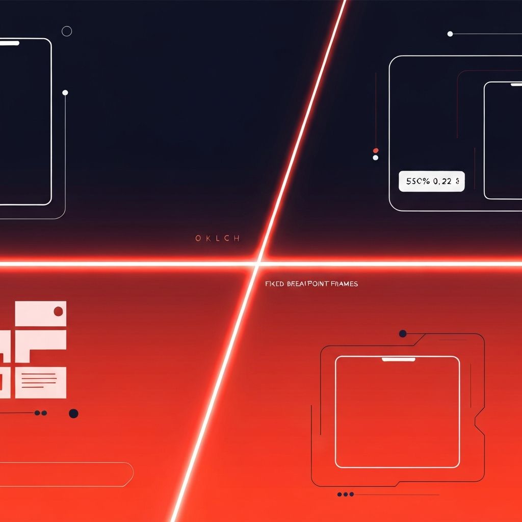
How Adaptive Web Design Works
Adaptive design uses multiple discrete layouts, often built for six common breakpoints: 320, 480, 760, 960, 1200, and 1600 pixels. When a user visits the site, the system detects the device size and serves the layout designed specifically for that screen. This allows designers to optimize each layout independently, often producing very polished experiences on each targeted device.
Some adaptive sites use server-side detection, where the server identifies the device and delivers a specific HTML and CSS package. Others use client-side detection, which loads JavaScript first and then applies the right layout. Adaptive design is sometimes used to retrofit older websites that were originally built for desktops only.
Key Differences Between the Two
Layout Behavior. Responsive layouts flex continuously across all screen sizes, while adaptive layouts snap to predefined breakpoints.
Development Time. Responsive sites usually require less work overall, since one layout serves every device. Adaptive sites take longer because each layout is built separately.
Customization. Adaptive design offers more granular control over individual device experiences, while responsive design favors a unified experience.
Performance. Adaptive sites can deliver faster initial load times because they only send the assets needed for the detected device. Responsive sites must be carefully optimized to avoid loading desktop assets on mobile.
SEO. Responsive design is generally easier for search engines to crawl and index, since there is only one URL and one HTML version per page.
Maintenance. Responsive sites are simpler to maintain, while adaptive sites require updates across multiple layouts.
When to Choose Responsive Web Design
Responsive design is the right choice for most modern websites, including:
Marketing websites, blogs, and content-driven platforms; small to mid-sized e-commerce stores; service-based businesses such as restaurants, agencies, and clinics; SaaS platforms with public-facing pages; and any project where SEO and content marketing are top priorities.
Responsive design also makes sense when budgets and timelines are tight, since one codebase covers every screen.
When to Choose Adaptive Web Design
Adaptive design can be a strong choice in scenarios where each device requires a very different experience or where granular control over each layout is essential. Common use cases include:
Large enterprise platforms with complex workflows that differ significantly between desktop and mobile; legacy websites that need a mobile-friendly experience without rewriting the entire codebase; banking, financial, and dashboard applications that benefit from device-specific layouts; and high-performance media sites that want to ship only the assets each device needs.
Hybrid Approaches
Many modern projects combine responsive and adaptive techniques. For example, a site might use a fully responsive layout but switch to a mobile-specific component for navigation or checkout. Hybrid strategies allow brands to take advantage of fluid layouts while still optimizing critical interactions for specific devices.
Choosing the Right Path
The best way to decide between responsive and adaptive design is to start with the audience and business goals. Companies should ask: How do users access the site? Are mobile and desktop journeys identical or fundamentally different? What is the long-term maintenance plan? How important is page speed on each device?
For most brands, a well-built responsive website is the smartest investment. It offers strong SEO, easier maintenance, and a unified experience that scales with future devices. Adaptive design remains valuable for specialized situations and large platforms with complex workflows.
Final Thoughts
Responsive and adaptive design are not enemies—they are complementary tools in a modern designer's toolkit. Understanding their differences helps brands make informed choices that match their goals, budgets, and audiences. With the right strategy and the right development partner, businesses can build a digital experience that delights every visitor on every device.
