Understanding Responsive Web Design Common Breakpoints
Responsive web design common breakpoints are the screen widths at which a website's layout changes to better fit the user's device. They are defined in CSS using media queries and form the structural skeleton of any responsive site. While there is no single official standard, the industry has converged on a handful of widely used ranges that work well for the majority of devices in circulation today.
Choosing breakpoints wisely is one of the most important decisions in responsive design. Too few, and your layout will look awkward on certain screens. Too many, and your CSS becomes complex, fragile, and hard to maintain. The goal is to use just enough breakpoints to keep your content readable, balanced, and beautiful across the range of devices your audience actually uses.
Hire AAMAX.CO for Pixel-Perfect Responsive Implementation
Translating breakpoint strategy into a production-ready website takes experience. AAMAX.CO can help. They are a full-service digital marketing company offering web development, digital marketing, and SEO services worldwide. Their team builds responsive websites and modern web applications with breakpoint architectures designed around content and user experience rather than arbitrary device sizes. They combine careful design with disciplined CSS practices to deliver sites that look polished on every screen, from compact phones to ultra-wide displays.
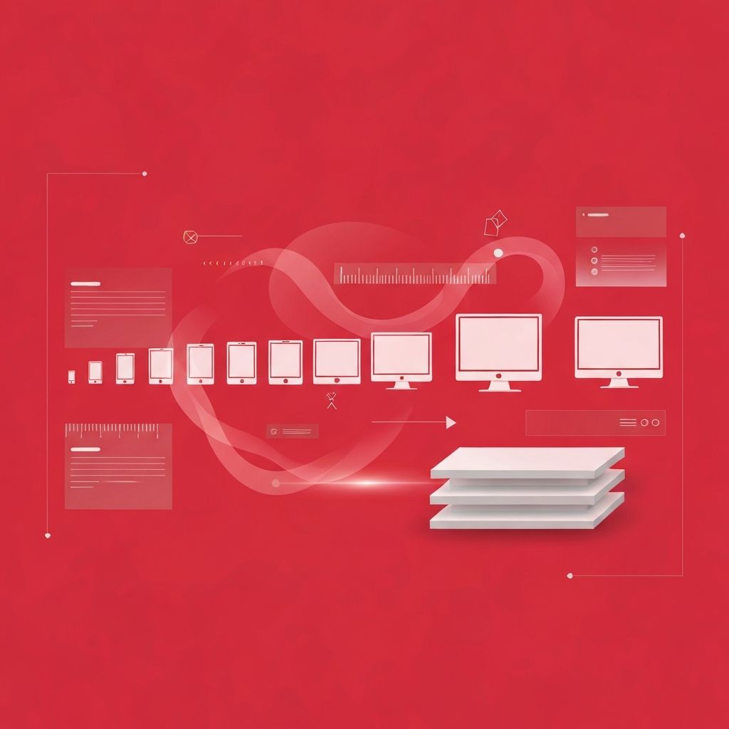
The Most Commonly Used Breakpoints
Most responsive design systems define between three and six major breakpoints. A typical mobile-first set begins with a base style for very small screens and adds enhancements at larger widths. Common breakpoint ranges include extra small for the smallest phones, small for larger phones, medium for tablets, large for laptops and small desktops, extra large for typical desktops, and 2x large for large desktops and ultra-wide monitors.
Popular CSS frameworks have helped standardize these ranges. Tailwind CSS, for example, uses breakpoints around 640, 768, 1024, 1280, and 1536 pixels. Bootstrap uses 576, 768, 992, 1200, and 1400 pixels. While the specific numbers differ slightly, the underlying structure is similar across most modern systems and reflects how content typically wants to break.
Phone Breakpoints
The smallest breakpoints target phones. Modern smartphones range roughly from 320 pixels on the very smallest devices to around 430 pixels on larger flagship phones. Designs at these sizes typically use a single column, large tap targets, simplified navigation such as a hamburger menu or bottom tab bar, and condensed typography. Forms become single-column, images expand to the full width, and secondary information often collapses behind expandable sections.
Tablet Breakpoints
Tablet breakpoints generally start around 600 to 768 pixels and extend up to about 1024 pixels. At these sizes, designs often introduce two-column layouts, side-by-side image and text blocks, and more elaborate navigation. The challenge with tablets is that they bridge mobile and desktop expectations, and orientation matters greatly. A tablet in portrait mode may behave more like a large phone, while in landscape it can resemble a small laptop.
Laptop and Desktop Breakpoints
Laptop and desktop breakpoints typically begin around 1024 to 1280 pixels and continue up to around 1920 pixels. These ranges support multi-column grids, persistent sidebars, mega menus, and richer hover interactions. Typography can grow more sophisticated, with display headlines, larger images, and generous white space. Most editorial layouts and dashboards spend much of their attention here because this is where many users do focused work.
Ultra-Wide and Large Display Breakpoints
Large monitors and ultra-wide displays push beyond 1920 pixels and even 2560 pixels in some cases. Without careful planning, content can stretch awkwardly across these screens, causing long line lengths that hurt readability. The best practice is to set a maximum content width, often between 1200 and 1600 pixels, while allowing background elements such as hero images and color blocks to extend fully. This keeps text readable while still embracing the visual richness of large displays.
Content-First Versus Device-First Breakpoints
While device categories provide helpful intuition, the most resilient breakpoint strategy is content-first. Instead of starting with specific device widths, start with the smallest viewport and slowly resize the browser. Add a breakpoint only when the layout starts to feel cramped or awkward. This approach produces breakpoints that match the natural rhythm of your content and design rather than guesses about future devices.
Content-first thinking also encourages the use of fluid typography and spacing using techniques such as the clamp function, which scales values smoothly between minimum and maximum sizes. With strong fluid scaling, you often need fewer breakpoints because the design adjusts continuously rather than in discrete jumps.
Container Queries Reduce the Need for Many Breakpoints
Container queries have changed how designers think about breakpoints. Instead of relying solely on the viewport, components can respond to the size of their parent container. A card might switch to a horizontal layout when placed in a wide column and stack vertically when placed in a narrow sidebar, regardless of the overall viewport width. This makes design systems more modular and reduces dependence on global breakpoints.
Avoiding Common Breakpoint Mistakes
One mistake is adding too many breakpoints, which leads to brittle CSS that breaks every time devices change. Another is targeting specific devices, such as a particular phone or tablet model, which becomes outdated quickly. A third is hiding important content on mobile rather than restructuring it, which frustrates users who want the same information regardless of device.
The best breakpoint strategies are minimal, content-driven, and aligned with a clear design system. They use fluid scaling for fine adjustments and reserve explicit breakpoints for moments when the layout structure genuinely needs to change.
Testing Across Breakpoints
Always test your design across the full range of breakpoints, not just at the exact widths defined in your CSS. Many issues appear in the in-between zones, just before or after a breakpoint kicks in. Use browser developer tools, real devices, and services like BrowserStack to confirm that the experience holds up across as many environments as possible.
Conclusion
Responsive web design common breakpoints provide a useful starting point, but the best designs treat them as a guide rather than a rule. By focusing on content, embracing fluid scaling, leveraging container queries, and testing thoroughly, designers and developers can build websites that feel intentional and polished on every screen, today and well into the future.
