Why Navigation Menu Web Design Matters
Navigation menu web design is one of the most important elements of any website. The menu is the primary map visitors use to move through content, find products, and complete tasks. A well-designed menu reduces friction, boosts engagement, and increases conversions. A poorly designed one drives users away within seconds. In an era when attention spans are shrinking and competition is just one click away, getting navigation right can mean the difference between a thriving website and a forgotten one.
Modern navigation goes far beyond the basic horizontal bar at the top of the page. It includes mega menus, sticky headers, off-canvas drawers, breadcrumbs, footer navigation, in-page anchors, and contextual sidebars. Each of these patterns serves a different purpose, and the choice depends on the site's structure, audience, and goals.
Hire AAMAX.CO for Navigation-Centric Web Design
Designing menus that delight users while supporting business goals takes experience and craft. AAMAX.CO is a full-service digital agency that helps brands create user-friendly websites with intelligent navigation systems. Their website design team applies UX research, accessibility standards, and conversion best practices to every menu they build, ensuring visitors can find what they need quickly on any device. From small business sites to large enterprise platforms, they design navigation that scales with the brand.
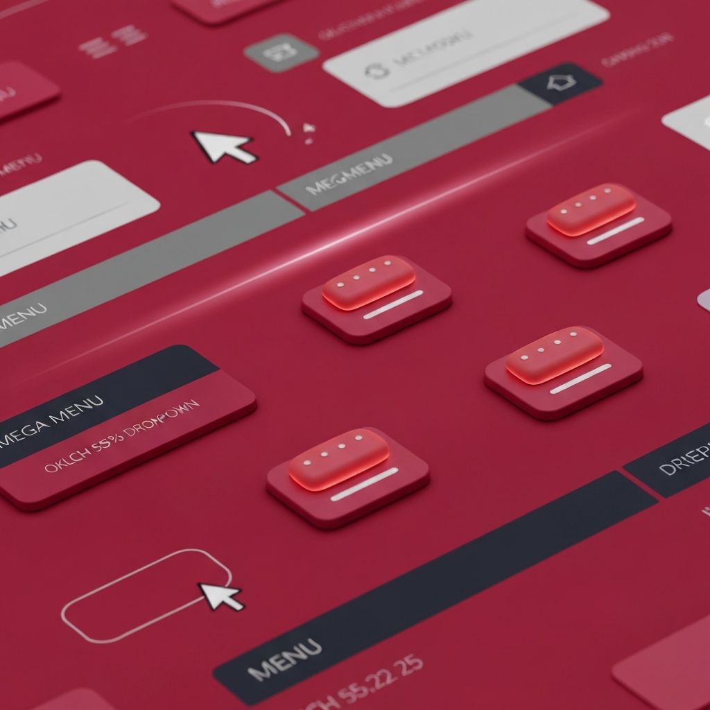
Core Principles of Effective Navigation
Great navigation menu web design follows a handful of timeless principles. First is clarity — labels should be short, specific, and use the language of the user, not internal jargon. Second is consistency — menu placement, behavior, and styling should remain the same across the site so users build muscle memory. Third is hierarchy — the most important pages deserve the most prominent positions, while secondary pages can live in dropdowns or footers.
A fourth principle is feedback. Menus should clearly indicate which item is active, which is hovered, and what will happen on click. Subtle motion, color shifts, and underlines all help. Finally, navigation should be discoverable without being intrusive. Hamburger icons are popular on mobile but can hide important pages from desktop users, so designers must weigh tradeoffs carefully.
Common Navigation Patterns
Several navigation patterns dominate modern web design. The classic horizontal top bar still works for sites with five to seven primary sections. Mega menus expand into multi-column layouts, ideal for e-commerce and large content sites with many categories. Sticky headers keep navigation accessible during long scrolls, while transparent headers blend into hero sections for a cinematic feel.
On mobile, off-canvas drawers, bottom navigation bars, and full-screen overlays each have their place. Bottom bars are popular for app-like experiences because they place primary actions within thumb reach. Drawers preserve screen space but require an extra tap. The right choice depends on how often users switch sections and how content-heavy the site is.
Information Architecture First
Before designing a menu, designers must define the underlying information architecture. This involves grouping pages into logical categories, naming them with user-friendly terms, and prioritizing them based on traffic and business value. Card sorting exercises, tree testing, and analytics review all help validate the structure. A beautiful menu built on a confusing IA will still frustrate users.
Designers should also plan for growth. A menu that fits perfectly today may overflow in a year as new product lines launch. Modular systems with mega menus, search-driven discovery, or smart filtering can absorb growth gracefully without requiring a full redesign.
Accessibility in Navigation Design
Accessibility is critical in navigation menu web design. Menus must be operable by keyboard, screen reader, and switch devices, not just mouse and touch. This means using semantic HTML elements such as nav, ul, and li, providing visible focus states, and adding ARIA attributes where native elements fall short. Dropdowns should open with both hover and click, close with the Escape key, and trap focus appropriately when expanded.
Color contrast, font size, and target size all matter. Apple's and Google's human interface guidelines recommend touch targets of at least 44x44 pixels — a rule that should apply to every interactive menu item. Ignoring accessibility not only excludes users but also increases legal risk under regulations like the ADA and EAA.
Performance and Animation
Navigation menus often involve animations: dropdowns sliding open, drawers transitioning in, underlines morphing across items. These details can elevate the experience but must be implemented with care. CSS transforms and opacity changes are GPU-friendly, while animating layout properties like width and height can cause jank. Reduced-motion preferences should be respected to support users with vestibular sensitivities.
Designers should also avoid loading huge images or heavy scripts inside mega menus. Lazy-loading content behind menus and prefetching only the most likely next page can keep performance budgets in check.
Search as Navigation
For content-rich sites, search complements traditional menus and sometimes replaces them. Type-ahead search with smart suggestions, recent queries, and visual results can become a primary navigation tool. Combining a clean menu with powerful search ensures both browsers and goal-driven users find their way quickly.
Testing and Iteration
The best navigation comes from continuous iteration. Heatmaps, session recordings, click-tracking, and A/B tests all reveal how real users interact with menus. Designers should watch for common pain points: menu items ignored, dropdowns closed accidentally, mobile drawers abandoned. Each insight feeds back into the next iteration.
Conclusion
Navigation menu web design sits at the intersection of usability, accessibility, branding, and business strategy. Done well, it makes a site feel intuitive and effortless. Done poorly, it sabotages every other design decision. By following solid principles, choosing the right patterns, and partnering with experts like AAMAX.CO, brands can build navigation systems that delight users today and scale gracefully into the future.
