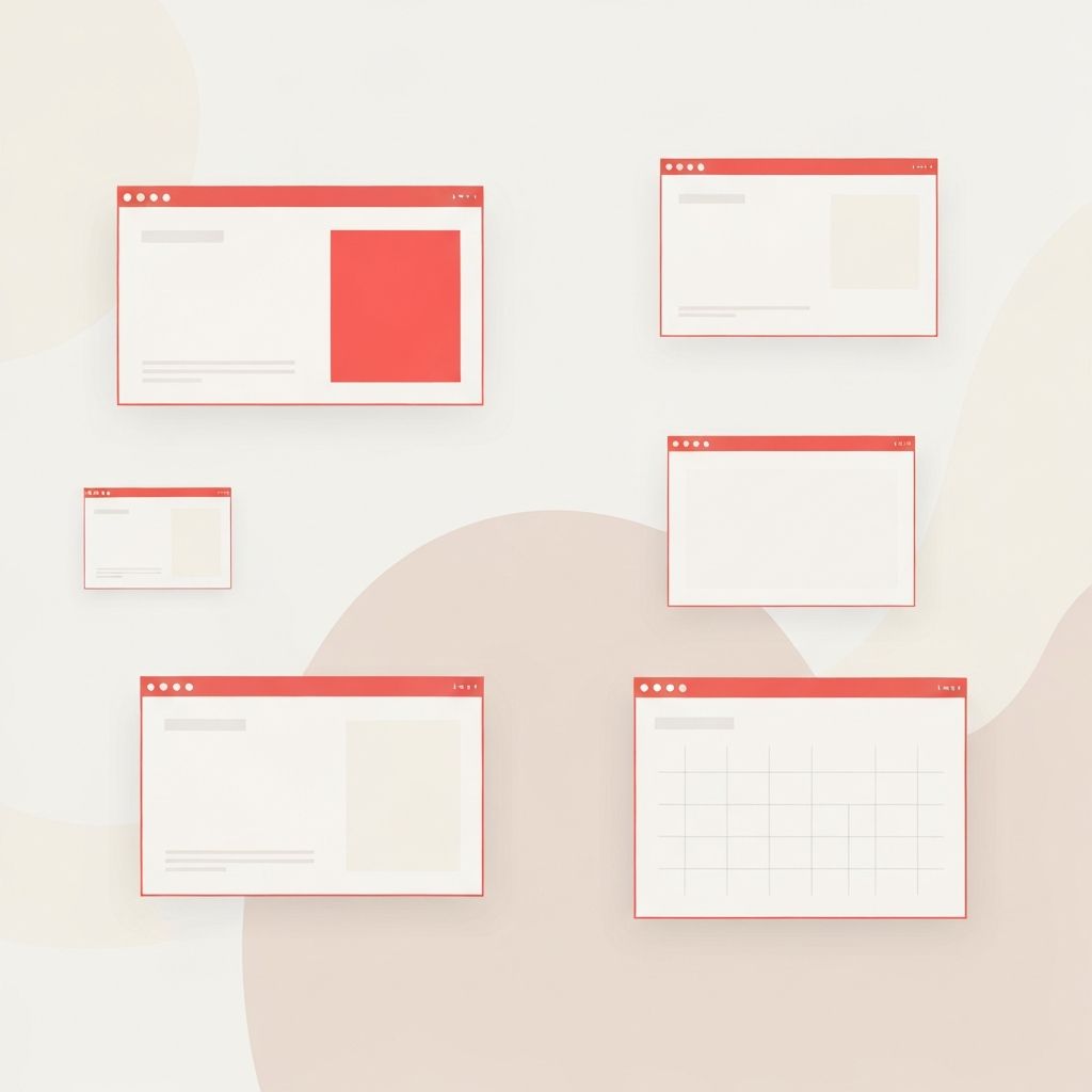
Minimalist web design is more than a stylistic choice; it is a strategic philosophy that strips away unnecessary elements to focus attention on what truly matters. By using whitespace, restrained typography, and purposeful imagery, minimalist websites communicate clearly, load quickly, and feel timelessly elegant. In an era of digital noise, minimalism stands out by offering calm, clarity, and confidence.
Hire AAMAX.CO for Minimalist Web Design and Development Services
Brands seeking a refined digital presence often turn to AAMAX.CO, a full-service digital marketing company that offers world-class web development, digital marketing, and SEO services. Their team has helped businesses across industries embrace minimalism without sacrificing functionality, blending elegant aesthetics with robust website development practices. They understand that minimalism is not about doing less, but about doing more with intention, and they craft digital experiences that feel both modern and enduring.
The Core Principles of Minimalist Web Design
At its heart, minimalist web design follows a few essential principles: clarity, hierarchy, restraint, and purpose. Every element on the page must justify its presence. If a button, image, or line of text does not serve the user, it is removed. This philosophy forces designers to think critically about each decision and ensures that nothing distracts from the core message.
Hierarchy is established through scale, weight, and spacing rather than ornamentation. A single bold headline, supported by a short paragraph and a clear call-to-action, can be more persuasive than a page filled with competing visuals.
The Power of Whitespace
Whitespace, also known as negative space, is the silent hero of minimalism. It gives content room to breathe, guides the eye, and creates a sense of premium quality. Brands like Apple, Stripe, and Notion use whitespace masterfully to elevate their products and reinforce trust.
Whitespace is not wasted space. It improves comprehension, reduces cognitive load, and helps users focus on the most important content. When used intentionally, it transforms a simple layout into a sophisticated experience.
Typography as a Design Element
In minimalist design, typography often becomes the centerpiece. With fewer visual elements competing for attention, the choice of typeface, size, weight, and spacing carries enormous weight. Designers gravitate toward clean sans-serifs like Inter, Helvetica, or Geist, paired occasionally with a refined serif for contrast.
Limiting the design to one or two typefaces, with carefully tuned scale and rhythm, ensures consistency and readability. Letter-spacing, line-height, and paragraph length are all fine-tuned to enhance the reading experience.
Restrained Color Palettes
Minimalist websites typically rely on a limited color palette, often built around neutrals with one or two accent colors. This restraint creates visual harmony and ensures that calls-to-action stand out. Monochromatic schemes, off-whites, soft grays, and a single bold accent are common choices.
Color is used purposefully to direct attention, signal interaction, or reinforce branding, never as decoration for its own sake.
Performance and Accessibility Benefits
Beyond aesthetics, minimalism delivers tangible technical benefits. Fewer elements mean faster load times, smaller page weights, and improved Core Web Vitals. This translates to better SEO rankings, lower bounce rates, and a smoother experience on slower connections or older devices.
Minimalism also tends to be more accessible. Clear hierarchy, generous spacing, and high contrast make content easier to read for users with visual impairments or cognitive challenges. Screen readers benefit from clean semantic structure, and keyboard navigation becomes more predictable.
Common Pitfalls to Avoid
While minimalism may look simple, executing it well is challenging. A common mistake is confusing minimalism with emptiness. Removing too much content can leave users without context or guidance. Another pitfall is sacrificing usability for visual purity, hiding navigation behind ambiguous icons or relying solely on hover states.
True minimalism balances restraint with clarity. Every interaction must remain intuitive, every piece of content must serve a purpose, and the overall experience must feel effortless rather than sparse.
Modern Techniques and Trends
Contemporary minimalism embraces subtle motion, tactile micro-interactions, and refined details. Smooth scroll-triggered animations, gentle hover effects, and carefully crafted transitions add personality without compromising simplicity. Variable fonts allow for expressive typography while keeping file sizes small.
Dark-mode-friendly palettes, oklch color spaces, and accessible focus states are also becoming standard in modern minimalist projects. These advancements allow designers to create experiences that feel fresh while still honoring the timeless principles of minimalism.
Conclusion
Minimalist web design endures because it respects the user. By focusing on clarity, hierarchy, and intention, it creates websites that load fast, communicate effectively, and feel premium. Whether for a startup, a portfolio, or a global enterprise, minimalism offers a powerful framework for building digital experiences that stand the test of time.
