Understanding Material Design for Web Applications
Material Design, developed by Google, has become one of the most influential design systems in digital product development. Originally created for Android applications, Material Design principles have successfully translated to web environments, creating cohesive experiences across platforms. Understanding and implementing these principles enables designers to create intuitive, visually appealing web experiences that feel familiar to billions of users.
The system's foundation rests on principles inspired by physical materials, particularly paper and ink. This tangible metaphor helps users understand interface behaviors and spatial relationships. Light, surface, and movement create depth and hierarchy that guides user attention and interaction.
Professional Material Design Implementation by AAMAX.CO
AAMAX.CO brings expertise in implementing design systems like Material Design for web projects. Their web application development services incorporate industry-standard design principles to create polished, professional digital experiences. As a full-service digital marketing company, they understand how design systems contribute to brand consistency and user satisfaction across all digital touchpoints.
Core Material Design Principles
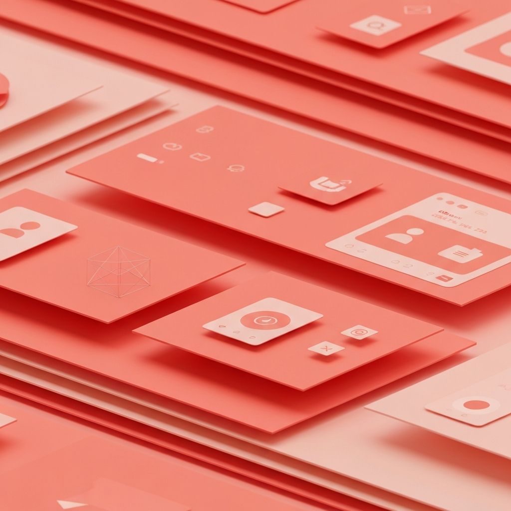
Material is the metaphor that gives the design system its name. Surfaces behave like physical paper, casting shadows and stacking in understandable ways. This physicality creates intuitive depth relationships that users naturally comprehend without explicit instruction.
Bold, graphic, and intentional design characterizes Material Design aesthetics. Large typography, deliberate color choices, and meaningful imagery create impactful visual experiences. Every element serves a purpose; decorative additions without function are avoided.
Motion provides meaning in Material Design. Animations show spatial relationships, indicate state changes, and guide attention. Movement is never arbitrary but always serves to enhance understanding and engagement.
Material Design Surface and Elevation
Surfaces in Material Design are the building blocks of interface construction. Each surface represents a piece of material with specific properties including color, shape, and elevation. Understanding surface behavior enables creation of coherent spatial interfaces.
Elevation creates hierarchy through shadow depth. Higher elevation indicates greater importance or prominence. Consistent elevation patterns help users understand interface organization and component relationships.
Cards exemplify Material Design surface principles. These contained units hold related content and actions, appearing to float above the background surface. Card design demonstrates how surfaces create visual organization and interaction boundaries.
Sheets, both bottom sheets and side sheets, use surface behavior to present additional content or options. Their sliding motion and elevation change communicate their relationship to underlying content.
Typography in Material Design
Material Design's type system creates clear hierarchy through scale, weight, and spacing. The system defines specific text styles for different purposes, from large headlines to body text to button labels. This systematic approach ensures consistency across applications.
Roboto serves as Material Design's primary typeface, designed specifically for digital interfaces. Its geometric forms and open curves optimize legibility across screen sizes and resolutions. Alternative typefaces can be used while maintaining the scale and hierarchy principles.
Type scale in Material Design defines a set of contrasting sizes that work together harmoniously. The scale provides sufficient variety for hierarchy while maintaining visual coherence. Restricting to scale sizes prevents arbitrary sizing decisions.
Material Design Color System
The Material Design color system balances brand expression with usability considerations. Primary colors establish brand identity, while secondary colors provide accent and variety. The system ensures accessibility through defined contrast requirements.
Color application follows specific patterns in Material Design. Surfaces typically use neutral colors, while interactive elements and status indicators use more saturated hues. This differentiation helps users understand what can be interacted with.
Dark theme implementation in Material Design requires careful color adaptation. Colors that work in light themes may need adjustment for dark backgrounds. The system provides guidance for creating accessible, attractive dark themes.
Component Examples and Implementation
Buttons in Material Design come in multiple variants with specific use cases. Contained buttons with background color serve primary actions, while text buttons suit less prominent options. Understanding button hierarchy prevents visual confusion.
Text fields follow specific patterns for states, labels, and feedback. Outlined and filled variants suit different contexts. Error states, helper text, and character counts follow consistent patterns across implementations.
Navigation components including bottom navigation, navigation drawer, and tabs provide consistent wayfinding. Each component suits specific contexts and information architectures. Selection follows prescribed visual treatments.
Lists and grids organize content collections according to Material Design patterns. Consistent spacing, alignment, and interaction patterns create familiar experiences. Customization possibilities exist within these established frameworks.
Motion and Animation Principles
Material Design motion serves functional purposes beyond decoration. Transitions show relationships between elements and states. Animation duration and easing follow specific guidelines that feel natural and purposeful.
Choreographed motion coordinates multiple element animations into coherent sequences. Related elements move together in patterns that communicate their relationships. This choreography creates polished, professional experiences.
Responsive motion adapts to user input, providing feedback that confirms actions and indicates states. Touch feedback, loading indicators, and state transitions all follow motion principles that feel immediate and responsive.
Responsive Implementation for Web
Material Design for web requires responsive adaptation across screen sizes. Breakpoints and layout grids ensure appropriate presentation from mobile to desktop. Component density may vary between touch and pointer interfaces.
Layout grids in Material Design use columns, gutters, and margins that adapt to screen width. These grids provide consistent spacing and alignment while accommodating different content amounts and screen sizes.
Component adaptation may involve changing from bottom navigation to navigation rails or drawers at larger sizes. These transitions should feel natural and maintain navigational consistency.
Material Design Web Resources and Tools
Material Design's official documentation provides comprehensive guidance for implementation. The material.io website offers specifications, guidelines, and resources for designers and developers.
Material UI for React and other component libraries provide pre-built implementations of Material Design components. These libraries accelerate development while ensuring design system compliance.
Design tools including Figma and Sketch offer Material Design component kits. These resources enable rapid prototyping and design exploration within the system's guidelines.
Customization Within Material Design
Material Design allows substantial customization while maintaining system coherence. Theming capabilities enable brand expression through color, typography, and shape modifications. This flexibility enables unique applications that still feel recognizably Material.
Shape customization affects component corners from rounded to cut to fully rounded. These shape families create distinctive visual identities while maintaining functional clarity.
Custom components can be created following Material Design principles. Understanding the underlying logic enables extension of the system for unique needs not covered by standard components.
