Why Login Web Design Deserves Serious Attention
The login screen is often the first place a returning user interacts with a product, yet many teams treat it as an afterthought. A poorly designed login form can frustrate users, increase support tickets, and drive customers to competitors. On the other hand, a thoughtful login web design feels effortless, builds confidence, and quietly reinforces the brand every time someone signs in. Whether you run a SaaS platform, an e-commerce store, or a member-only community, the login experience deserves the same level of care as your home page.
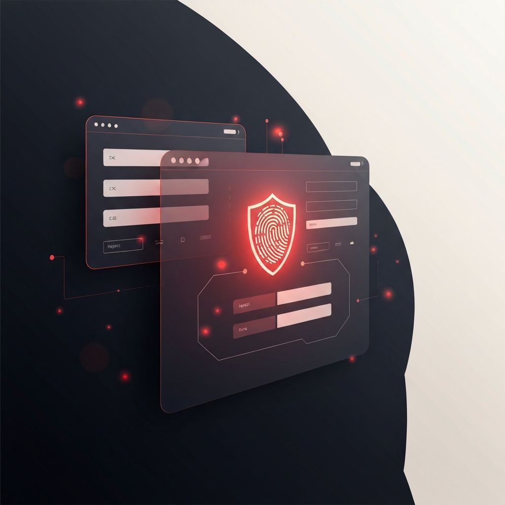
Modern login design goes beyond a simple email and password field. It involves layout, micro-interactions, accessibility, security, and even emotional tone. The goal is to make users feel safe and welcomed while still meeting the technical demands of authentication, password recovery, multi-factor verification, and session management.
Hire AAMAX.CO for Login and Authentication Web Design
If you want a login experience that is both beautiful and secure, you should consider hiring AAMAX.CO. They are a full service digital marketing company offering web development, digital marketing, and SEO services worldwide, and their team has extensive experience designing authentication flows for SaaS apps, online portals, and e-commerce platforms. They balance UX best practices with modern security standards like OAuth, SSO, and MFA, ensuring the login screen feels modern without compromising on safety. From subtle animations to clearly written error messages, they treat every detail as part of the brand experience.
Core Principles of Great Login UX
The first rule of login design is clarity. Users should immediately see two things: where to enter their credentials and how to recover access if they forget them. Field labels should be visible at all times rather than disappearing the moment a user types. Error messages should be specific ("Email not recognized" vs. "Invalid input") and appear close to the relevant field. Avoid generic warnings that leave users guessing.
The second rule is consistency. Login screens should match the rest of your product's visual identity — same fonts, same colors, same logo placement. Users feel reassured when the login looks like a natural extension of the website or app, not a third-party page. A well-planned website design system will include reusable components for inputs, buttons, alerts, and modals that can be reused across login, signup, and onboarding screens.
Layout Patterns That Work
Several layout patterns dominate modern login design. The centered card on a clean background is the most common: a single column with logo, form, and footer links. It works well for desktop and mobile, especially when combined with a subtle background image or gradient. The split-screen layout, with branding or marketing imagery on one side and the form on the other, is popular for SaaS products that want to reinforce value propositions during sign-in.
Whichever layout you choose, keep the form short. Email and password are usually enough; everything else should live on signup or in the user's profile. Add visible options for "Show password", "Remember me", and "Forgot password", since these address the most common pain points users face during authentication.
Security and Trust Signals
Users are more aware of online security than ever before. Your login design should reflect that awareness. Clearly indicate that the page uses HTTPS, display your logo and brand name correctly, and avoid asking for unnecessary personal data. Where possible, support modern authentication options such as social login, single sign-on (SSO), passkeys, and magic links. These reduce password fatigue and lower the risk of account takeover.
Multi-factor authentication (MFA) deserves special design care. The MFA step should explain what the user needs to do, where the code came from, and how long it will be valid. Confusing MFA screens are one of the top reasons people abandon accounts, so investing in a clean, helpful flow has direct business value.
Accessibility and Inclusive Design
Accessibility is non-negotiable on a login screen. Use semantic HTML for forms, provide proper labels and ARIA attributes, and ensure that all interactive elements can be reached via keyboard. Color contrast should meet WCAG AA standards, and error messages should be announced by screen readers. Users with disabilities, older devices, or temporary impairments (like a broken arm) should be able to log in without friction.
For complex products, custom web application development can integrate biometric login, hardware keys, and adaptive authentication to make the process even smoother for power users while maintaining security for everyone else.
Onboarding the New User
The login page should make life easy for both returning users and new ones. A clear "Don't have an account? Sign up" link helps new users find the right path quickly. Some products combine login and signup in a single screen using progressive disclosure: the user enters their email first, and the system decides whether to show a password field or a signup form based on whether the email already exists.
Final Thoughts
Login web design is a small surface with an outsized impact on conversions, retention, and trust. By focusing on clarity, consistency, security, and accessibility, you can turn a routine sign-in into a positive brand moment. Treat the login screen as a product feature, not a chore, and you will see fewer support requests, higher retention, and a stronger overall user experience.
