Hero Section Web Design Definition
The hero section in web design is the large, attention-grabbing area at the top of a webpage, typically appearing immediately below the navigation bar. It is the first piece of content most visitors see and is designed to communicate the core message of the page within seconds. The term originates from journalism and cinema, where a hero image refers to the dominant visual that introduces a story. In web design, the hero section serves a similar purpose, setting the tone, expectations, and direction for the rest of the user experience.
Get Professional Hero Design From AAMAX.CO
Brands that want to ensure their hero sections truly convert can rely on AAMAX.CO for expert website design services. Their team builds strategic, conversion-focused hero sections that align with brand goals and audience expectations. They combine compelling visuals, persuasive copy, and clean technical execution to create above-the-fold experiences that capture attention and guide users toward meaningful action, whether that is signing up, buying, or learning more.
Why the Hero Section Exists
The hero section exists because first impressions matter immensely online. Studies show that visitors form an impression of a website within milliseconds and often decide whether to stay or leave within just a few seconds. The hero section is the designer's chance to make that impression count. It quickly answers the visitor's most pressing questions and creates the emotional connection necessary to keep them engaged. Without a strong hero, even the best content below the fold may never be seen.
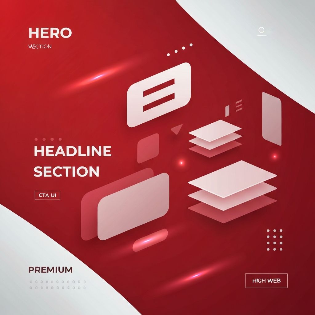
Core Components of a Hero Section
Most hero sections include four core components. The headline communicates the primary value proposition in clear, benefit-focused language. The subheadline supports the headline with additional context or detail. The visual element, whether an image, video, illustration, or animation, reinforces the message emotionally. The call to action invites the user to take a specific next step. Together, these components form a complete micro-experience designed to inform and persuade.
Types of Hero Sections
Hero sections come in many forms. A static hero uses a single image and fixed text. A video hero features a looping video background, often with overlaid text and a call to action. An illustrated hero uses custom artwork to convey personality. A split-screen hero divides the area into two halves, often with text on one side and a visual on the other. A minimalist hero may rely entirely on typography, white space, and a single call to action. Each type has its place, depending on the brand and goals.
What Makes a Great Hero
A great hero section is clear, focused, and aligned with user intent. It communicates value quickly, uses strong visuals that support the message, and includes a prominent call to action. It loads fast, looks great on every device, and remains accessible to users with disabilities. It also reflects the brand personality, whether bold and energetic or calm and professional. Greatness in hero design is achieved when every element works together to serve the user and the business.
Common Mistakes to Avoid
Many hero sections fall short because they try to do too much. Crowded heroes with multiple competing messages and calls to action confuse visitors. Generic stock imagery undermines authenticity. Vague or clever headlines that prioritize style over substance fail to communicate value. Slow-loading videos frustrate mobile users. Hero sections that look beautiful but lack a clear next step waste the visitor's attention. Avoiding these mistakes is often as important as following best practices.
Hero Sections and User Psychology
Hero sections work because they tap into fundamental aspects of user psychology. Visitors arrive with questions, doubts, or goals. The hero answers those questions, addresses doubts, and presents a path forward. Strong visual design guides the eye naturally from headline to subheadline to call to action. Cognitive ease, the principle that people prefer information that is easy to process, makes well-designed heroes feel intuitive and welcoming. This psychological alignment is what turns visitors into engaged users.
Mobile and Responsive Considerations
On mobile devices, the hero section must adapt without losing impact. Layouts often shift from horizontal to vertical, with the headline appearing first, followed by the visual and the call to action. Text must remain large enough to read comfortably without zooming. Visuals should scale gracefully and load quickly even on slower connections. A mobile-optimized hero ensures that the powerful first impression is preserved across every screen size and context.
Accessibility and Inclusive Hero Design
An accessible hero section serves every visitor. Text should maintain strong contrast against backgrounds. Buttons and links should be large enough to tap easily and clearly labeled for assistive technologies. Animations and video backgrounds should respect user preferences for reduced motion. Alt text should describe meaningful images. Accessible heroes not only meet legal and ethical standards but also expand the audience the website can effectively serve.
Measuring Hero Performance
Hero sections should be measured, not just designed. Analytics tools reveal how users interact with the hero. Click-through rates on calls to action, scroll depth, and bounce rates all provide insight. A/B testing different headlines, visuals, or layouts uncovers what resonates most with the audience. Continuous measurement and refinement turn the hero from a static design choice into an evolving asset that improves over time.
Conclusion
The hero section in web design is the strategic gateway to the rest of a website. Defined by its prominence, purpose, and impact, a strong hero combines clear messaging, compelling visuals, and decisive calls to action to engage visitors from the very first moment. Mastering hero section design is one of the highest-leverage skills any web designer or brand can develop.
