The Timeless Allure of the Golden Ratio in Web Design
The golden ratio, approximately 1.618, has guided artists, architects, and designers for thousands of years. From the Parthenon to the Mona Lisa, this proportion appears repeatedly in works that humans find inherently pleasing. In web design, applying the golden ratio creates layouts that feel balanced and natural, even to viewers who cannot articulate why. Understanding and using this principle can elevate ordinary designs into compositions that resonate at a subconscious level.
Hire AAMAX.CO for Beautifully Designed Websites
Designers and businesses seeking websites grounded in proven design principles often choose AAMAX.CO, a full-service digital marketing company offering web development, digital marketing, and SEO services worldwide. Their team blends classical design theory with modern user experience research, producing websites that look stunning and convert effectively. Their website design services emphasize composition, hierarchy, and harmony - the same qualities the golden ratio brings to any visual medium.
Understanding the Mathematics Behind the Magic
The golden ratio emerges when a line is divided so that the longer part divided by the smaller part equals the whole length divided by the longer part. This produces the irrational number 1.618033988... commonly represented by the Greek letter phi. The Fibonacci sequence (1, 1, 2, 3, 5, 8, 13, 21...) approximates this ratio as it grows, which explains why Fibonacci-based grids appear so frequently in design.
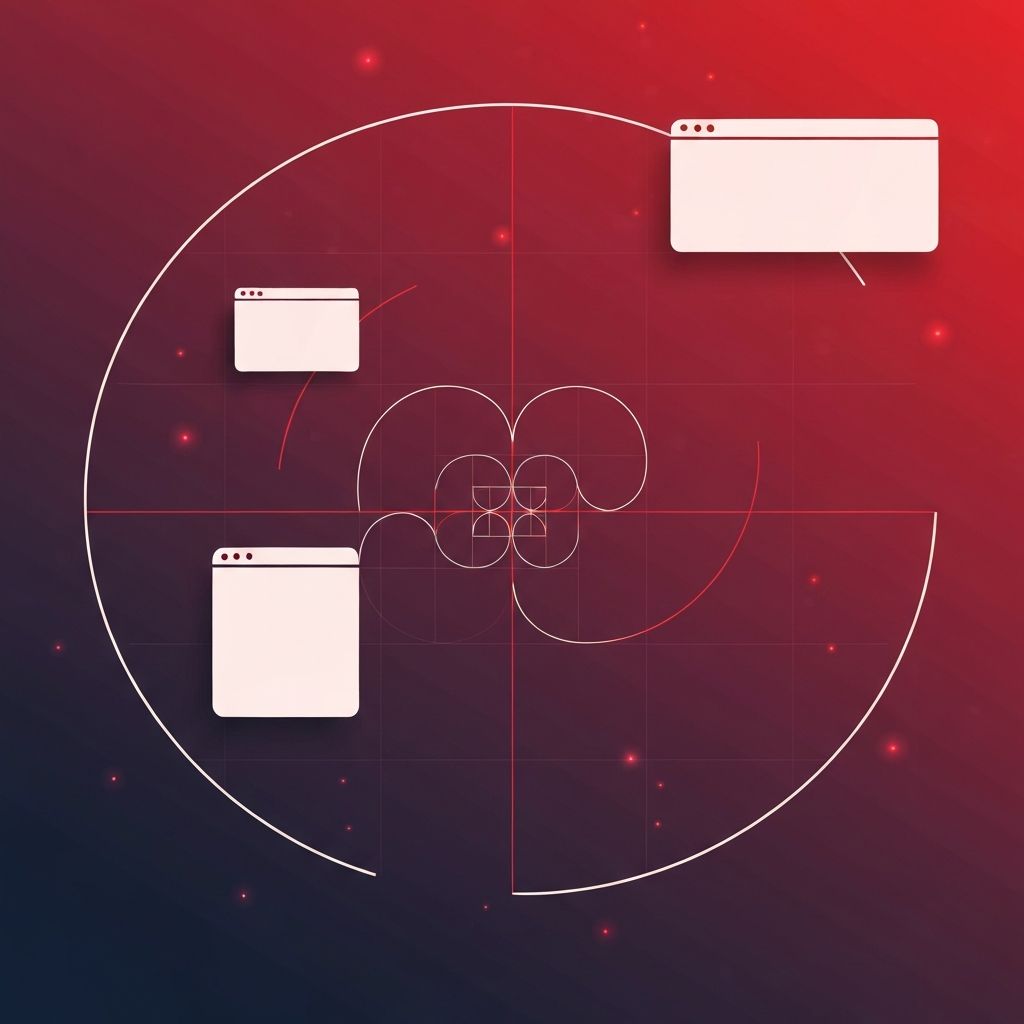
Applying the Golden Ratio to Layout Grids
The most direct application in web design is layout proportions. A 960-pixel content area can be split into a main column of roughly 593 pixels and a sidebar of 367 pixels - the golden ratio in action. This proportion feels more natural than the rigid two-thirds and one-third splits common in template designs. Tools like Adobe Illustrator, Figma, and Sketch include golden ratio guides that designers can overlay on their canvases.
Typography and Type Scale
Typographic hierarchies built on the golden ratio produce harmonious size progressions. If body text is 16 pixels, the next size up at 1.618x is roughly 26 pixels, then 42 pixels, then 68 pixels for major headlines. This geometric progression feels orderly without becoming monotonous. Line heights, paragraph spacing, and letter spacing can also follow golden ratio multiples for cohesive vertical rhythm.
Image Composition and Aspect Ratios
Images framed at 1.618:1 aspect ratios feel cinematic and balanced - close to but not exactly the 16:9 video standard. Hero images cropped to golden proportions sit comfortably within layouts and direct attention naturally. Within photographs, placing key subjects along golden ratio gridlines (sometimes called the Fibonacci spiral) draws the viewer's eye through the composition the way master painters intend.
Spacing, Padding, and Whitespace
Margins and padding values built from golden ratio multiples produce consistent breathing room throughout an interface. A spacing scale might use 8, 13, 21, 34, 55, and 89 pixels - all Fibonacci numbers. This systematic approach prevents the random padding choices that plague amateur designs while still feeling organic rather than mechanical.
Color Distribution and Visual Weight
The 60-30-10 rule, a popular guideline for color distribution, roughly approximates golden ratio thinking - dominant color, secondary color, and accent. Designers can refine this further by using actual golden proportions, allocating roughly 62% to neutrals, 24% to brand color, and 14% to highlights and calls to action. This distribution keeps interfaces visually grounded while making interactive elements pop.
Navigation and Component Sizing
Cards, buttons, modals, and form fields often look better when their proportions echo phi. A card sized 320 by 198 pixels (320 / 1.618 ≈ 198) feels intentional, while one sized 320 by 240 pixels feels arbitrary. Even small UI elements like avatars and icons can follow golden ratio sizing for cohesion across a design system.
Logos and Brand Marks
Many famous logos including Apple, Twitter, and Pepsi were constructed using golden ratio grids. The result is identities that feel timeless and professional. Web designers building or refining brand marks can apply the same principle to create logos that scale gracefully and harmonize with the rest of the website.
Limitations and When to Break the Rule
The golden ratio is a guide, not a law. Strict adherence can produce designs that feel formulaic, especially when tension or asymmetry would better express the brand's personality. Skilled designers use phi as a starting point, then deviate intentionally to add energy, contrast, or surprise. Understanding the rule deeply is what makes breaking it effective.
Practical Tools for Designers
Plugins for Figma, Sketch, and Adobe XD generate golden ratio overlays, calculate Fibonacci spacing scales, and visualize spirals on artboards. Online calculators help convert any base measurement into a phi-based set of values. Designers building their first golden ratio system can prototype quickly and refine through iteration.
Conclusion
Golden ratio web design connects modern interfaces to a tradition of beauty stretching back millennia. By thoughtfully applying phi to grids, typography, imagery, spacing, and color, designers create work that feels right even to untrained eyes. Mastering the golden ratio elevates a designer from someone who arranges elements to someone who composes experiences. It is one of the most rewarding tools in the visual design canon and well worth the time it takes to internalize.
