Introduction
Dashboards have become the command centers of modern digital businesses. From SaaS platforms and analytics tools to internal admin panels and customer portals, dashboard web design plays a critical role in helping users understand data, make decisions, and take action. A great dashboard is not just a collection of charts; it is a carefully crafted interface that prioritizes clarity, speed, and relevance for the people who rely on it every day.
Hire AAMAX.CO for Professional Dashboard Design
If you need a polished, high-performance dashboard for your product or business, you can hire AAMAX.CO for expert web design and development services. Their team specializes in building data-rich interfaces that balance aesthetics with usability, helping organizations turn raw information into actionable insights. As a full-service digital marketing company, they bring deep expertise in design, development, and SEO to every project they deliver worldwide.
What Makes a Great Dashboard
A great dashboard answers three questions instantly: What is happening? Why is it happening? What should I do next? To do this, it must surface the most important metrics first, provide context for those metrics, and make it easy to drill down into details. This requires a strong information hierarchy, consistent visual language, and a deep understanding of the user's goals.
Successful dashboards also respect cognitive load. Cluttered screens packed with charts overwhelm users and bury insights. Designers should ruthlessly prioritize, removing anything that does not serve a clear decision-making purpose. White space, clear typography, and thoughtful grouping help users scan quickly and focus on what matters.
Information Architecture and Layout
The foundation of dashboard design is information architecture. Start by mapping user roles and the questions each role needs answered. An executive may want a single view of revenue and churn, while an operations manager may need granular data on tickets, response times, and team performance. Tailor the layout to these needs rather than forcing a one-size-fits-all template.
Most dashboards benefit from a layered structure: a high-level summary at the top, key trends in the middle, and detailed tables or logs at the bottom. Use cards, panels, and clear section headers to organize content. Responsive grids ensure the layout adapts gracefully to different screen sizes without sacrificing readability.
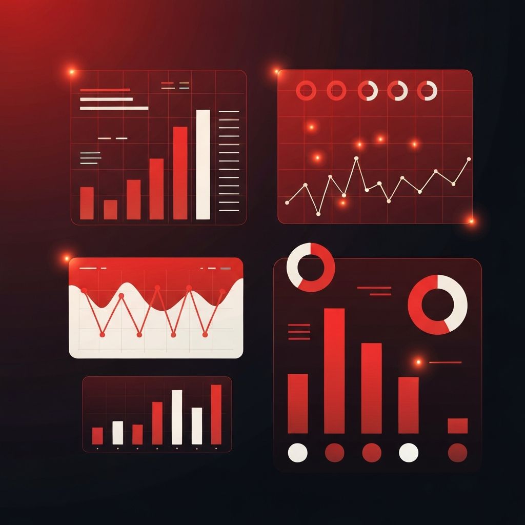
Data Visualization Best Practices
Data visualization is the heart of dashboard design. Choose chart types based on the story you want to tell: bar charts for comparisons, line charts for trends over time, pie charts only for simple part-to-whole relationships, and tables for precise values. Avoid 3D effects, excessive colors, and decorative elements that distort perception.
Color should be used purposefully. Reserve bright accents for highlights, alerts, and key metrics. Use neutral palettes for background data so important figures stand out. Always test for color blindness and ensure sufficient contrast for accessibility. Tooltips, legends, and concise labels help users interpret charts without confusion.
Performance and Real-Time Updates
Dashboards often handle large datasets, so performance is critical. Slow load times and laggy interactions erode trust quickly. Optimize queries, paginate large tables, and use caching strategies to deliver instant responses. For real-time data, websockets and efficient streaming techniques keep dashboards fresh without overwhelming the browser.
Skeleton loaders, progressive rendering, and clear loading states make waits feel shorter. When data is updating, indicate it visibly so users know what they are seeing is current. A fast, responsive dashboard is the difference between a tool people love and one they avoid.
Customization and User Roles
Different users need different views. Modern dashboards allow customization through saved layouts, filters, and personalized widgets. Role-based access ensures sensitive data is visible only to those who need it, while permissions control who can edit, export, or share information.
Building these capabilities requires solid backend architecture and thoughtful UX. Partnering with an experienced web application development team ensures your dashboard scales with your business and supports complex user hierarchies without compromising performance.
Mobile and Responsive Considerations
Many users access dashboards on tablets and phones, especially executives reviewing data on the go. Responsive design is no longer optional. Prioritize the most critical metrics for smaller screens, collapse secondary panels into expandable sections, and ensure touch targets are large enough for mobile interaction.
Testing on real devices is essential. Emulators help, but actual usage uncovers subtle issues with gestures, scroll behavior, and chart rendering. A truly mobile-friendly dashboard feels native, not like a shrunken desktop interface.
Security and Data Privacy
Dashboards often display sensitive business or personal data. Security must be built in from day one. Use strong authentication, encrypted connections, role-based access control, and audit logs. Comply with relevant regulations such as GDPR or HIPAA depending on your industry.
Regular security reviews and penetration testing help identify vulnerabilities before attackers do. A breach can destroy user trust overnight, so investing in robust protection is non-negotiable for any serious dashboard product.
Conclusion
Dashboard web design is a discipline that blends UX, data visualization, performance engineering, and security. When done well, dashboards empower teams to make faster, smarter decisions with confidence. By focusing on user goals, simplifying complexity, and partnering with skilled designers and developers, businesses can transform overwhelming data into a clear competitive advantage.
