Introduction
Bento box web design has quickly become one of the most recognizable layout trends of the decade. Inspired by the compartmentalized Japanese lunch box, this style organizes information into a grid of clearly defined cards, each highlighting a single feature, product, or story. The result is a layout that feels orderly, visually rich, and easy to scan, even when packed with information. From Apple to leading SaaS platforms, brands are adopting bento layouts to communicate complex value propositions in a single screen.
This article breaks down what bento box web design really is, why it works so well, and how to implement it in a way that supports both branding and conversions.
Build Your Bento Layout with AAMAX.CO
If you want a polished bento-style website that loads fast, ranks well, and converts visitors into customers, you can hire AAMAX.CO. Their team specializes in modern website design and development, helping brands turn dense product stories into clean, modular layouts that perform beautifully on every device.
What Is Bento Box Web Design?
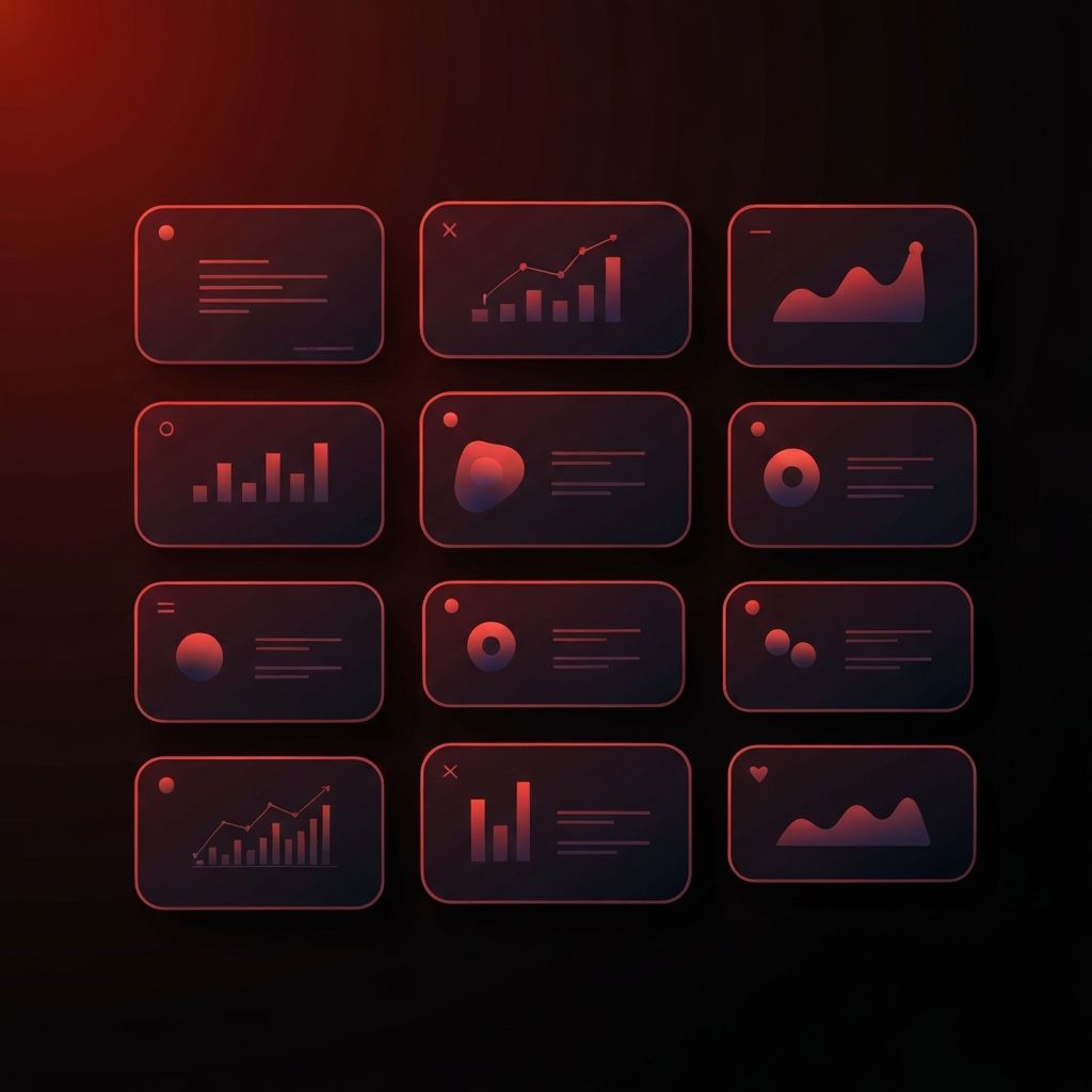
At its core, bento box design is a modular grid where each cell is a self-contained unit of content. Cells can vary in size, color, and content type, mixing imagery, short copy, icons, and even small animations. The visual rhythm comes from the contrast between large and small cells, dense and airy compositions, and the consistent rounded corners or soft shadows that hold the system together.
Unlike traditional long-scroll layouts that rely on hero sections and stacked rows, bento layouts let users absorb multiple ideas almost simultaneously. This makes them especially powerful for product pages, feature overviews, and portfolio sections.
Why Bento Layouts Work So Well
Bento design works because it respects how people actually read websites. Most users scan rather than read, jumping from one focal point to the next. A grid of clearly separated tiles gives them obvious entry points and a sense of control. They can dive deeper into the cells that interest them and skim past the rest without feeling overwhelmed.
It also supports storytelling. By placing related ideas side by side, bento layouts create visual relationships between features, benefits, and proof points. This helps users connect the dots faster than a long, linear narrative ever could.
Strong Visual Hierarchy
One of the biggest strengths of bento design is its built-in hierarchy. Larger cells naturally draw the eye first, making them perfect for hero messages, signature features, or hero imagery. Smaller cells then act as supporting evidence, secondary features, or quick stats. Designers can guide attention without resorting to heavy typography or aggressive color contrast.
This makes bento layouts particularly effective for brands that want to feel premium and confident without shouting. The structure itself does the heavy lifting.
Mobile Responsiveness and Bento Grids
A common concern with bento layouts is how they behave on smaller screens. Done well, the grid simply collapses into a single column where each cell becomes its own focused section. Done poorly, it turns into an awkward stack of mismatched blocks. The key is to design the grid mobile-first and decide which cells deserve to be hero elements on small screens.
Smart use of order, padding, and content priority ensures that the experience feels just as intentional on a phone as it does on a desktop. This is where experienced designers and developers add real value.
Storytelling Through Modular Content
Bento boxes are excellent vehicles for storytelling because each cell can carry a single, focused message. Instead of writing long paragraphs explaining every feature, brands can pair a short headline with a meaningful image or icon and let the layout do the rest. Over time, this approach trains users to expect quick, digestible insights from your site.
It also makes content easier to maintain. New features can be added by dropping in another cell, and outdated ones can be removed without disturbing the rest of the page.
Branding Opportunities
Because bento cells can each carry their own background color, gradient, or imagery, the layout becomes a powerful branding canvas. Designers can use a curated palette to create rhythm across the grid, alternating brand colors, neutral tones, and accent shades to keep the eye moving. Subtle motion, such as hover effects or scroll-triggered animations, can add personality without overwhelming the user.
This is why bento layouts feel so on-brand for tech and lifestyle companies. The grid becomes an extension of the brand system rather than just a container for content.
Best Practices for Bento Box Design
To get the most out of bento layouts, keep cells focused on one idea each. Avoid stuffing multiple messages into a single tile, and resist the urge to make every cell visually loud. Use whitespace generously, both inside and between cells, to give the design room to breathe.
Consistency matters too. Stick to a clear set of corner radii, shadows, and spacing values so the grid feels like one cohesive system. Typography should be restrained, with one or two clear styles used across the entire layout.
When Bento Design Works Best
Bento layouts shine on landing pages, product feature sections, portfolio grids, and dashboards where multiple pieces of information need to coexist. They are less ideal for long-form articles or pages that require deep, sequential reading. The trick is to use bento where it amplifies clarity and switch to more traditional layouts where users need to focus on a single, continuous narrative.
Conclusion
Bento box web design is more than a passing trend. It is a flexible, scalable system that helps brands communicate complex stories in a clear, premium way. When implemented thoughtfully, it improves scannability, strengthens branding, and supports conversions across devices. For any business looking to refresh its digital presence, the bento approach is worth a serious look.
