A Look Back at 2020 Web Design Trends
The year 2020 reshaped how people use the internet. With more time spent online than ever before, web design responded with bold visuals, expressive typography, and experiences designed to feel alive. Many of the trends that defined that year — dark mode, glassmorphism, oversized type, asymmetrical layouts — have continued to influence design years later. Looking back at 2020 isn’t just nostalgia; it’s a useful exercise in understanding how today’s standards came to be.
This article walks through the most influential 2020 web design trends, why they emerged, and how they’ve aged. For designers and business owners alike, knowing where current best practices come from makes it easier to choose which trends to keep, which to retire, and which to revisit.
Hire AAMAX.CO for Timeless, Trend-Aware Web Design
Trends move quickly, and chasing every one of them is a recipe for a site that needs a redesign every two years. AAMAX.CO helps brands strike the right balance between contemporary design and lasting usability. Their team draws on years of experience across website design projects to apply trends with intention — using them where they reinforce the brand and skipping them where they’d quickly look dated. They serve clients globally with a measured, strategic approach.
Dark Mode Goes Mainstream
Dark mode existed before 2020, but that year it became a baseline expectation. Major operating systems shipped with dark themes, and websites began offering toggles to match. Dark mode reduces eye strain in low-light environments, conserves battery on OLED displays, and creates dramatic visual contrast for content like photography, code, and data dashboards.
The challenge in 2020 was that many sites added dark mode as an afterthought. Buttons, illustrations, and shadows didn’t adapt, leading to broken visuals. The lasting lesson is that dark mode requires its own design system — not just an inverted version of the light theme.
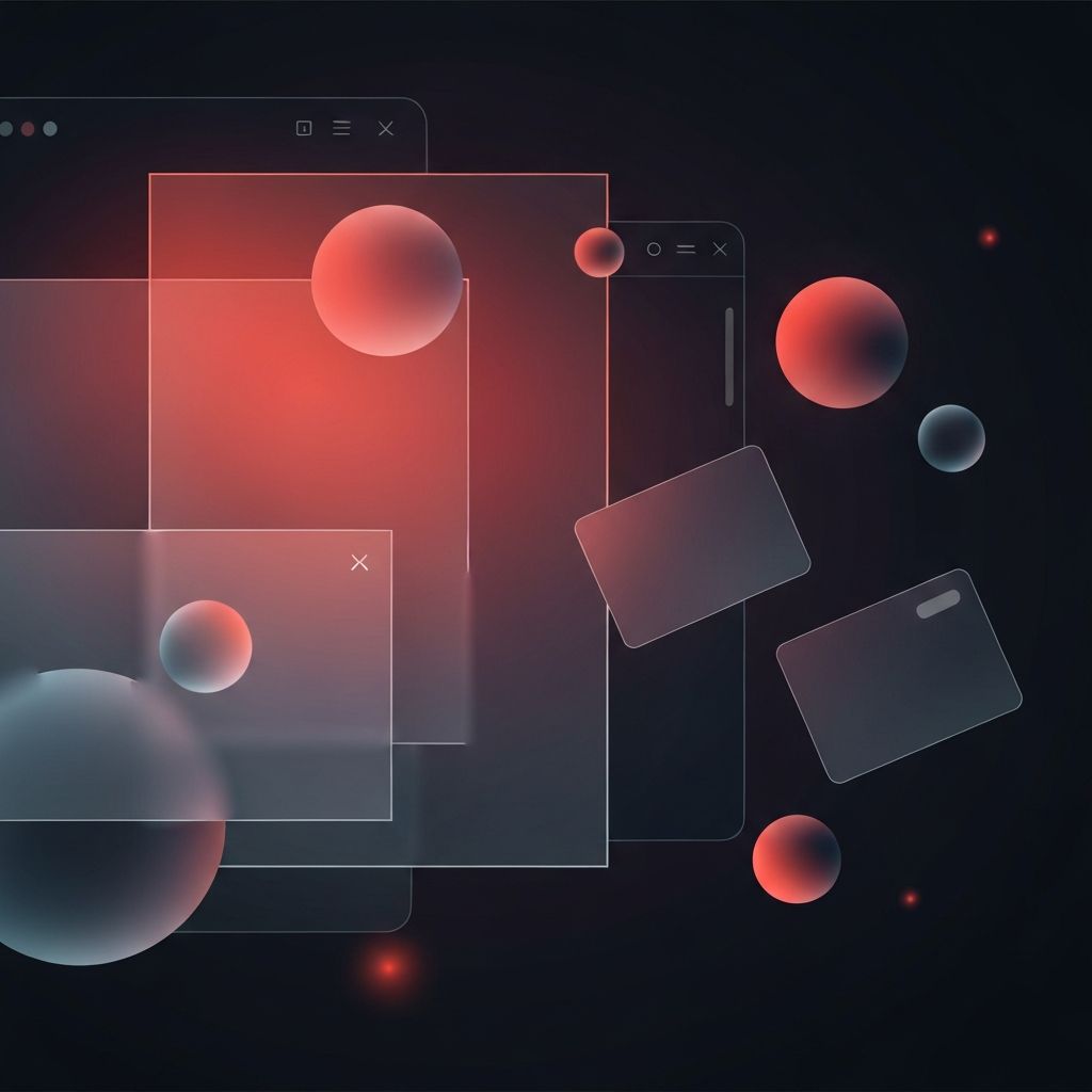
Glassmorphism and Soft Layering
Glassmorphism — translucent surfaces with frosted blur effects — became a defining visual style of 2020. Inspired by macOS Big Sur, Apple’s redesigned operating system, the look spread across landing pages, dashboards, and product marketing sites. Layered cards seemed to float, creating depth without heavy drop shadows.
The trend works best when used sparingly, on top of rich backgrounds that give the blur something interesting to react to. Overused, it can hurt readability and accessibility. Many sites that adopted it heavily in 2020 have since pulled back to use it as an accent rather than a primary style.
Oversized Typography
2020 saw typography take center stage. Headlines grew enormous, sometimes spanning the full width of the viewport, treating words as the primary visual element. Variable fonts gained traction, allowing designers to fine-tune weight, width, and slant directly in the browser without loading multiple font files.
This trend pushed brands to invest in custom typefaces and to treat type itself as identity. The best examples balanced bold typography with restrained color palettes, letting words carry the visual weight. The trend has aged well and continues to influence modern design.
Asymmetrical and Broken Grid Layouts
Designers grew tired of perfectly aligned twelve-column grids and began experimenting with intentional imbalance. Headlines bled off the edge of the screen, images overlapped columns, and content shifted unpredictably across breakpoints. Done right, the asymmetry created energy and personality. Done poorly, it created confusion.
The lasting takeaway is that grids are tools, not rules. Breaking them on purpose, with clear hierarchy and accessibility in mind, can produce memorable layouts. Random asymmetry without intent simply looks broken.
Three-Dimensional Illustrations and Renders
2020 marked the rise of 3D illustrations as a hero element on landing pages. Tools like Spline, Blender, and Cinema 4D made it easier to produce custom 3D assets, and brands moved away from generic stock illustrations toward unique rendered scenes. The look was tactile, glossy, and instantly recognizable.
Modern web application development increasingly incorporates real-time 3D using libraries like Three.js and React Three Fiber, building on the same aesthetic foundation but adding interactivity. The trend has matured from static renders to live, interactive experiences.
Microinteractions and Subtle Motion
2020 saw a surge in microinteractions — the small animations that respond to user actions. Buttons bounced when clicked, form fields glowed on focus, and icons morphed between states. These details made interfaces feel responsive and alive without overwhelming users.
The key was restraint. Sites that animated everything quickly became exhausting, while sites that picked a few critical interactions to enhance felt polished. The principle still holds today: motion should reinforce meaning, not decorate every element.
Scrolling as a Storytelling Device
Long-form scrollytelling became more sophisticated in 2020. Designers used scroll-triggered animations, parallax layers, and pinned sections to guide users through narratives. News organizations, brand campaigns, and portfolio sites all adopted the pattern.
The risk was hijacking the user’s scroll, which could disorient or annoy. The best implementations kept the user in control while adding subtle motion as scroll progressed. This trend continues today, refined by performance improvements and better libraries.
Accessibility Moves to the Foreground
2020 also marked a turning point for accessibility awareness. High-profile lawsuits, increased advocacy, and public guidelines pushed accessibility from a checklist item to a core design concern. Designers began considering color contrast, focus indicators, reduced motion preferences, and screen reader compatibility from the start of every project.
This shift has only strengthened in the years since. Accessibility isn’t a 2020 trend — it’s a permanent expectation that every modern website development project should embrace.
Conclusion: 2020 Set the Stage for Modern Design
The 2020 web design trends weren’t just stylistic experiments — they reflected a moment when the web had to absorb millions of new users, support more remote work, and feel more human. Dark mode, bold typography, expressive motion, and accessibility all matured during that year and shaped the standards that continue to define modern web design. Understanding the lineage helps designers and business owners make smarter choices today, picking the trends that have proven their staying power and leaving the rest behind.
