Introduction
2016 was a pivotal year for web design. The industry was settling into a post-flat-design era, blending the clarity of minimalism with new layers of depth, motion, and personality. Material design from Google had matured, mobile-first thinking was the default, and brands were investing heavily in storytelling through video, animation, and immersive scrolling. Looking back at 2016 web design trends offers valuable perspective on how today's interfaces evolved and which ideas have proven timeless.
Hire AAMAX.CO for Trend-Driven Web Design and Development
Whether you want a refreshed brand experience or a complete digital transformation, they at AAMAX.CO deliver future-ready websites that build on proven design principles. Their team studies trends carefully and applies only the patterns that genuinely improve engagement and conversions. From bold typography to immersive scrolling, their website development services help brands stay current without chasing fads.
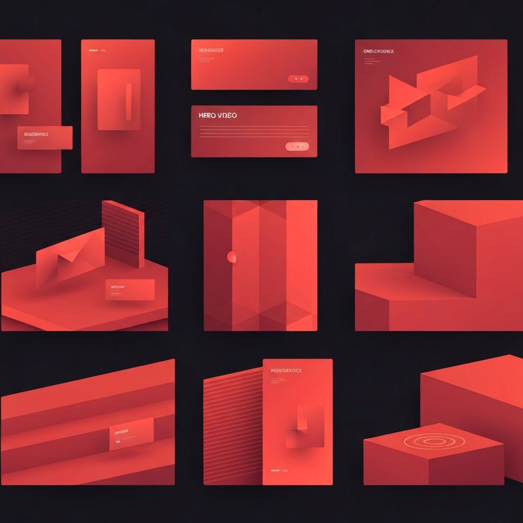
The Rise of Hero Videos
One of the most defining trends of 2016 was the use of full-screen background videos on landing pages. Brands replaced static hero images with looping cinematic clips that conveyed mood, lifestyle, and product benefits within seconds. Hospitality, automotive, and fashion industries embraced this approach because it created emotional resonance instantly. The trend pushed designers to think about performance, autoplay etiquette, and fallback experiences for users on slow connections.
Card-Based Layouts
Cards became the default content container in 2016. Inspired by Pinterest, Material Design, and Twitter, cards offered a modular way to present information consistently across devices. They scaled gracefully from desktop grids to mobile single-column stacks, making them ideal for responsive design. News sites, e-commerce platforms, and SaaS dashboards adopted cards because they balanced visual variety with structural predictability.
Bold Typography
Typography took center stage in 2016. Designers paired oversized headlines with generous whitespace to create magazine-style impact. Custom typefaces from services like Google Fonts and Typekit allowed brands to express personality without bloating page weight. Typography became a primary design element rather than a passive layer, often replacing imagery entirely on hero sections and editorial pages.
Microinteractions and Animation
Subtle animation transformed user interfaces in 2016. Microinteractions, such as button hover states, form validation feedback, and loading indicators, added polish and clarity. Designers used CSS transitions, SVG animation, and JavaScript libraries to bring interfaces to life without overwhelming users. The principle was simple: motion should support the user's task, not distract from it.
Material Design Maturation
Google's Material Design evolved significantly in 2016, providing a comprehensive system for layout, typography, color, and motion. Many non-Google products adopted Material principles, particularly the use of layered surfaces, ink-based animations, and meaningful elevation. Material Design demonstrated how a unified design system could scale across products and platforms while remaining flexible enough for unique brand expression.
Long-Form Scrolling and Storytelling
The era of users hating to scroll officially ended. Designers embraced long-form pages that guided visitors through narratives, often using parallax effects, sticky navigation, and full-viewport sections. Editorial publishers, agencies, and tech companies built immersive case studies and product pages that felt more like interactive magazines than traditional websites. This trend laid the groundwork for the scroll-driven experiences that dominate today.
Modular Grids and Asymmetry
While 12-column grids remained popular, 2016 saw growing experimentation with asymmetric layouts and modular grids. Designers broke out of rigid columns to create dynamic compositions inspired by editorial print design. CSS Grid was on the horizon, and Flexbox adoption made it easier to build complex responsive layouts without floats or hacks.
Color and Gradients Return
After years of muted flat color palettes, 2016 welcomed a resurgence of vibrant gradients and duotones. Spotify's iconic duotone campaign and Instagram's gradient logo update signaled a new appetite for richer color. Designers used gradients to add depth, energy, and brand personality without abandoning the simplicity that flat design had championed.
Mobile-First Becomes Standard
By 2016, mobile traffic surpassed desktop for many industries. Mobile-first design moved from buzzword to default workflow. Designers prototyped on small screens first, then scaled up, ensuring that core experiences worked beautifully on any device. Performance budgets, image optimization, and progressive enhancement became essential skills for every web team.
What 2016 Trends Still Hold Up
Many 2016 trends remain influential. Card layouts, bold typography, meaningful microinteractions, and mobile-first thinking are now considered fundamentals rather than trends. Hero videos and long-form storytelling continue to drive engagement when used thoughtfully. The lessons from 2016 emphasize balance: combining visual impact with usability, and innovation with performance.
Conclusion
2016 was a year of bold experimentation that produced lasting design conventions. By revisiting these trends, modern designers and businesses can identify which ideas were ahead of their time and which were temporary fads. The best digital products today still draw on the clarity, storytelling, and motion principles that defined this transformative year. Partnering with an experienced agency ensures that your website honors timeless design wisdom while embracing the innovations of today and tomorrow.
