Introduction
The 2000s were a transformative decade for the internet. Websites evolved from text-heavy academic pages into visually rich, interactive experiences that defined an entire generation of digital culture. From glossy buttons and reflective logos to skeuomorphic textures and gradient-heavy backgrounds, 2000s web design represents an era of bold experimentation, technical innovation, and stylistic excess. Understanding this era is essential for designers and businesses who want to appreciate where modern UX comes from and why certain trends keep returning in nostalgic revivals.
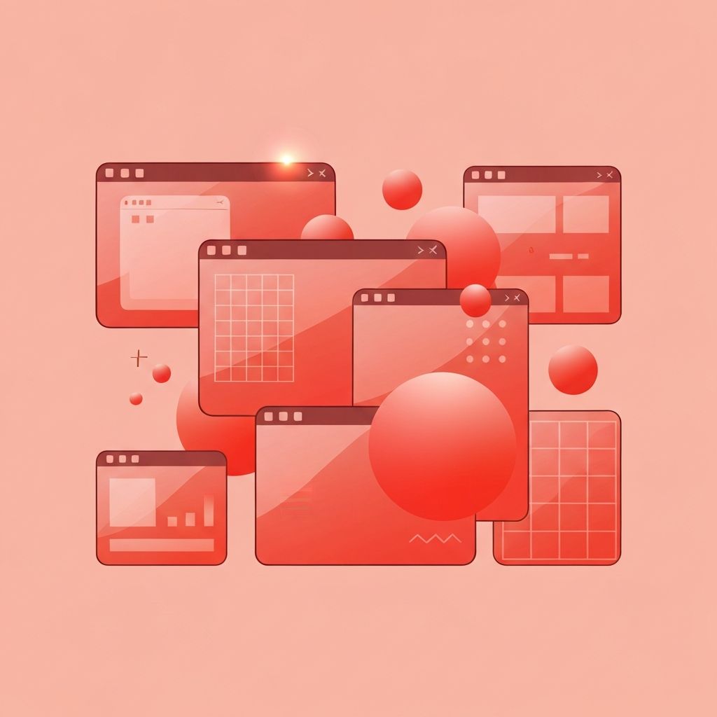
Hire AAMAX.CO for Modern Web Design Inspired by Timeless Eras
If you love the personality of early-2000s websites but want a fast, responsive, and conversion-optimized experience, they at AAMAX.CO can help. Their team blends nostalgic design influences with modern best practices to deliver brand experiences that stand out. Whether you need a complete website design overhaul or a polished retro-inspired campaign site, they craft pixel-perfect interfaces backed by clean, scalable code.
The Rise of Visual Web Design
At the start of the decade, the web was largely a utilitarian space. Designers worked within the constraints of slow connections, small monitors, and limited browser capabilities. By the mid-2000s, however, broadband adoption accelerated, and Adobe Flash, CSS, and JavaScript matured rapidly. Designers began layering imagery, animation, and interactivity in ways that had previously been impossible. Websites became more than informational documents; they became experiences.
Signature Visual Trends
Several recognizable styles defined 2000s web design. Glossy reflections on logos and buttons, often called the Web 2.0 look, were everywhere. Designers used radial gradients, drop shadows, and bevel effects to give flat shapes a sense of depth and physicality. Rounded corners replaced sharp edges, and pastel color palettes softened the look of corporate sites. Stock photography of smiling business professionals became a cliché but signaled trust and professionalism.
Skeuomorphism also rose to prominence. Interface elements were designed to mimic real-world objects, such as leather-textured calendars, wooden bookshelves for media libraries, and metallic toolbars. This approach helped users transition from physical workflows to digital ones, but it also created visually heavy pages that pushed browsers to their limits.
Layout Conventions of the Era
Most websites were built using HTML tables for layout. Designers nested tables inside tables to achieve complex grids, often slicing large Photoshop mockups into individual images. Fixed-width designs of 800 or 1024 pixels were standard, optimized for the dominant CRT monitors of the time. Sidebars, top navigation bars, and footer link farms became conventional patterns that persisted long after better solutions emerged.
CSS adoption grew steadily, and by the late 2000s, semantic markup and div-based layouts began replacing table layouts. This shift laid the groundwork for the responsive and accessible web we enjoy today.
Typography and Color
Typography in the 2000s was limited by web-safe fonts such as Arial, Verdana, Georgia, and Times New Roman. To break out of these constraints, designers often replaced headlines with images of stylized text, sometimes enhanced with sIFR or Cufón replacement techniques. Color palettes leaned toward bright blues, oranges, and greens, frequently paired with white backgrounds to create energetic, optimistic visuals.
The Flash Revolution
Adobe Flash dominated the era, enabling designers to create animated splash pages, interactive games, and immersive brand experiences. Restaurants, fashion brands, and entertainment studios competed to produce the most cinematic intros. While Flash later fell out of favor due to performance and accessibility issues, it pushed creative boundaries and influenced how people thought about motion and interaction online.
Lessons Modern Designers Can Learn
While few designers would recommend returning to table layouts or Flash splash screens, the 2000s offer valuable lessons. The era prioritized personality, brand expression, and emotional resonance, qualities that minimalist modern interfaces sometimes lack. Selective use of textures, gradients, and playful animation can humanize a digital product without sacrificing usability. Many contemporary trends, including neumorphism, glassmorphism, and Y2K revival aesthetics, are direct descendants of 2000s sensibilities.
Why Studying Web Design History Matters
Understanding the evolution of web design helps modern teams make better decisions. Designers who know why rounded corners, gradients, and three-column layouts became popular can apply those patterns intentionally rather than reflexively. Clients benefit from working with agencies that understand both the heritage and the future of the medium, ensuring that brand experiences feel timeless rather than tied to a single trend cycle.
Conclusion
The 2000s were messy, ambitious, and unforgettable in the world of web design. They taught us how visual language could transform a static document into an immersive brand experience. While modern best practices favor speed, accessibility, and responsiveness, the spirit of experimentation that defined the 2000s still inspires today. Brands that want to channel that energy responsibly can work with experienced agencies to bring nostalgic style and contemporary engineering together in one cohesive product.
