Introduction: Forms Are the Heartbeat of Every Web Page
Behind every click that matters on the web is a form. Whether it collects an email address, a credit card, a loan application, or a simple message, the form is where visitor intent meets business outcome. That is why web page form design deserves the same strategic attention as hero sections, navigation, and checkout flows. A beautifully crafted page can still underperform if its form is confusing, slow, or distrustful.
This guide explores the principles and techniques that turn ordinary forms into reliable conversion engines, with practical advice any business can apply.
Build High-Converting Forms With AAMAX.CO
Designing and implementing a truly effective form requires equal parts design thinking and engineering discipline. AAMAX.CO is a full-service digital marketing company offering web development, digital marketing, and SEO services worldwide. Their team builds forms that are visually polished, accessibility-compliant, and deeply integrated with marketing automation, CRM, and analytics stacks. Whether the goal is a simple contact page or a complex multi-step application, they pair thoughtful design with robust development to deliver forms that consistently convert. Explore their website development capabilities to see how they approach form-driven web pages.
Start With the Goal of the Page
Every form exists to achieve a business outcome: a lead, a sale, a signup, a feedback submission. Before any field is drawn, the team should define that outcome clearly and align the rest of the page around it. A consultation request form belongs to a different page type than a checkout or a support ticket, and the surrounding content, imagery, and tone should reinforce that purpose. When the goal is crisp, every design decision becomes easier.
Placement and Page Flow
Where a form sits on the page matters. Lead-generation pages often place a short form in the hero section, giving high-intent visitors an immediate path to action while still offering long-form content below for those who need more convincing. Long applications usually live on their own dedicated page with minimal navigation so users focus on the task. Support and contact pages often pair a form with alternative channels such as phone numbers, live chat, and self-service articles, letting users choose the path that fits their situation best.
Only Ask for What You Truly Need
Every extra field costs conversions. The fastest way to improve a form is to remove fields that can be inferred, looked up, or collected later. Address lookups can replace five fields with one. Email addresses can be enriched with third-party data for B2B lead scoring. Phone numbers can be requested only when the user opts into a call. Treat each field as a cost, and justify its presence with real business value.
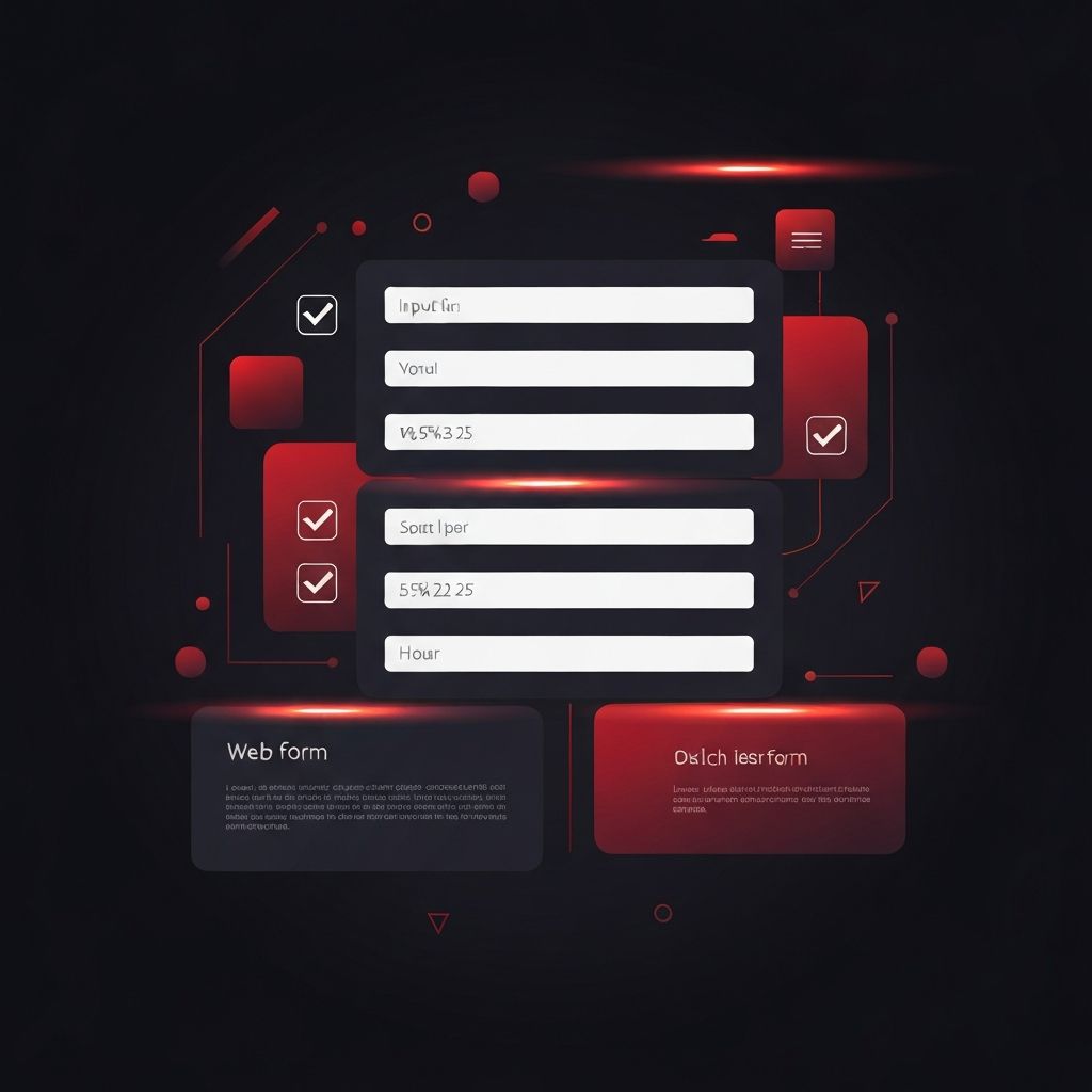
Layout and Visual Structure
A single-column layout remains the safest default for most web page form design. It aligns with natural reading patterns, works beautifully on mobile, and avoids the zigzag scanning problems of multi-column forms. Group related fields into sections with clear headings, add generous vertical spacing between groups, and keep the primary submit button anchored at the end of the flow. For longer forms, step indicators or progress bars help users sense momentum and reduce drop-off.
Labels, Hints, and Microcopy
Labels should sit above their inputs, be written in plain language, and stay visible even after the user starts typing. Placeholder text should offer examples rather than replace labels. Short hints under sensitive fields, such as 'we never share your phone number,' reassure users at the exact moment they hesitate. Error messages should be specific, friendly, and actionable. 'Password must be at least eight characters' is far more useful than 'invalid input.'
Inline Validation and Real-Time Feedback
Validation should feel like a helpful conversation, not an interrogation. As the user finishes each field, success or error states appear inline. Strength meters on passwords, automatic formatting on phone numbers, and live character counts on messages all give the user a sense of control. When submission fails, the form should scroll to the first error, move focus into it, and explain clearly how to fix the issue.
Accessibility as a First-Class Concern
Accessible forms are a win for everyone. Proper label-to-input associations, visible focus states, sufficient color contrast, keyboard-friendly interactions, and meaningful error announcements for screen readers create an experience that works for all users. Checkboxes and radios should have adequate tap targets on mobile, custom selects should preserve keyboard behavior, and required fields should be identified in more than just color. When accessibility is baked in, the form naturally becomes cleaner, more predictable, and easier to use.
Speed, Reliability, and Resilience
Form UX extends beyond the visible design. Forms must load quickly, submit reliably, and recover gracefully from network issues. Progressive enhancement ensures the form still works when JavaScript fails. Autosaving long applications protects users from lost progress. Idempotent submissions prevent duplicate records if a user double-clicks the button. These quiet engineering choices dramatically reduce support tickets and increase trust. For custom, data-intensive experiences such as onboarding workflows, expert web application development is often what turns a good form into a great product.
Security, Privacy, and Trust Signals
Users are increasingly cautious about where they enter personal information. Secure connections, clear privacy links, and transparent statements about how data will be used all help. On payment and signup forms, recognizable security badges, brief testimonials, and mention of encryption or trusted providers reduce hesitation. Spam protection should be invisible whenever possible, using techniques such as honeypots and behavioral signals rather than intrusive captchas that punish legitimate users.
Measurement and Continuous Improvement
Great form design is never finished. Analytics should track field-level drop-off, time to complete, validation errors, and conversion by device and traffic source. A/B testing different layouts, field orders, and button labels uncovers gains that intuition alone cannot predict. Even small wins compound over time into meaningful revenue improvements.
Conclusion
Web page form design sits at the intersection of marketing, product, engineering, and user experience. When these disciplines cooperate, forms stop feeling like obstacles and start feeling like the natural next step in a satisfying journey. Every business that takes its web pages seriously should take its forms just as seriously, because the form is where intent becomes outcome, and where a well-designed web page finally pays off.
