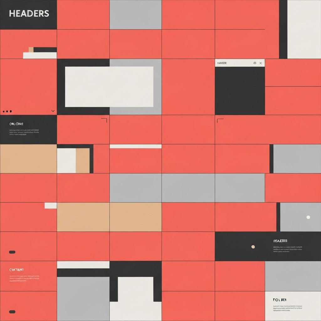
Building Blocks of Effective Web Design
Every web page consists of fundamental design elements that work together to create cohesive user experiences. Understanding these elements and their interactions enables designers to create pages that effectively communicate messages, guide user behavior, and achieve business objectives. Mastering these building blocks provides the foundation for creating exceptional digital experiences.
While trends evolve and technologies advance, the core elements of web page design remain consistent. Headers, navigation, content areas, and footers form structural foundations. Typography, color, imagery, and whitespace shape visual identity and readability.
Professional Web Design Elements by AAMAX
AAMAX.CO demonstrates mastery of web page design elements in every project they deliver. Their approach to website design carefully considers how each element contributes to overall user experience and business goals. They balance aesthetic appeal with functional effectiveness, creating pages that engage visitors and drive desired actions.
Header and Navigation Design
Headers establish brand identity and provide primary navigation. Logo placement, typically in the upper left, follows established user expectations. Navigation menus must be clear, logical, and accessible across all devices. Mega menus suit sites with complex architectures, while simpler sites benefit from streamlined navigation.
Sticky headers keep navigation accessible as users scroll, though they consume screen space on smaller devices. Search functionality helps users find specific content quickly. Mobile navigation patterns like hamburger menus must balance discoverability with screen efficiency.
Hero Sections and Visual Hierarchy
Hero sections create immediate visual impact and communicate core value propositions. Strong imagery or video backgrounds capture attention, while clear headlines and calls-to-action guide user behavior. The hero section sets the tone for the entire page experience.
Visual hierarchy directs user attention through size, color, contrast, and positioning. Primary elements receive prominence while supporting information recedes appropriately. Effective hierarchy ensures users encounter information in intended order and importance.
Typography in Web Design
Typography significantly impacts readability, aesthetics, and brand perception. Font selection must balance personality with legibility across devices. Heading hierarchies create structure and scanability. Line height, letter spacing, and line length affect reading comfort.
Responsive typography adjusts sizes and spacing for different screen sizes. Web fonts expand design possibilities but require attention to loading performance. Establishing clear typographic scales creates consistency and professional appearance.
Color and Contrast
Color palettes reinforce brand identity and create emotional responses. Limited palettes maintain visual coherence while accent colors draw attention to important elements. Sufficient contrast ensures readability and meets accessibility requirements.
Background colors establish atmosphere and affect content perception. Button colors influence click-through rates. Consistent color usage across elements creates unified experiences. Testing color combinations for accessibility prevents excluding users with visual impairments.
Imagery and Visual Content
Images communicate faster than text and create emotional connections. High-quality, relevant imagery enhances credibility and engagement. Illustrations provide unique brand personality and explain complex concepts effectively.
Image optimization balances quality with loading performance. Responsive images serve appropriate sizes for different devices. Alt text ensures accessibility and supports SEO. Video content, used judiciously, can increase engagement and time on page.
Whitespace and Layout
Whitespace, or negative space, provides visual breathing room that enhances comprehension and focus. Generous margins and padding create sophisticated, uncluttered appearances. Cramped layouts overwhelm users and reduce effectiveness.
Grid systems create consistent, organized layouts. Modular approaches allow flexible content arrangement while maintaining coherence. Breaking grid conventions intentionally creates visual interest and emphasizes key elements.
Footer Design
Footers provide secondary navigation, contact information, legal links, and social connections. Well-organized footers help users find information not prominently featured elsewhere. Newsletter signup forms in footers capture engaged visitors reaching page bottoms.
Trust elements like certifications, partner logos, and security badges often appear in footers. Copyright information, privacy policies, and terms of service links fulfill legal requirements. Footer design should complement overall page aesthetics while serving utility functions.
