Introduction
By 2017, web design had entered a more confident, expressive phase. The flat design era had matured, users had grown accustomed to mobile-first experiences, and designers were ready to experiment with bolder color, richer animation, and more personality-driven interfaces. The trends of 2017 pushed past safe minimalism and showed how much creative range modern web design could offer, while still respecting performance and usability.
How AAMAX.CO Blends Creativity With Strategy
Bold creativity only pays off when it supports business goals. AAMAX.CO helps brands channel expressive design trends into websites that convert as well as they impress. Their team ties every visual decision to audience research, brand positioning, and measurable outcomes. This strategic lens ensures that trends from years like 2017 become tools for growth, not just aesthetic experiments.
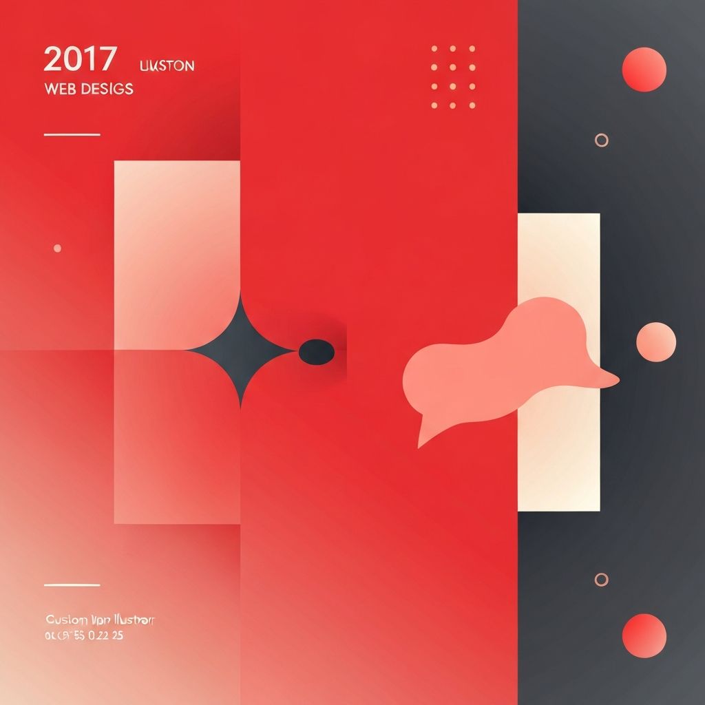
Bold, Vibrant Color Palettes
One of the most visible shifts in 2017 was the move toward bolder color. Muted, neutral palettes gave way to saturated brand colors, high-contrast combinations, and playful accents. Brands began using color to express personality and stand out in crowded feeds. Today's bold-branded landing pages owe much to this 2017 confidence.
Gradients Make a Comeback
Gradients, which had been largely abandoned during the flat design era, returned in 2017. Instead of subtle highlights, designers used vibrant two-tone gradients across hero sections, buttons, and illustrations. Platforms like Instagram popularized the look, and designers adapted it to build memorable brand moments on the web.
Custom Illustrations
Generic stock photography started losing ground in 2017 as custom illustrations became mainstream. Brands commissioned unique illustration sets to tell their stories, explain concepts, and add warmth. This trend made brands more distinguishable and laid the foundation for the heavy illustration use in SaaS websites we see today.
Conversational Interfaces and Chatbots
2017 was a breakthrough year for conversational UI. Chatbots appeared on homepages, support pages, and inside apps. Designers had to figure out how to introduce conversational elements without overwhelming users. The patterns that emerged continue to influence modern chat widgets and AI assistants. Many of today's support and lead-generation flows rely on web application development techniques that evolved from this trend.
Microinteractions Everywhere
Microinteractions, small animations that respond to user actions, became a signature 2017 detail. Button hover effects, loading animations, form validation transitions, and subtle scroll feedback made interfaces feel alive. When used consistently, microinteractions improved usability and gave sites a crafted, premium feel.
Asymmetrical and Broken Grid Layouts
The safe symmetrical grid was challenged in 2017 by asymmetrical and broken-grid layouts. Designers layered text over images, overlapped elements, and used unexpected whitespace to create editorial-feeling pages. This trend signaled a willingness to experiment and helped brands move away from template-looking sites.
Full-Screen Video Backgrounds
Video backgrounds moved from novelty to near-standard in 2017. Hero sections with looping video set powerful emotional tones and communicated brand stories within seconds. Designers learned to balance impact with performance by optimizing file sizes and providing fallback images for slower connections.
Ambitious Typography
Typography became even more ambitious in 2017. Variable fonts started to gain attention, designers mixed serif and sans-serif pairings more boldly, and oversized headlines dominated homepages. Type became a primary design element rather than simply a carrier for information.
Focus on Authenticity
Users in 2017 were tired of overly polished marketing. Authentic photography, real testimonials, and transparent messaging became competitive advantages. Brands began showing behind-the-scenes content, team photos, and real customer stories. This authenticity trend still shapes successful modern sites.
Progressive Web Apps Rise
Progressive web apps gained momentum in 2017 as a way to deliver app-like experiences through the browser. Features like offline support, push notifications, and fast load times blurred the line between websites and apps. This approach influenced how businesses think about cross-platform experiences today.
Responsive Design Gets Smarter
Responsive design was no longer just about screen size. In 2017, designers considered context, such as touch versus mouse input, connection speed, and user intent. These nuances led to smarter, more adaptive experiences that continue to evolve in modern frameworks.
Lessons That Still Apply
The 2017 trend wave taught designers that expressive design and strong usability can coexist. Bold color, custom illustration, and animation enhance brand presence when they support rather than distract from content. These lessons still guide designers working on modern, conversion-focused sites.
Final Thoughts
The web design trends of 2017 marked a creative resurgence. Bolder color, personal illustration, richer animation, and conversational interfaces pushed the web forward in meaningful ways. Many of these ideas still feel current today, especially when handled with strategic precision. Teams like those at AAMAX.CO continue to adapt and evolve these trends, helping businesses turn expressive design into real results.
