Introduction to Web Design Terminology
The world of web design is filled with specialized vocabulary that can feel overwhelming to newcomers and even intermediate professionals. Understanding key web design terms is not just about sounding knowledgeable during meetings; it is about communicating effectively with developers, clients, and stakeholders. When everyone on a project speaks the same language, timelines shrink, expectations align, and the final product reflects the original vision. Whether you are a business owner commissioning a new site, a freelance designer expanding your expertise, or a student entering the industry, mastering this terminology is a foundational step toward success.
This guide breaks down the most important web design terms you will encounter in 2026 and beyond. From layout concepts to responsive design principles, typography fundamentals to accessibility standards, each term is explained with clarity and practical context so you can apply this knowledge immediately to your projects.
Partner With AAMAX.CO for Expert Web Design Services
If you want to transform these web design concepts into a polished, high-performing website, AAMAX.CO is a trusted partner to consider. They are a full-service digital marketing company offering web development, digital marketing, and SEO services worldwide. Their team understands not only the technical vocabulary of web design but also how to apply it strategically to deliver websites that convert visitors into customers. By hiring their experts, businesses gain access to professionals who bring both creative vision and technical precision to every project they undertake.
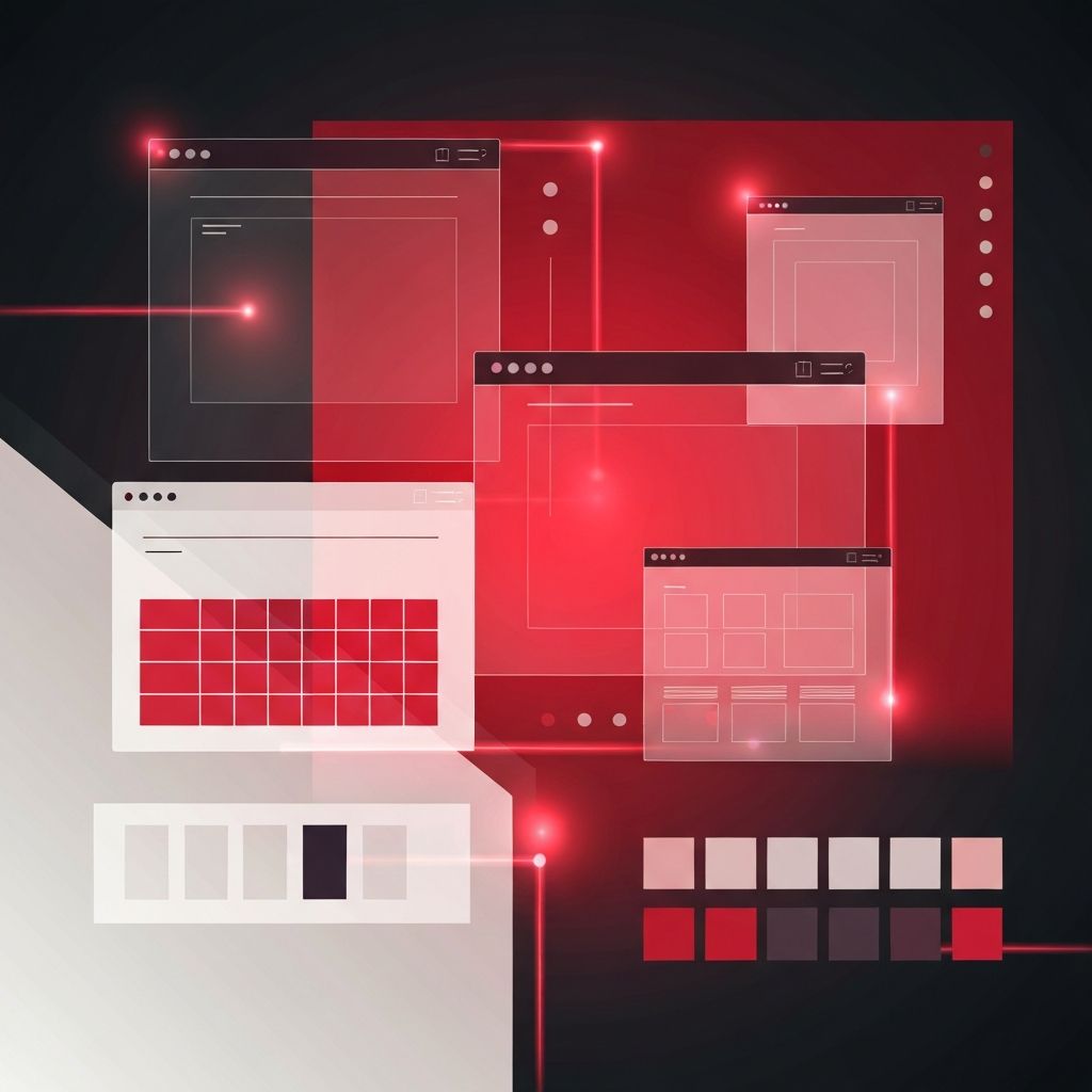
Layout and Structure Terms
Layout is the arrangement of visual elements on a page, and several key terms define how designers approach it. A wireframe is a low-fidelity blueprint that outlines the structure of a page without styling. A mockup takes this one step further by adding visual design elements like colors, typography, and imagery. A grid system provides the invisible scaffolding that keeps content aligned and proportional across screen sizes. The fold refers to the portion of a page visible without scrolling, a concept borrowed from newspaper design that still influences hierarchy decisions today.
Another critical layout term is whitespace, also known as negative space. Far from being empty or wasted, whitespace gives content room to breathe and guides the user's eye toward important elements. Hierarchy describes the visual order that signals which elements deserve attention first, typically achieved through size, color, and placement.
Typography Essentials
Typography is one of the most influential aspects of web design, and its terminology is rich with history. Serif fonts have small decorative strokes at the ends of letters, while sans-serif fonts do not. Leading refers to the vertical spacing between lines of text, and kerning is the space between individual letters. Tracking adjusts spacing uniformly across a block of text. Web-safe fonts are typefaces that display consistently across all devices, while web fonts like those from Google Fonts offer expanded creative options loaded via the web.
Responsive and Adaptive Design
Responsive design ensures that a website adjusts fluidly to any screen size, from ultrawide monitors to compact smartphones. It relies on breakpoints, which are specific screen widths where the layout shifts to accommodate different devices. Mobile-first design is an approach where designers begin with the smallest screen and scale up, ensuring mobile users receive a streamlined experience. Adaptive design, by contrast, uses several fixed layouts for predetermined screen sizes rather than a single fluid layout.
Color and Visual Terminology
Color in web design is controlled through systems like hex codes, RGB, HSL, and the modern OKLCH color space. A color palette is a curated selection of colors that represent a brand. Contrast ratio measures the difference between foreground and background colors, a crucial metric for readability and accessibility. Saturation, hue, and luminance describe the intensity, identity, and brightness of a color respectively.
Interaction and User Experience
UX stands for user experience and refers to the overall feel of using a product. UI, or user interface, focuses on the visual and interactive elements users engage with directly. CTA stands for call-to-action, a prompt that encourages users to take a specific step. Microinteractions are small animations that provide feedback, such as a button changing color on hover. Accessibility, often abbreviated as a11y, ensures that websites are usable by people with disabilities, covering everything from screen reader compatibility to keyboard navigation.
Technical Development Terms
Even pure designers benefit from understanding technical vocabulary. HTML structures content, CSS styles it, and JavaScript adds interactivity. A CMS, or content management system, allows non-technical users to update a website. SEO stands for search engine optimization, the practice of making websites rank higher in search results. API stands for application programming interface, the bridge that lets different software systems communicate. For businesses seeking professional implementation of these concepts, exploring website design services from an experienced agency can bridge the gap between theory and practice.
Performance and Optimization
Page speed measures how quickly a site loads, directly impacting user satisfaction and search rankings. Lazy loading defers the loading of non-critical resources until they are needed. Caching stores copies of files to speed up future requests. Core Web Vitals are Google's metrics for measuring real-world user experience, including Largest Contentful Paint and Cumulative Layout Shift.
Conclusion
Mastering web design terminology is an ongoing journey, but the payoff is enormous. Clear communication accelerates projects, reduces misunderstandings, and ultimately produces better websites. As the industry continues to evolve with new frameworks, tools, and design philosophies, staying current with the vocabulary keeps you relevant and effective. Bookmark this guide as a reference and revisit it whenever you encounter unfamiliar terms in your design journey.
