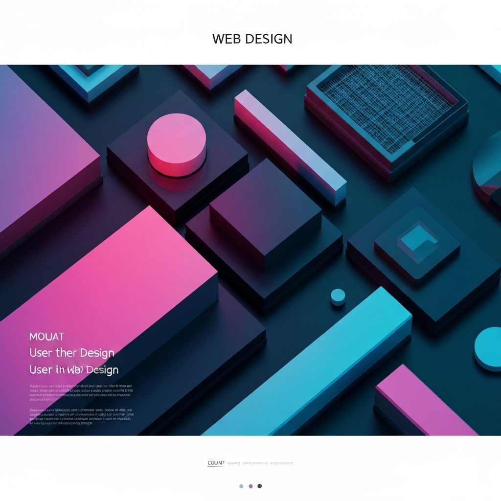
Building Blocks of Exceptional Web Design
Every website is composed of fundamental elements that work together to create user experiences. Understanding these building blocks—and how they interact—is essential for creating effective web design. From typography and color to layout and imagery, each element contributes to how users perceive and interact with your digital presence.
Mastering web design elements requires understanding both individual components and their relationships. A beautiful typeface can be undermined by poor color choices. Stunning imagery can be wasted in a confusing layout. The art of web design lies in orchestrating all elements into cohesive, effective experiences that serve both users and business objectives.
How AAMAX.CO Masters Web Design Elements
AAMAX.CO is a full-service digital marketing company whose designers bring deep expertise in every web design element. Their website design services reflect meticulous attention to typography, color, layout, and all the components that create exceptional digital experiences. They understand that great web design is about more than individual elements—it's about how everything works together to achieve client goals.
Typography: The Voice of Your Design
Typography is perhaps the most important web design element, as most website content is text. Font choices communicate personality before users even read the words. Serif fonts suggest tradition and authority, while sans-serif options convey modernity and clarity. Script and display fonts add personality but must be used judiciously.
Type hierarchy guides users through content by establishing visual importance. Headings, subheadings, body text, and captions each serve specific purposes and require appropriate styling. Effective hierarchy makes content scannable and helps users find information quickly.
Readability depends on more than font selection. Line height, line length, and spacing all affect how comfortably users can consume text. Body text should typically use 16-20 pixel sizes, 1.5-1.7 line height, and 50-75 character line lengths for optimal readability.
Color: Emotion and Communication
Color profoundly influences how users perceive your website and brand. Color psychology suggests that different hues evoke different emotional responses—blue conveys trust, green suggests growth, red creates urgency. Strategic color choices align visual experience with brand personality and messaging goals.
Color palettes should be intentionally limited and cohesive. Most effective websites use a primary brand color, one or two accent colors, and neutral tones for backgrounds and text. Too many colors create visual chaos that overwhelms users and dilutes brand impact.
Contrast is essential for both aesthetics and accessibility. Text must contrast sufficiently with backgrounds for readability. Interactive elements should be visually distinct from static content. Accessibility guidelines provide specific contrast ratios that ensure content is perceivable by users with visual impairments.
Layout and Composition
Layout determines how elements are arranged on the page, guiding user attention and creating visual flow. Grid systems provide structure that maintains consistency across pages while allowing flexibility within established patterns. Responsive grids adapt layouts appropriately for different screen sizes.
Visual hierarchy through layout helps users understand content importance. Larger elements, prominent positioning, and generous surrounding space all signal importance. Effective layouts lead users naturally through content in intended sequences.
White space (negative space) is as important as content. Adequate spacing prevents overwhelm, improves comprehension, and creates sophisticated visual impression. Cramped layouts feel chaotic and unprofessional, while generous spacing suggests confidence and clarity.
Imagery and Visual Content
Images create emotional connections that text alone cannot achieve. Photography, illustrations, icons, and graphics all contribute to user experience and brand perception. Visual content should be purposeful rather than decorative, supporting messaging and user goals.
Image quality significantly impacts credibility. Blurry, poorly lit, or obviously stock photography undermines professional impression. Investment in quality imagery—whether custom photography or carefully selected stock—reflects positively on brand perception.
Optimization ensures images enhance rather than hinder user experience. Large unoptimized images slow page loads and frustrate users. Modern image formats, responsive sizing, and lazy loading techniques balance visual impact with performance requirements.
Navigation and Interaction Elements
Navigation elements help users find their way through your website. Menus, breadcrumbs, links, and search functions all contribute to wayfinding. Navigation should be immediately understandable, consistently positioned, and available when users need it.
Interactive elements like buttons, forms, and controls invite user action. These elements should be clearly identifiable as interactive, with visual feedback confirming user actions. Size, color, and positioning affect how likely users are to engage with interactive elements.
Micro-interactions add polish and feedback through subtle animations and responses. Hover effects, loading indicators, and transition animations create more engaging experiences when used thoughtfully. However, excessive animation distracts rather than enhances.
Content Elements and Patterns
Content blocks organize information into digestible chunks. Cards, sections, and modules create visual separation that aids comprehension. Consistent patterns help users predict where to find information and how to interact with content.
Lists and structured content present information efficiently. Bullet points, numbered lists, and tables organize complex information clearly. These formats improve scannability and help users quickly assess relevance.
Media elements including video, audio, and interactive content require thoughtful integration. These rich media elements can powerfully engage users but also create performance and accessibility challenges. Implementation should consider user control, fallbacks, and performance impact.
Forms and Input Elements
Forms are critical conversion elements that require careful design. Field labels, placeholders, and help text guide users through completion. Layout and grouping make complex forms feel manageable. Error handling helps users recover from mistakes without frustration.
Input elements should match expected data types. Date pickers, dropdown menus, and appropriate keyboard types on mobile all reduce friction. Smart defaults and auto-completion speed completion while reducing errors.
Form accessibility ensures all users can complete forms successfully. Label associations, error announcements, and keyboard navigation support users with disabilities. Accessible forms also tend to be more usable for everyone.
Footer and Supporting Elements
Footer elements provide important secondary information and navigation. Contact details, legal links, social media connections, and sitemap navigation commonly appear in footers. Well-designed footers serve users who scroll to page bottom seeking additional information.
Trust elements including certifications, testimonials, and security indicators build confidence. Strategic placement of these elements supports conversion by addressing user concerns at decision points.
Utility elements serve specific functions throughout the site. Search bars, language selectors, accessibility controls, and similar utilities should be consistently positioned and styled for easy discovery and use.
Bringing Elements Together
Effective web design integrates all elements into cohesive experiences. Consistency in styling, spacing, and interaction patterns creates unified visual language. Design systems document these decisions, ensuring consistency as websites grow and evolve.
Balance between elements creates comfortable visual experiences. No single element should dominate unless intentionally emphasized. Harmony among typography, color, imagery, and layout produces professional, credible impressions.
Testing with real users reveals whether element combinations work as intended. User feedback identifies confusion, frustration, and delight that inform refinement. Iterative improvement based on user input optimizes element integration over time.
