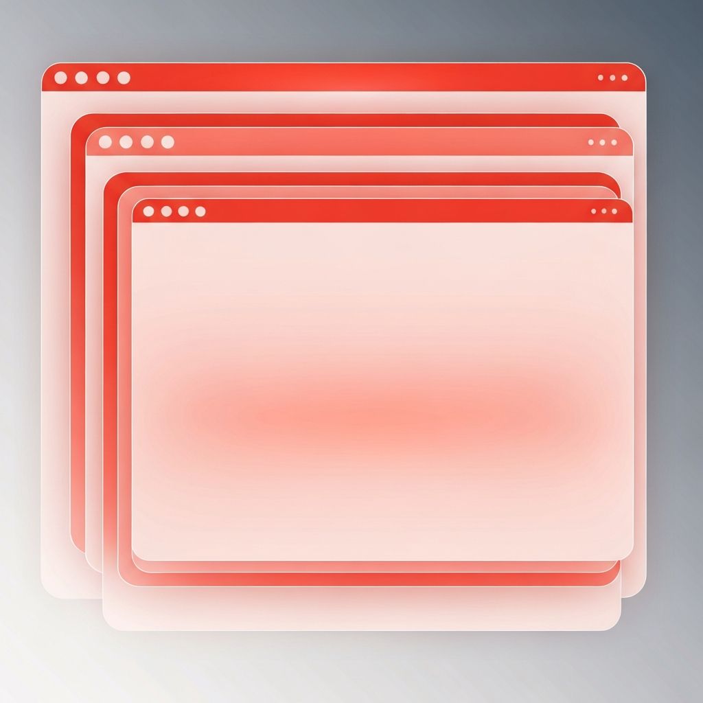
The Role of Tabs in Web Design
Tabs are one of the oldest and most reliable patterns in user interface design. Borrowed from physical file folders, they let users switch between related sections of content within the same view, keeping context intact and saving precious screen real estate. When used well, tabs in web design organize complex information into digestible chunks and help users focus on one subject at a time. When used poorly, they hide important content, confuse navigation, and frustrate users. Understanding the right moments to reach for tabs and the right way to build them is essential for any serious designer or developer.
Build Better Interfaces With AAMAX.CO
Teams that want to implement thoughtful, accessible interface patterns in their projects can work with AAMAX.CO, a full-service digital agency offering web design, web development, digital marketing, and SEO services worldwide. Their designers and engineers bring a craft-first approach to UI patterns like tabs, ensuring they work beautifully across devices, remain accessible to keyboard and screen reader users, and reinforce the overall information architecture of the site. Through their website design services, they help brands build interfaces where every component, from tabs to forms to navigation, earns its place on the page.
When to Use Tabs
Tabs shine when you have multiple sections of related content and users typically only need to see one at a time. Classic use cases include product detail pages with description, specifications, and reviews; settings panels with account, notifications, and privacy sections; or dashboards where different data views share the same context. Tabs preserve the sense of a single place while offering multiple perspectives on its content. If users often need to compare information from different sections side by side, tabs are the wrong choice; consider accordions, columns, or separate pages instead.
When to Avoid Tabs
Tabs fail when they hide essential information that most users need to see. If every visitor has to click through three tabs to get basic details, the tabs are doing harm by adding friction. Tabs also struggle when labels are ambiguous, when there are too many of them, or when the content inside varies wildly in length and structure. On small screens, long rows of tabs wrap awkwardly or force horizontal scrolling. Before adding tabs, designers should ask whether the information could live better as a single scrollable page, a set of cards, or a progressive disclosure pattern.
Anatomy of a Good Tab Component
A well-designed tab component has clear, distinct states: default, hover, focus, active, and disabled. The active tab should be unmistakable, typically through a stronger color, underline, or raised effect. Hover and focus states provide feedback for mouse and keyboard users. Labels should be short, scannable, and parallel in structure, for example all nouns or all verbs. Icons can support labels but rarely replace them well; icon-only tabs often confuse users unless the meaning is universally obvious. Spacing between tabs should make each one easy to click without accidental taps on neighbors.
Accessibility Considerations
Tabs are one of the most commonly mishandled patterns in terms of accessibility. A proper implementation follows the ARIA authoring practices: the tab list has role tablist, each tab has role tab, and each panel has role tabpanel. Keyboard interactions should allow arrow keys to move focus between tabs, Home and End to jump to the first or last tab, and Tab to move from the active tab into its panel. Focus must be visible and logical. Screen readers should announce the tab role, the selected state, and the relationship between tabs and panels. Skipping these details creates a pattern that looks fine but excludes real users.
Responsive Tab Patterns
Tabs need to adapt to every screen size. On wide desktops, a horizontal row works well. On tablets and phones, designers have several options. Scrollable tab bars keep the horizontal pattern while letting users swipe to additional tabs; these should indicate that more tabs exist with a subtle gradient or arrow. Alternatively, tabs can collapse into a dropdown or convert into a stacked accordion on narrow screens. Each choice has tradeoffs. Scrollable rows preserve familiarity but hide tabs below the fold of horizontal attention. Accordions require more vertical scrolling but make every section visible at a glance. The right choice depends on content and audience.
Performance and Lazy Loading
When tab panels contain heavy content like videos, large tables, or third-party widgets, loading all of them upfront wastes bandwidth and slows the initial render. Lazy-loading the inactive panels keeps the page fast while still providing instant switching once a panel has been activated once. Developers should cache activated panels in memory to avoid refetching data when users switch back and forth. On the SEO side, content hidden behind tabs is still indexed by modern search engines as long as it is present in the rendered HTML, but critical content should still be accessible without requiring interaction.
Visual Styling Best Practices
Tabs should feel like part of the page, not a bolted-on widget. Their typography should harmonize with surrounding headings, their colors should draw from the existing palette, and their spacing should align with the rest of the design system. Subtle transitions between tabs can signal change without being distracting. Avoid heavy shadows, drastic color shifts, or overly decorative treatments that pull attention from the content itself. Remember, tabs are a navigation aid, not the star of the show.
Common Mistakes to Avoid
Several anti-patterns show up again and again. Tabs without a clear selected state leave users guessing where they are. Nested tabs, where tab panels themselves contain more tabs, quickly become disorienting. Tab labels that are too long wrap awkwardly or get truncated. Dynamic tab counts that change based on user state can break layouts. And tabs that scroll the page when clicked break the expected behavior of in-place switching. Avoiding these mistakes is mostly a matter of discipline and testing with real users.
Conclusion
Tabs remain a powerful pattern in modern web design when used with care. They reduce cognitive load, preserve context, and organize complex information elegantly. But they demand thoughtful design, accessible implementation, and responsive behavior to truly deliver value. Designers and developers who master tabs add a reliable tool to their toolkit, one that can elevate product pages, dashboards, documentation, and countless other interfaces. The goal is always the same: make it easier for users to find exactly what they need, without noise or friction, exactly where they are.
