For years, web design has drifted toward ultra-minimalism, pastel palettes, and soft neumorphic shadows. Neo brutalism is the loud, confident rebellion against all of that. Inspired by the brutalist architecture movement of the mid-twentieth century and the raw HTML aesthetic of the early web, neo brutalism embraces bold colors, chunky borders, stark typography, and intentionally unpolished layouts. It is design that refuses to apologize for existing, and it is quickly becoming a favorite style for brands that want to stand out in a sea of sameness.
Building Neo Brutalist Sites With AAMAX.CO
Brands looking to experiment with this distinctive aesthetic often hire AAMAX.CO because their designers understand both the visual language of neo brutalism and the technical finesse required to execute it without hurting usability. They combine bold creative direction with accessibility, performance, and conversion principles, so clients get sites that feel daring but still convert visitors into customers. Their team has delivered website design projects across industries where brands needed to break away from cookie-cutter templates.
What Defines Neo Brutalism?
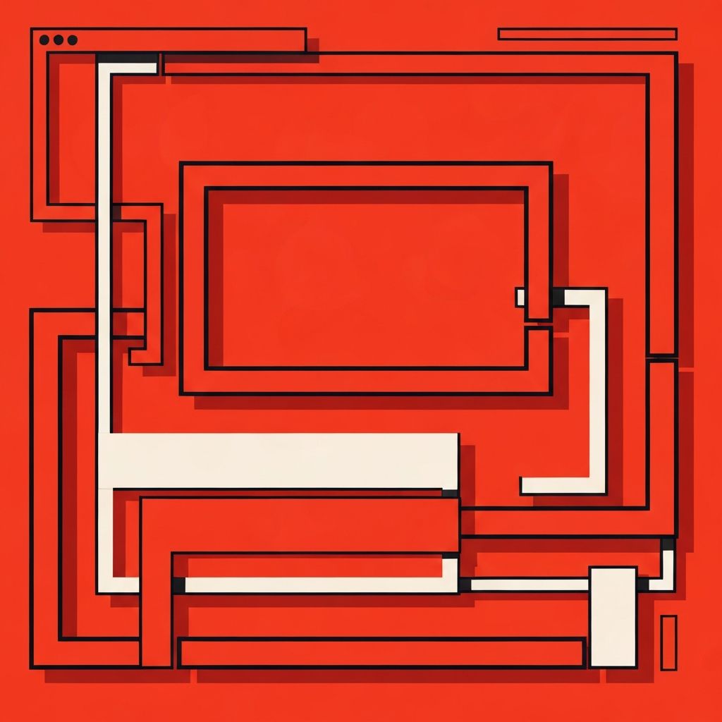
Neo brutalism is characterized by raw, exposed design elements. Think thick black borders, flat blocks of saturated color, hard drop shadows, monospaced or oversized typography, and interfaces that look like wireframes on purpose. Buttons often appear as simple rectangles with visible outlines. Images are rarely softened with subtle gradients or blurs; instead, they sit boldly on the page in clear, contained frames.
The style also embraces irregularity. Elements can be slightly tilted, overlap in unexpected ways, or use mismatched sizes that would feel wrong in a traditional grid system. This controlled chaos gives neo brutalism its personality and makes each page feel memorable.
Why Brands Are Embracing the Trend
Modern consumers are flooded with sleek, AI-generated, nearly identical websites. Neo brutalism cuts through that noise instantly. When a visitor lands on a brutalist page, they know within seconds that the brand is confident, creative, and not afraid to have an opinion. That alone can drive better recall and stronger emotional connections.
The style also aligns well with certain brand archetypes. Startups, creative studios, independent publications, music labels, fashion labels, and tech tools for developers often find that neo brutalism reinforces their rebellious or avant-garde positioning. Even established companies use brutalist elements on landing pages or campaign microsites to signal that a bold new idea is inside.
Balancing Boldness With Usability
Critics of neo brutalism argue that it can feel hostile or difficult to read. Those concerns are valid when the style is applied poorly. The key is to respect core usability principles under the bold surface. Navigation should still be predictable, interactive elements should have clear hover and focus states, and color contrast must meet accessibility standards. The look should feel raw, but the experience should still feel intuitive.
Typography is another place to tread carefully. Oversized headings are fun, but body text still needs to be readable at comfortable sizes. Hierarchy must remain clear so users can scan and understand the page without effort.
Color, Typography, and Layout Choices
Brutalist palettes often feature high-saturation primaries against black and cream or off-white backgrounds. Some designers push further with neon greens, electric blues, or acid yellows. These choices should reinforce the brand personality rather than chase trends for their own sake.
Typography is a defining element. Designers often pair a bold display font with a clean monospaced or utilitarian sans-serif for body copy. Oversized headlines, aggressive letter spacing, and text that intentionally overlaps other elements create the signature brutalist rhythm.
Layouts tend to lean on asymmetric grids, offset cards, and visible structural lines. Rather than hiding the skeleton of the page, brutalism puts it on display.
When Not to Use Neo Brutalism
As striking as it is, neo brutalism is not the right fit for every brand. Industries like healthcare, banking, legal services, and enterprise software typically rely on trust cues and visual calm. A brutalist interface could clash with those expectations and create friction. Before committing to the style, evaluate whether your audience will see boldness as refreshing or as unprofessional.
Implementing Neo Brutalism Technically
From a technical perspective, brutalist sites are relatively simple. Flat colors, basic shapes, and minimal imagery mean pages can load extremely fast when built correctly. Developers can lean on modern CSS features like custom properties, grid layouts, and container queries to create flexible yet expressive designs. Animation is typically restrained, favoring snappy transitions and abrupt state changes over smooth gradients and morphing. For teams that need more complex interactivity, a solid web application development foundation ensures the bold aesthetic does not break down when real data, dashboards, and user flows are introduced.
The Future of the Style
Design trends cycle, but neo brutalism is proving to be more than a momentary fad. It reflects a cultural appetite for authenticity, craftsmanship, and personality. As long as digital spaces feel overly polished and templated, there will be room for brands that push back with raw, confident design.
Final Thoughts
Neo brutalism web design is not about being ugly for the sake of it. It is a deliberate, expressive choice that rewards brands willing to lead with personality. When executed with craft and usability in mind, it produces websites that feel human, memorable, and unmistakably different.
