The best way to understand minimalist web design is to study real-world examples that successfully apply its principles. From global tech brands to independent portfolios, minimalism has shaped some of the most influential websites of the last decade. Examining these examples reveals patterns that can inspire and inform any digital project.
Hire AAMAX.CO for Minimalist Web Design and Development Services
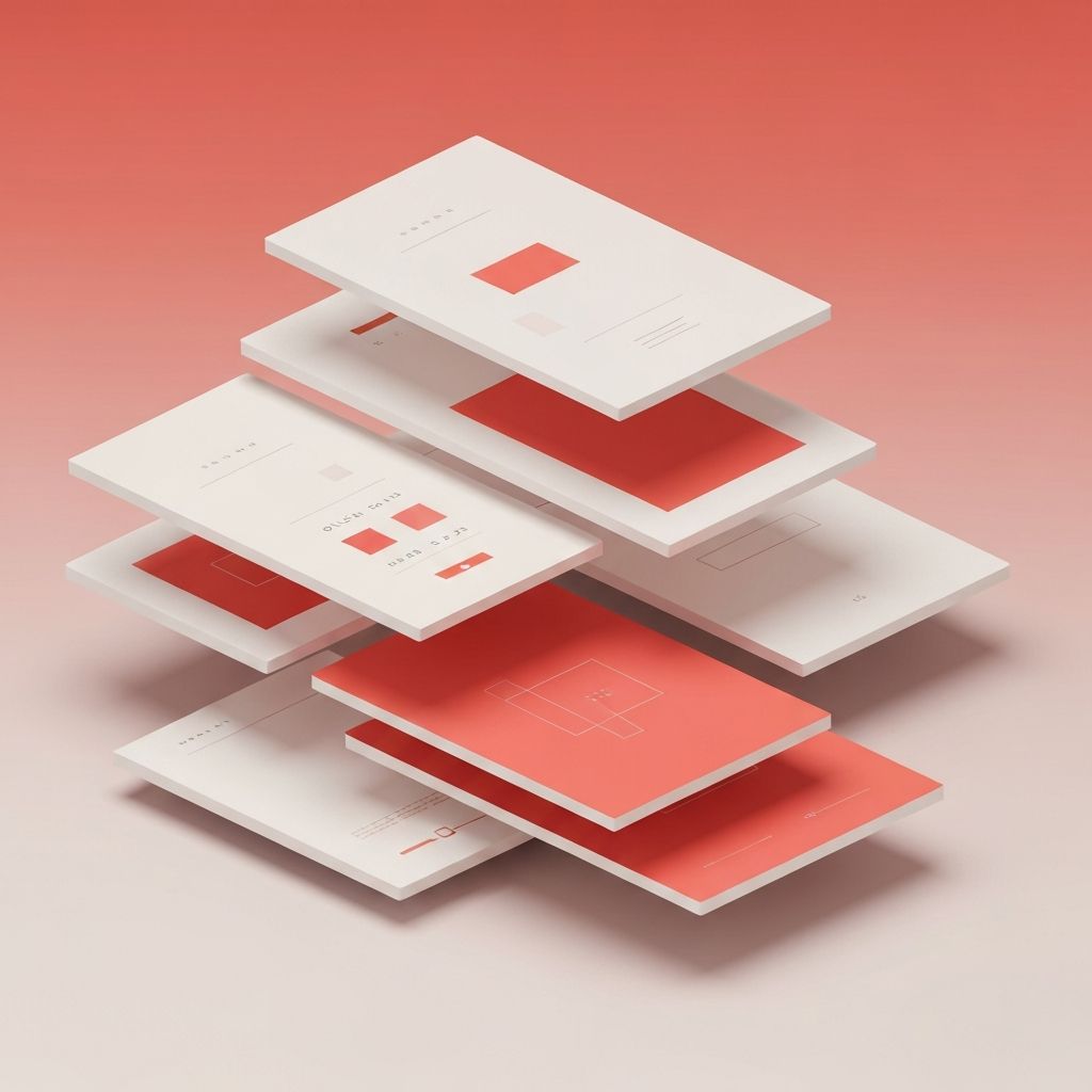
Many of today's most refined digital experiences are built by teams that understand the discipline behind simplicity. AAMAX.CO is a full-service digital marketing company offering web development, digital marketing, and SEO services worldwide. Their designers and developers are well-versed in creating clean, conversion-focused interfaces, and they bring proven expertise in website design to every project. They have helped clients across industries translate complex offerings into elegant, minimalist websites that resonate with modern audiences.
Apple: The Gold Standard of Restraint
Apple's website is perhaps the most iconic example of minimalist design at scale. Generous whitespace, full-width product imagery, and a single hero message per section create a sense of focus and reverence around each product. The typography is clean, the navigation is unobtrusive, and the user is never overwhelmed.
What makes Apple's approach exceptional is the consistency. Every page, every product, and every campaign follows the same visual language. This consistency builds trust and reinforces the premium positioning of the brand.
Stripe: Minimalism with Technical Depth
Stripe demonstrates that minimalism is not limited to lifestyle brands. Despite serving developers and enterprises with deeply technical products, Stripe's marketing site uses restrained typography, subtle gradients, and elegant motion to communicate complex ideas with ease.
Code snippets are integrated as design elements rather than afterthoughts, and animations bring abstract concepts to life without distracting from the message. Stripe shows how minimalism can elevate even the most technical content.
Notion: Clarity Through Simplicity
Notion's website mirrors the simplicity of its product. Clear headlines, simple illustrations, and ample whitespace make a powerful first impression. The site avoids jargon and focuses on what users can actually accomplish, presenting features as benefits rather than technical specifications.
The use of friendly, hand-drawn illustrations softens the overall feel and makes the brand approachable, proving that minimalism does not have to feel cold or corporate.
Linear: Modern Minimalism with Personality
Linear, the project management tool for software teams, has become a reference point for modern minimalist design. Its dark-mode-first palette, refined typography, and subtle motion create a futuristic yet approachable experience. The site uses every pixel intentionally, with no decoration for its own sake.
Linear demonstrates how minimalism can feel fresh and modern when paired with thoughtful motion design and a confident visual identity.
Bench: Storytelling Through Simplicity
Bench, the bookkeeping service, uses minimalism to tell a clear story. The homepage walks visitors through the value proposition with short headlines, simple illustrations, and a single call-to-action per section. There is no clutter, no competing messages, just a calm guided journey.
This example shows how minimalism can support narrative-driven marketing, making complex services feel accessible and trustworthy.
Independent Portfolios and Studios
Independent designers and creative studios often push minimalism to its most expressive limits. Sites like Bruno Simon's portfolio, Studio Feixen, and many Awwwards winners use bold typography, generous whitespace, and a single striking interaction to leave a lasting impression.
These portfolios prove that minimalism does not mean boring. With confidence and creativity, even the simplest layout can become unforgettable.
Common Patterns Across Great Examples
Looking across these examples, several patterns emerge. Successful minimalist sites tend to use a single hero message per viewport, restrained color palettes, refined typography, and purposeful motion. They prioritize content hierarchy, lead with benefits, and respect the user's time.
They also tend to be technically excellent. Fast load times, accessible markup, and responsive layouts are non-negotiable. Minimalism in design and minimalism in code often go hand in hand.
How to Apply These Lessons
When studying minimalist examples, the goal is not to copy but to understand the underlying principles. Ask why each element exists, how the hierarchy guides attention, and what emotions the design evokes. Then apply those principles to your own context, whether you are building a startup landing page, a portfolio, or a corporate site.
Start with content. Define the single most important message for each page, then design around it. Remove anything that does not support that message. Test the result with real users to ensure clarity and ease of use.
Conclusion
Great minimalist web design examples share a common DNA: clarity, restraint, intentionality, and respect for the user. By studying brands like Apple, Stripe, Notion, and Linear, designers can learn how to apply these principles in ways that feel both timeless and contemporary. Minimalism is not a trend, it is a discipline, and the best examples prove its enduring power.
